Style chips for easy usability
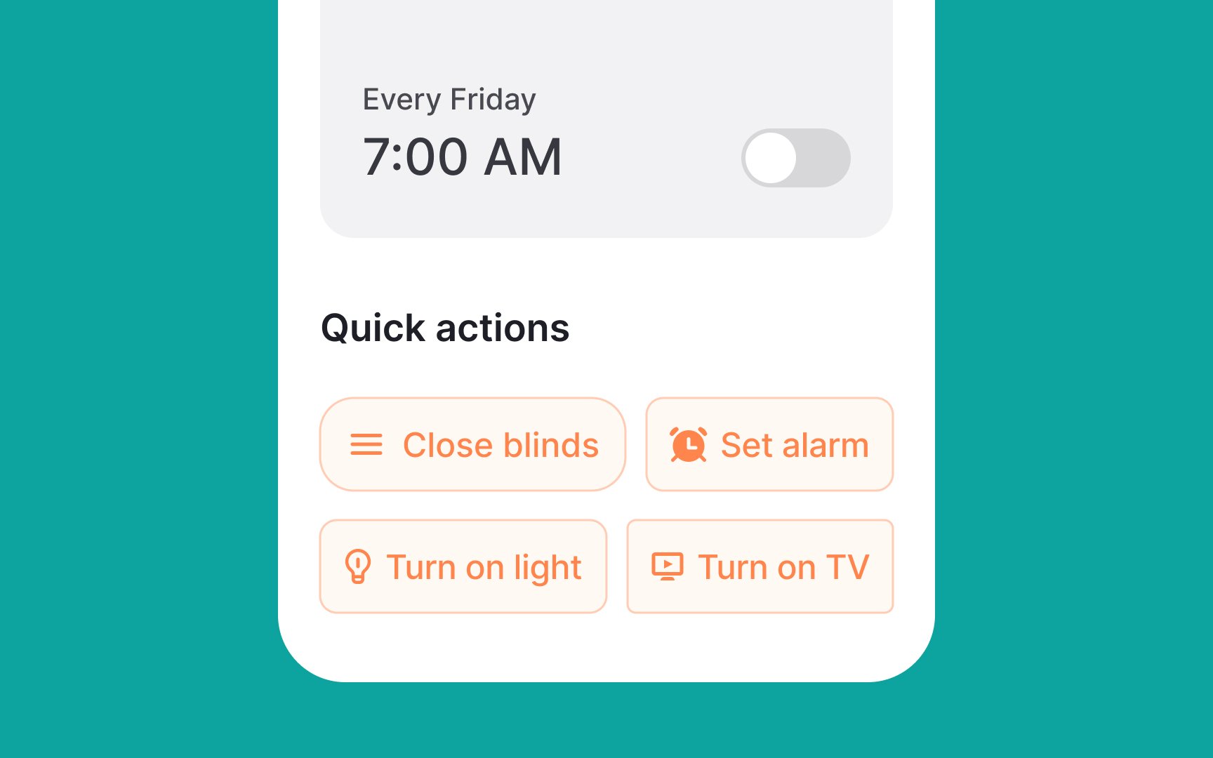
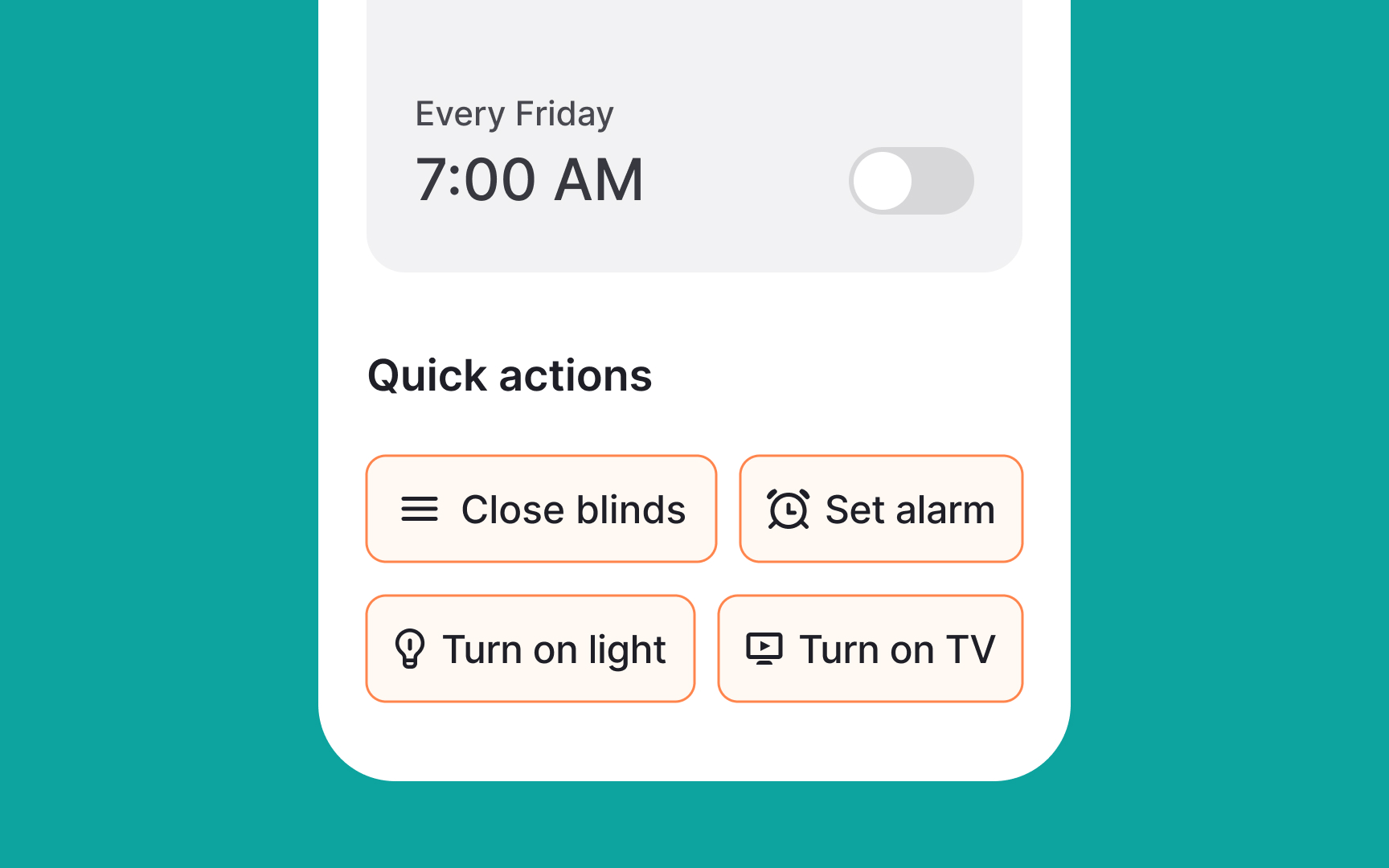
In order to ensure your chips are visually appealing and functional:
- Use relevant and clear leading and trailing icons that are easy to understand. For example, using a star icon at the beginning of a chip for "favorite" items, and a cross icon at the end of the chip that can be clicked to remove it.
- Consider rounded borders for an aesthetically pleasing chip design — while this is not a rule, most UIs style chips this way, so users are more likely to find this styling intuitive.
- Create a distinction between the chip background (fill color) and page color. Use distinctive borders or shadows to make them as prominent enough but not too attention-grabbing. Keep in mind that chips are only for secondary, non-critical actions and style them as such.
- Make sure the contrast ratio of the text label to the background is at least 3:1 to ensure readability.[1]
