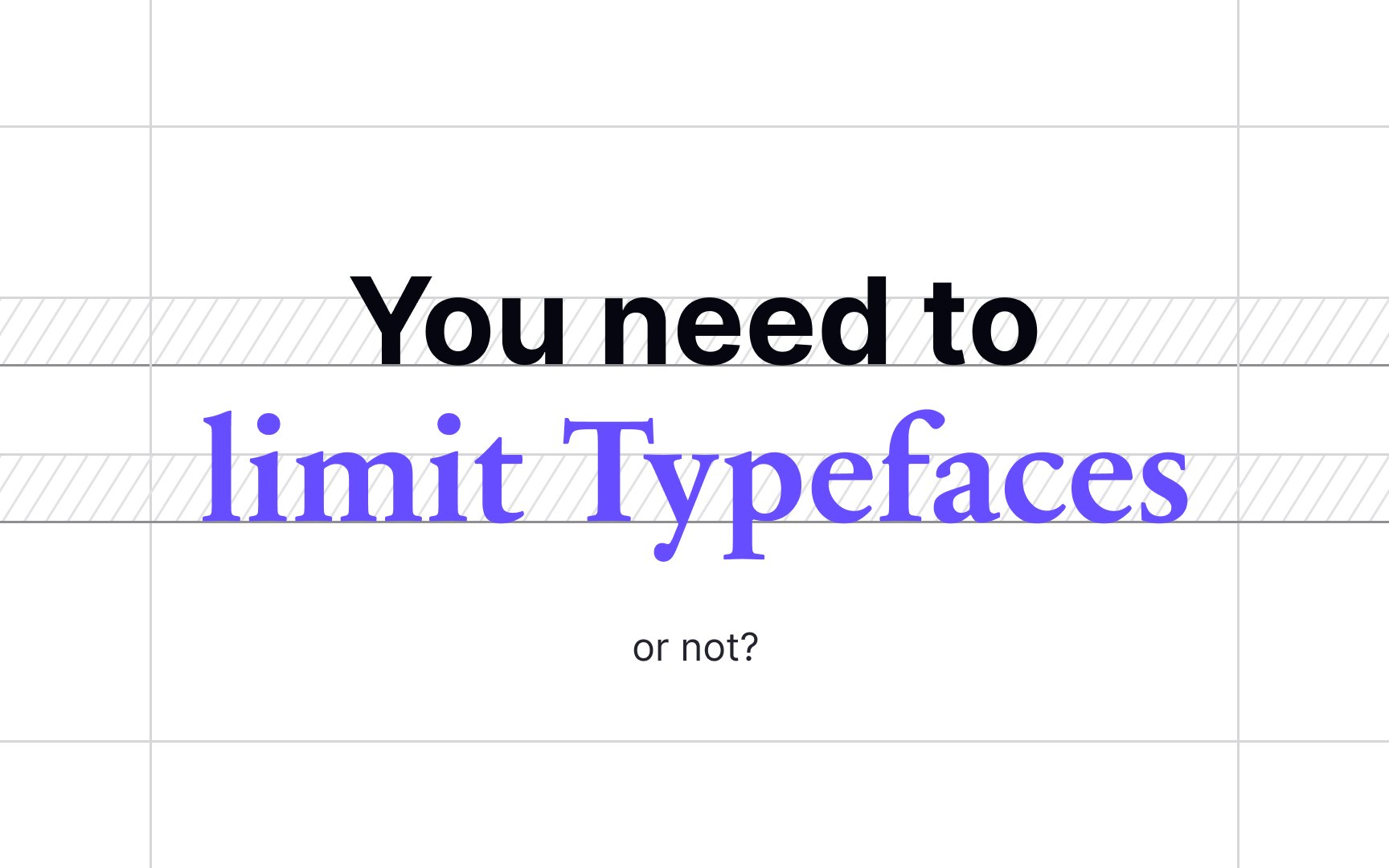
Limit your typefaces
Before committing to a typeface, you should assess its styles, legibility, weights, mood, and ability to complement your content. Let's say you have a couple of candidates, and here arises the question: how many typefaces are enough for your product?
The conventional wisdom says that a website, an app, or any other digital product should contain no more than 3 typefaces. Usually, one typeface with a good variety of font styles for different purposes works fine. Too many typefaces create a mess and disorient users. Plus, it becomes harder to maintain consistency across the product and balance out the visual hierarchy.
When selecting typefaces, make sure they contrast enough but remain visually compatible. For example, simple sans serifs work better for body copy. They allow you to let loose and experiment with more unique typefaces for headlines.
Pro Tip: Avoid messy, hard-to-read typefaces and always test a typeface's legibility at small sizes.
