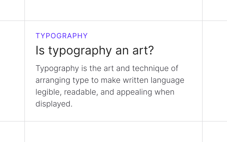
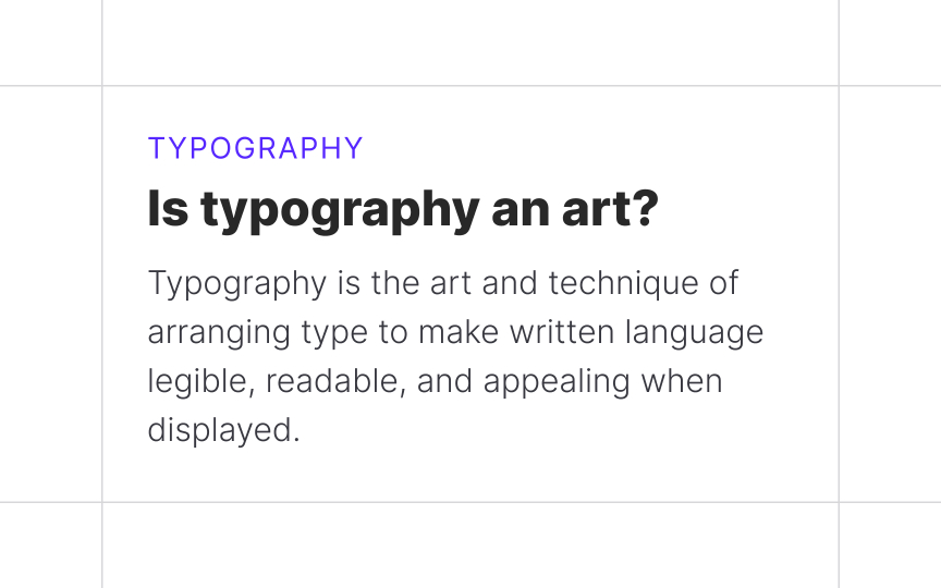
Type weight
Type weight helps add contrast to headings to lead readers down the page in a structured way. When specifying header size, be sure to choose your weight accordingly and vice versa. The weight of the font will help you select the best size range to use it at for optimal readability.
The rule of thumb here is, the thinner or thicker your type is compared with the regular font style, the larger it needs to be. Weights closer to 'regular' have a more balanced stroke-to-space ratio. If you use a small size for an extremely thin typeface, the strokes will practically disappear against the page or the screen. Extremely thick typefaces aren't suitable for smaller copy sizes either — mainly because the counters will close in.
When using extra thick or thin fonts, make sure it resides higher in the hierarchy at a larger size. This will improve both legibility and readability.


