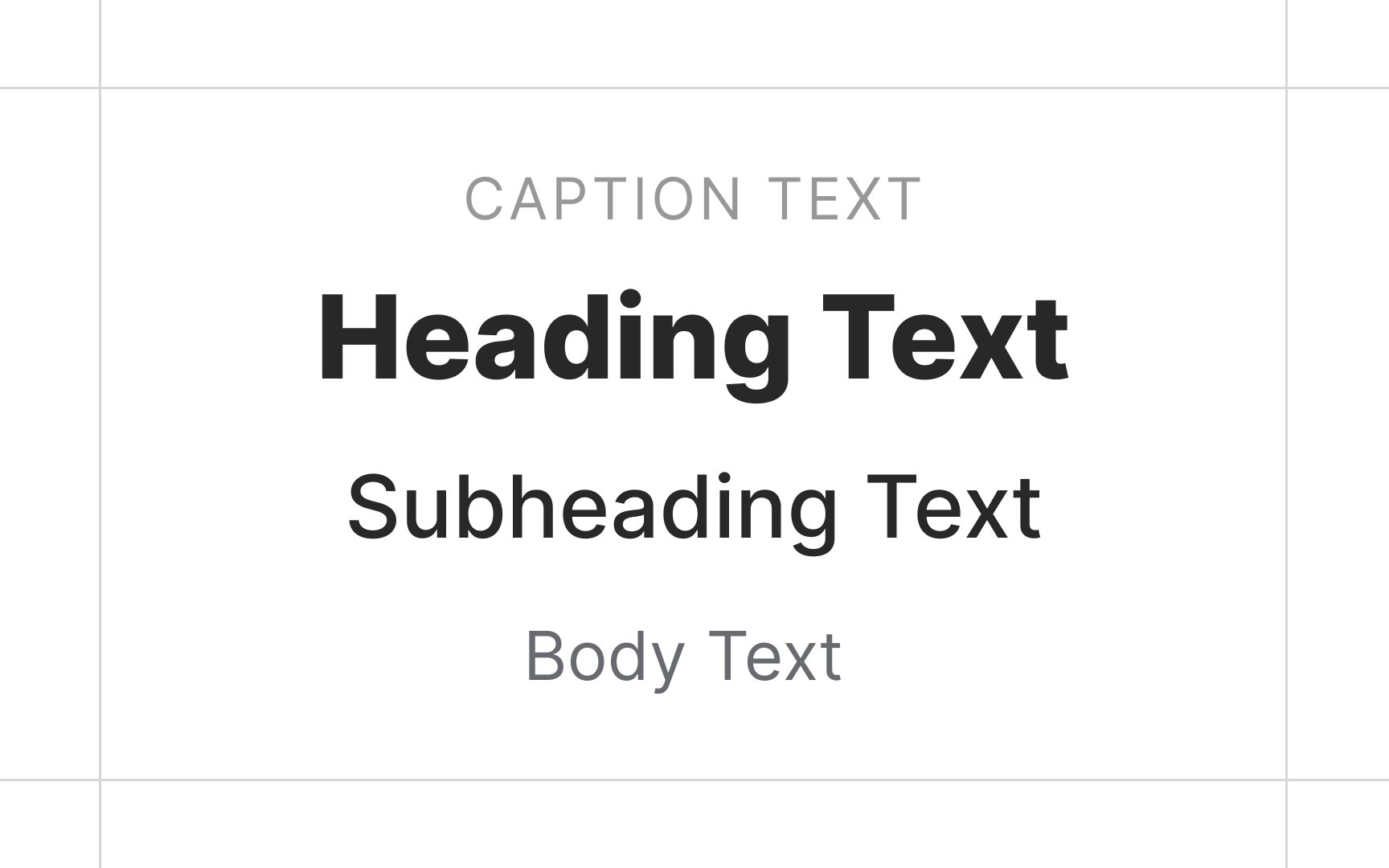
Typographic Hierarchy
Learn how to establish a clear visual hierarchy in your designs to enhance readability
Typographic hierarchy is a system for organizing text on a page that establishes its order of importance. It also allows readers to easily navigate the content and find what they are looking for.
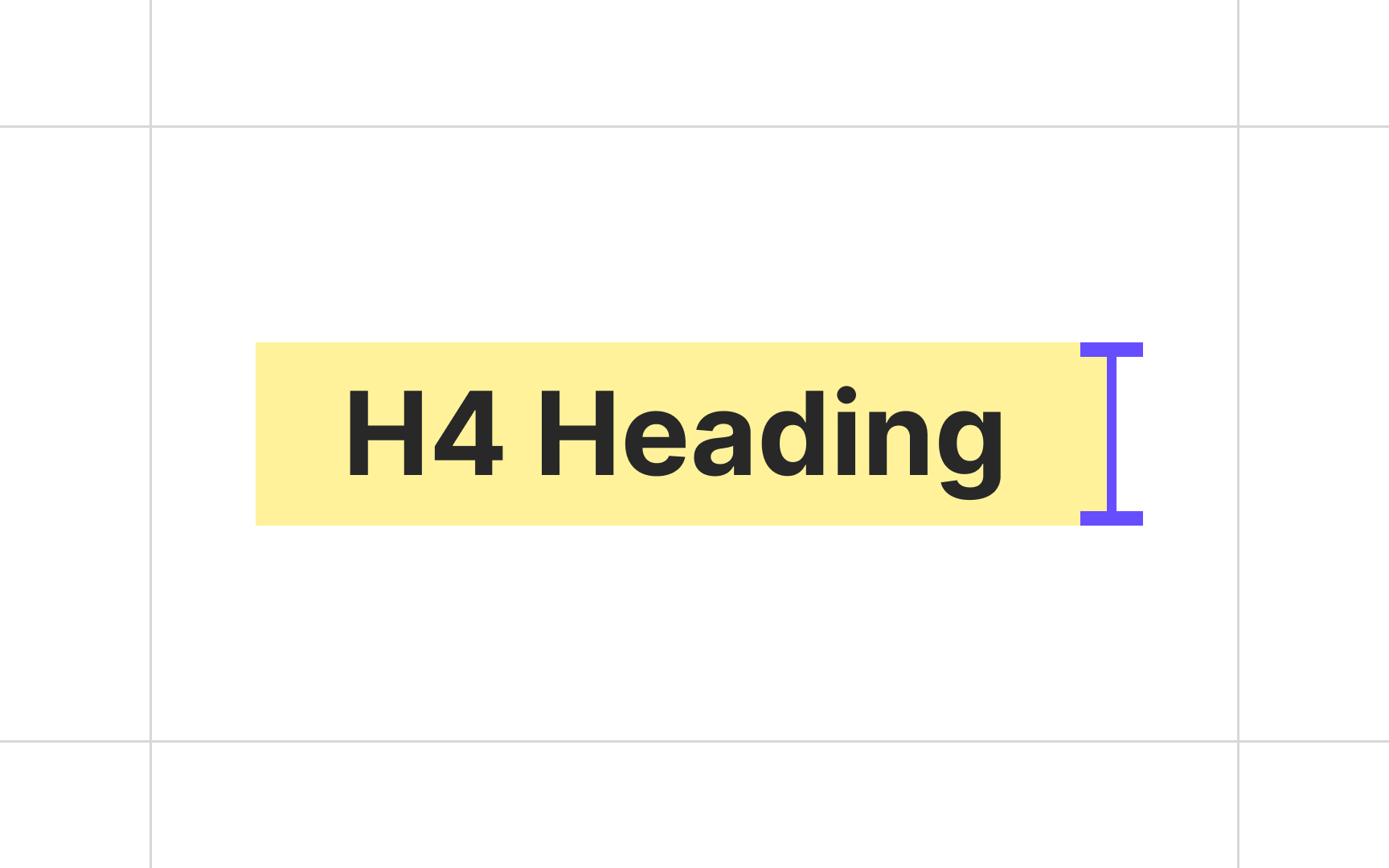
Headings are the crucial element of the type hierarchy. They help guide the reader’s eye to where a section begins and ends, and also offer visual rest between content sections.
Factors you need to consider to develop an effective typographic hierarchy are type size, typeface choice, weight, color, capitalization, and style. Each one plays an important role in creating highly readable and user-friendly content.


Type size is one of the essential instruments that help create hierarchy on a
When selecting font sizes, consider the visual presence of the
Carefully crafted type scales create a cohesive typography experience. They communicate hierarchy differences in font weight, size, letter spacing, and case.
Type weight helps add contrast to headings to lead readers down the
The rule of thumb here is, the thinner or thicker your type is compared with the regular font style, the larger it needs to be. Weights closer to 'regular' have a more balanced stroke-to-space ratio. If you use a small size for an extremely thin
When using extra thick or thin fonts, make sure it resides higher in the hierarchy at a larger size. This will improve both legibility and readability.

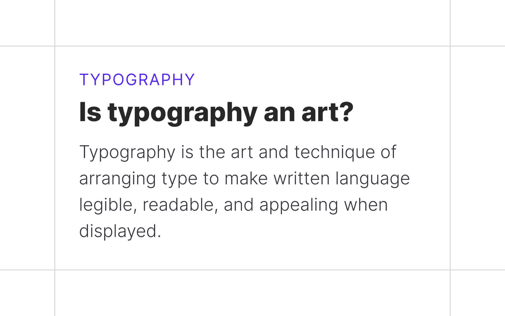
Type styles like bold or italic help add emphasis to a heading. When formatting your headings, the emphasized elements should reinforce the hierarchy.
Applying bold type style to a larger or different
Pro Tip: Some experts argue that italics shouldn't be used in headings, especially with bold, as it creates visual clutter.[3] Experiment with styles to see what works better for your content.


It's crucial to use color in moderation. Too much color in too many instances can create visual confusion and undermine the goal of using color in the first place.
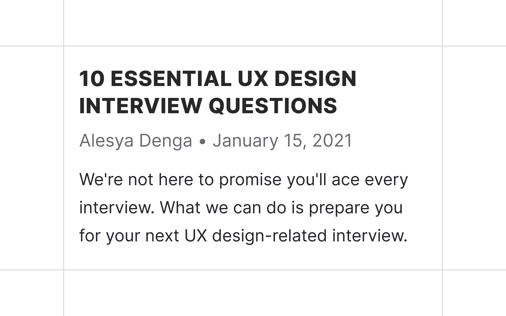
All-caps text — text with all the letters capitalized— can effectively draw attention and denote importance. It works especially well for short headings and subheadings. At the same time, all caps text is more challenging to read than regular lowercase text.
As most of the text we read is lowercase, lowercase is more familiar and legible to us. Research also suggests that the varied shapes of lowercase letters help our brain recognize words more easily.[4] Capitalization homogenizes these shapes and leaves a rectangular contour.
All caps are sometimes suitable for headings shorter than one line,
Using too many elements to demarcate headlines creates visual clutter and increases cognitive load. Choose no more than 3 instruments to format your headings:
Sometimes designers feel that they need to make different level headings visually distinct. This might be a sign that you are using too many
Whether you use a type scale or create your own size
While optimal text size depends on the
After establishing the body
When creating type hierarchy, make sure to set up at least 4
But why design so many heading levels if the best practice is not to exceed 3 levels? Extra heading levels can come in handy in products where designers don't have full control over
While type scales come with all h1-h6 heading styles, h5 and h6 are rarely used. Their primary use case is long texts with complicated structures, like technical and legal documents. You can design these levels but keep in mind that you most likely won't need them.
Text size is one of the critical instruments needed to communicate typographic hierarchy. Headings should be more prominent than the body copy, and the
Secondary text should be at least 2px smaller than the body text, but still easily readable. The size
References
- Typographic Design Patterns And Best Practices — Smashing Magazine | Smashing Magazine
- Tips for Creating Effective Headings - Clear Sight Books | Clear Sight Books
Top contributors


Topics
From Course

Share


