Contrast
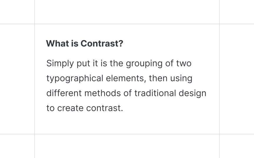
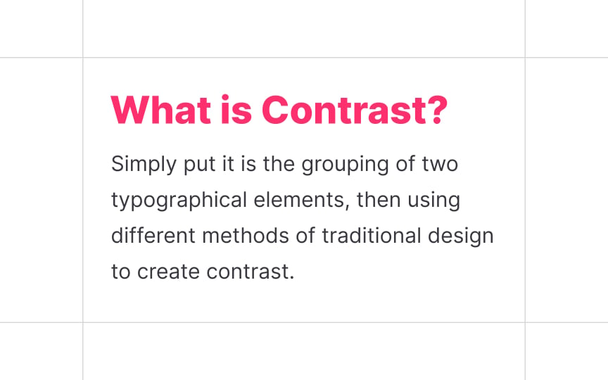
We use contrast when we want a specific element to stand out and attract user attention, especially when a page is overflowing with information. Contrast is based on the juxtaposition of visually opposite elements and is closely tied to balance, harmony, and the overall aesthetic of a composition.
According to Carl Dair, a Canadian designer and author of the book Design With Type, there are 7 principles of contrast in typography: size, weight, form, structure, color, texture, and direction.[1] For a stronger effect, designers combine methods. For example, you can use a larger font size, heavier font weight, and a different color to separate a headline from other content.


