Headings in Typography
Learn how to establish hierarchy in text with the help of headings
Headings provide additional structure to text content and create typographic hierarchy. Without them, users are presented with giant blocks of text that can be hard for them to understand and digest. Plus, large blocks of text are much harder to scan for relevant information.
Implementing proper heading styles to break up content in logical sections improves the overall user experience for your readers. It allows them to find the content that's most important to them quickly and easily. And it allows them to skip the parts that aren't as relevant.
Beyond aesthetics, headings serve a few important purposes in design. The most basic purpose is to separate sections of
A visual indication that the subject is changing aids in readability and scannability. Readers will often scan through a longer text document to find the information they're looking for. Headings help them spot the relevant sections easily, while also boosting SEO and accessibility.
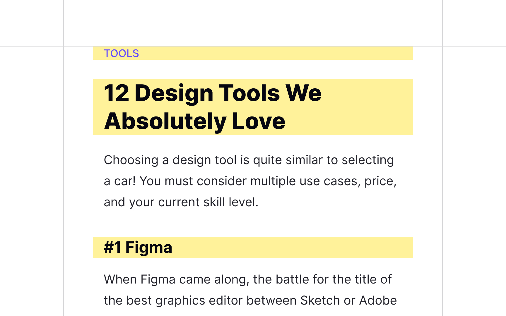
And finally, headings, along with subheadings, help create a visual hierarchy in text content. When a reader lands on a page that looks like a solid wall of text (particularly in digital products), they're unlikely to continue reading for long. Headings break that text up and provide structure, making the content less intimidating for users.
Subheadings are used in two ways in digital
The second instance is when a subheading is used on its own within the text, to highlight an important section within a topic that is already set apart by a
Not every piece of long-form content will use subheadings. Some will use more than one level of subheadings (so there are subheadings within subheadings). Deciding whether and how to use subheadings should be done based on the structure of your content. If their use improves
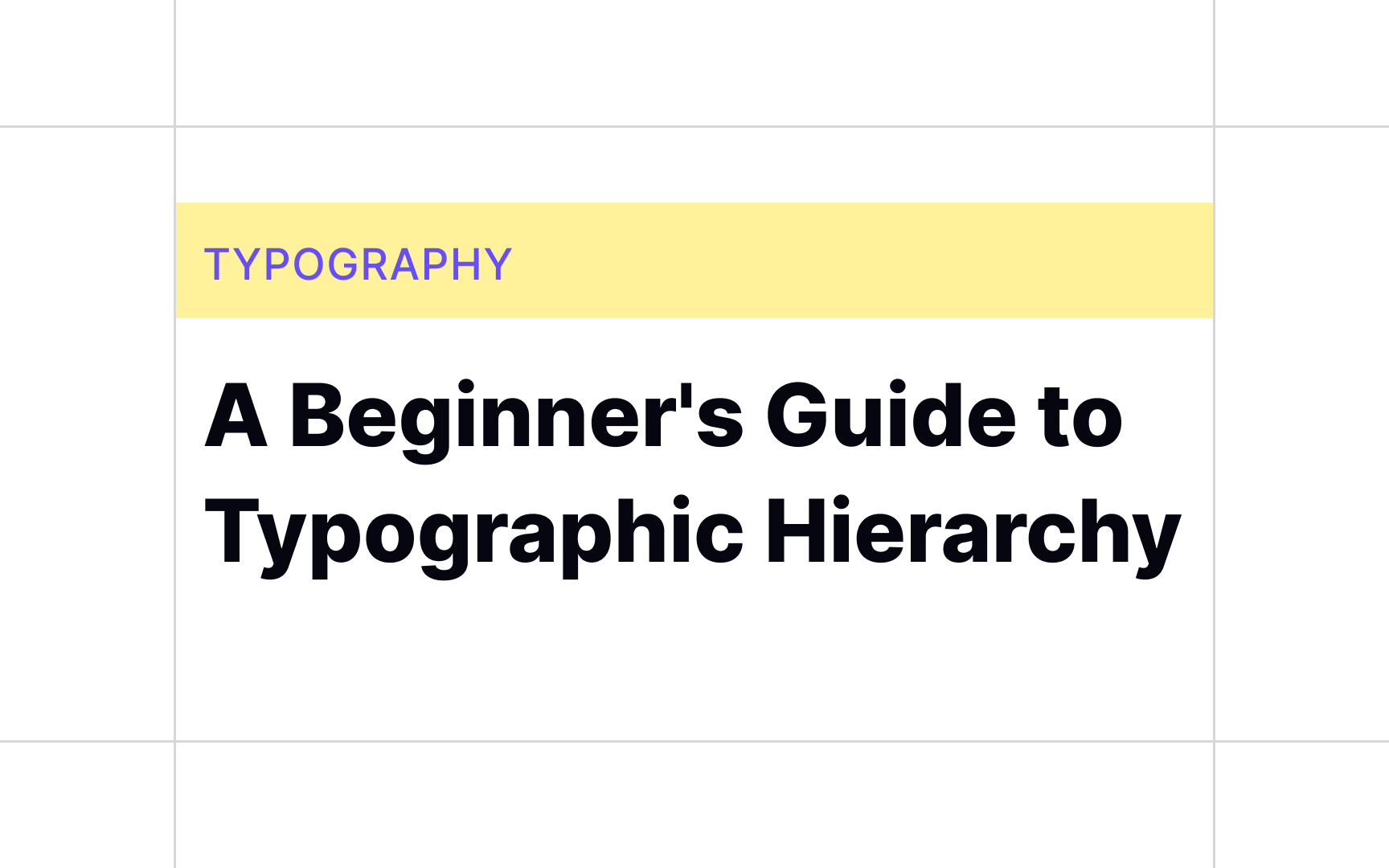
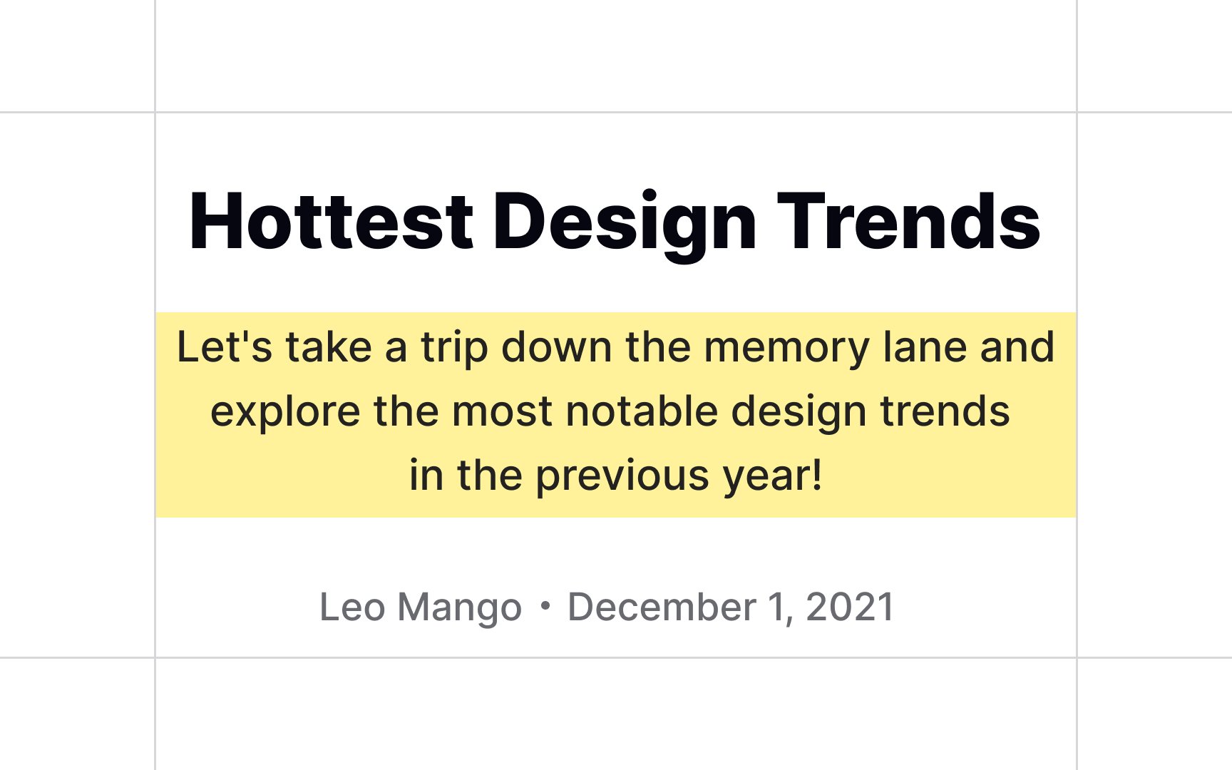
An eyebrow
As a general rule, eyebrow headings should only be used above the title of a piece of content. Don't use them above section headings within your content, unless you have a very compelling reason to do so.
Also, within typographic hierarchy, remember that your eyebrow heading is likely to be read after your article's title and subtitle, when all three are formatted well. Eyebrow headings are generally formatted in a way that does not compete for attention with the title and subtitle formatting, as they contain less important, tertiary information.
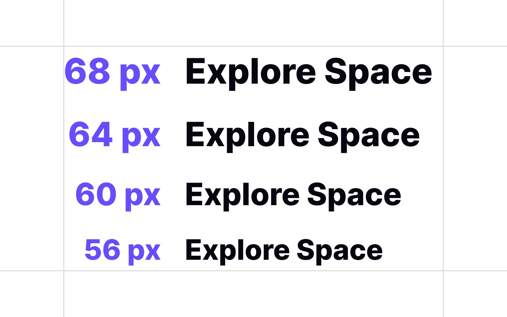
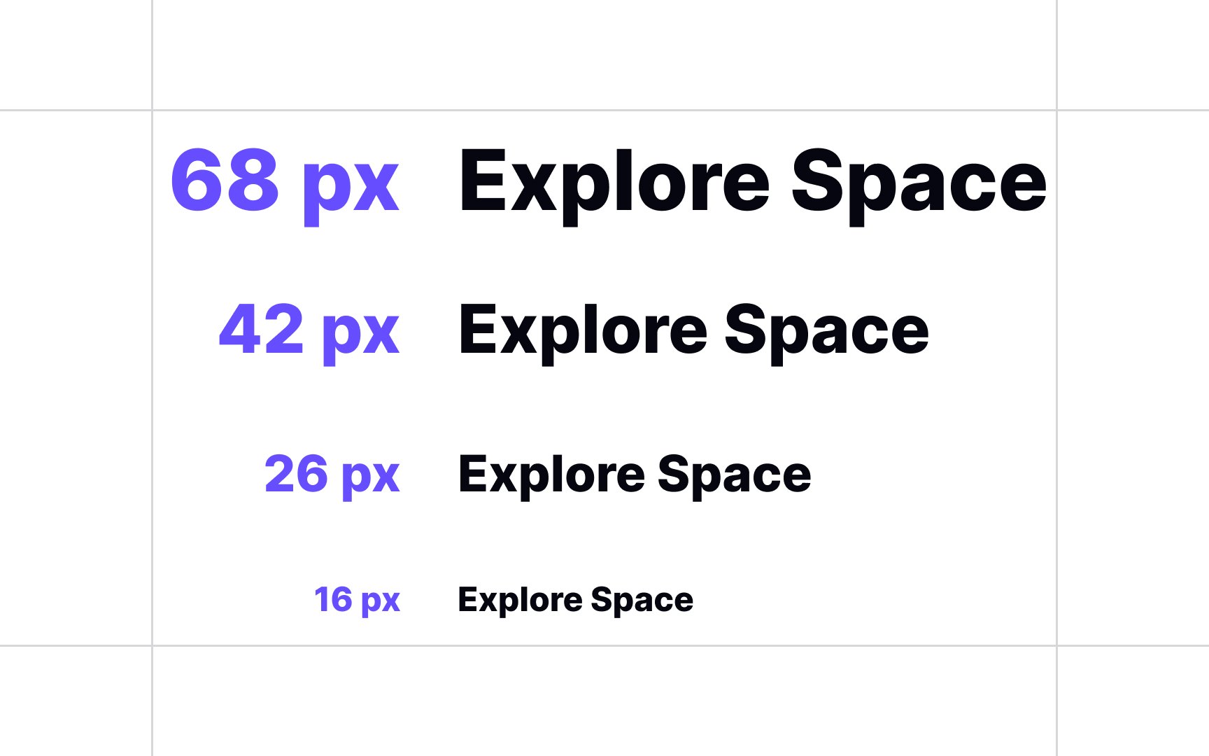
Typographic scale is vital for
There are 6 default
To create a scale, the best place to start is with your body font size. While you may not use all 6 heading levels, you may want to craft your scale to include all of them, especially if you want higher typographic contrast in your design. Choose a scale ratio to work with, then calculate your heading sizes based on that, in relation to the body font size.[3]
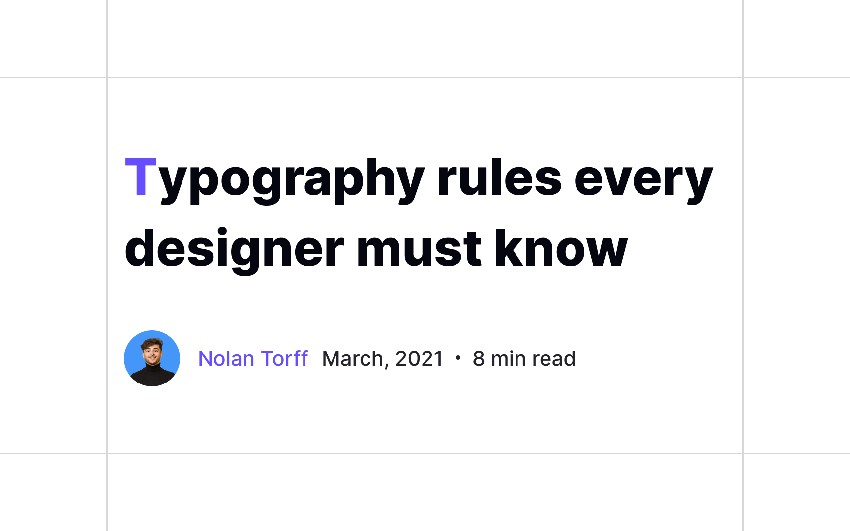
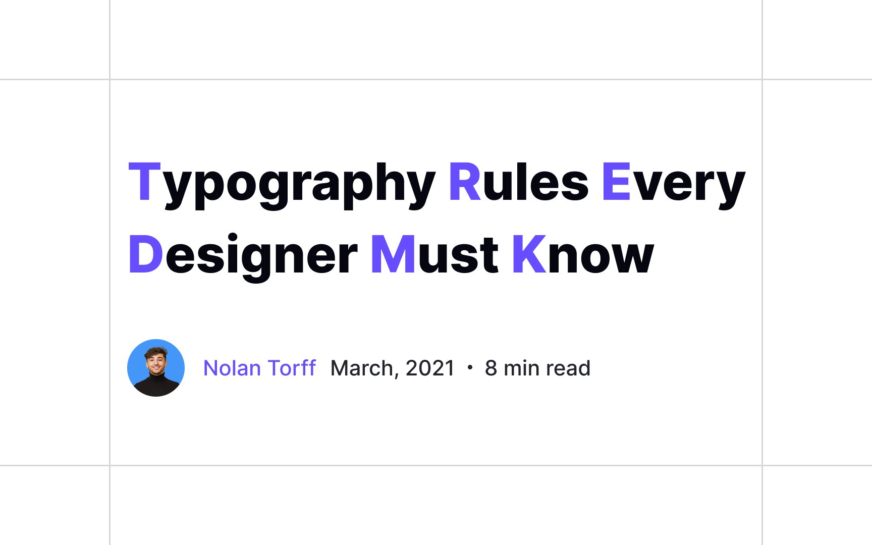
Title case is used for headings or titles in many editorial style guides. Title case dictates the capitalization of the first letter of a
In some style guides, different heading levels use different capitalization practices. For example, the APA style guide uses title case for first- and second-level headings, but sentence case for third-, fourth-, and fifth-level headings.
When designing your text
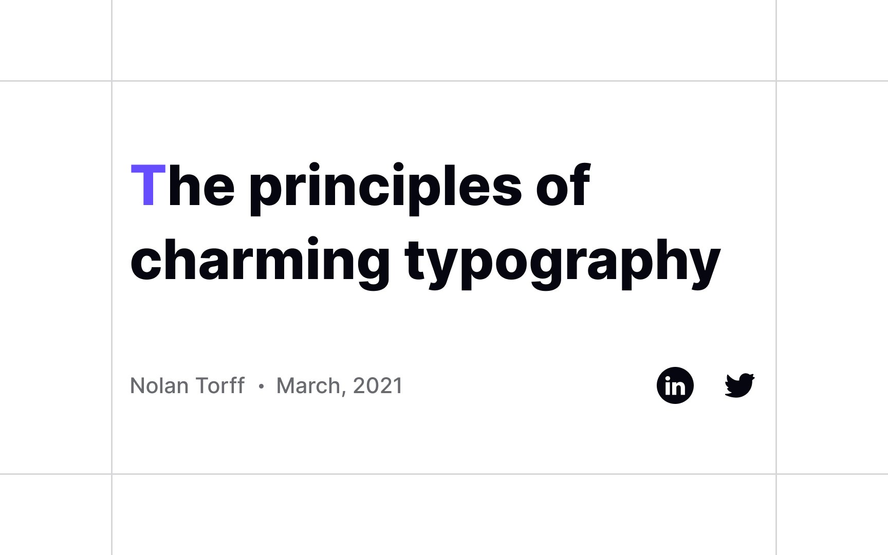
In sentence case, only the first letter of a
The use of sentence case for headings varies widely among digital products. A general rule of thumb, though, for considering sentence case has to do with the length of your headings. If your headings are generally longer, then it may improve readability to use sentence case instead of title case.[5]
References
Top contributors
Topics
From Course

Share


