Retention curve analysis
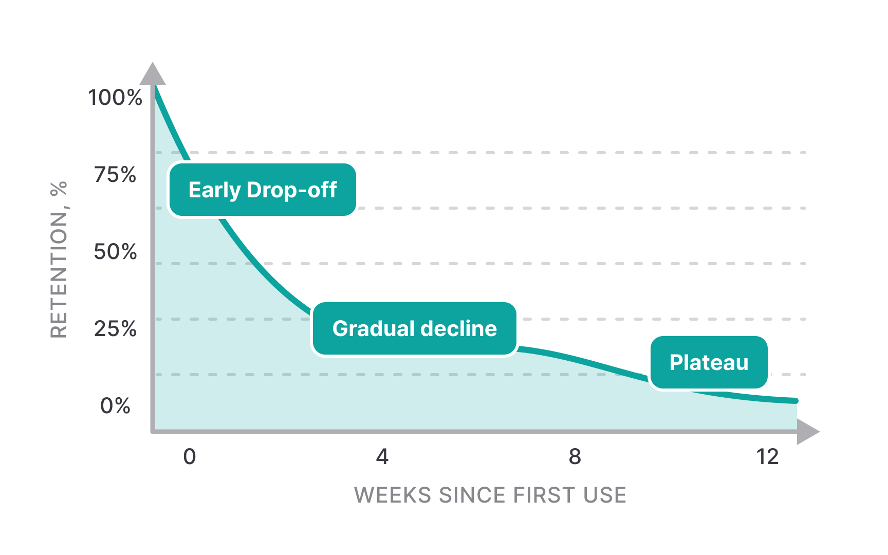
Retention curves visualize how many users continue engaging with a product over time, starting from their first interaction.[1] The characteristic shape of these curves — typically steep initial drop-off followed by gradual stabilization — reveals critical patterns in user behavior and product stickiness. A sharp drop in week one might indicate onboarding friction, while a gradual decline could suggest insufficient long-term value delivery.
The curve's shape varies significantly across different product types and user segments. For example, B2B software might show higher retention rates but slower initial adoption compared to consumer apps. Understanding these patterns helps set realistic benchmarks and identify opportunities for improvement at specific points in the user journey.
Analysis of retention curves often reveals 3 distinct phases:
- Early user drop-off during onboarding
- Medium-term engagement challenges
- Stable cohort of loyal users
By examining where the curve flattens and comparing curves across different user segments, teams can identify which user groups find sustainable value in the product and optimize experiences to help more users reach this stable phase.
Pro Tip: Look for "shoulder" points in retention curves where the drop-off rate changes significantly — these often indicate critical moments in the user journey.
