Visualizing roadmaps
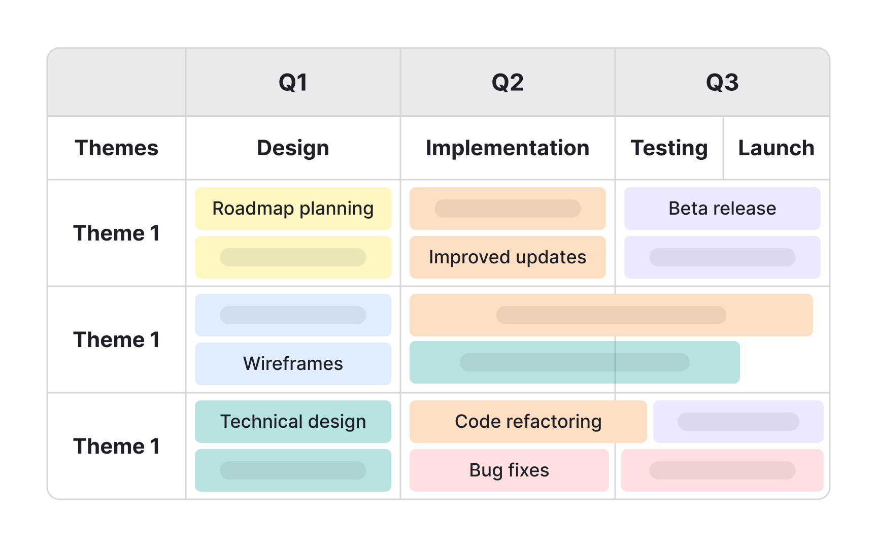
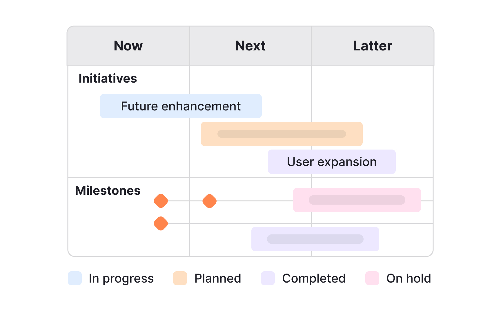
Visual roadmaps make complex information easier to understand at a glance. Instead of long text lists or static spreadsheets, they use timelines, themes, icons, and colors to show how initiatives connect and progress. This helps teams and stakeholders quickly grasp priorities, dependencies, and milestones without reading through dense descriptions. Visual clarity makes it easier to align discussions and adapt to changes.
The format chosen should match the purpose. Timelines work well for high-level strategic planning, while swimlanes or Kanban views can support cross-team coordination. Adding milestones, initiatives, and dependencies with simple markers helps keep the roadmap practical. Color coding can signal ownership, status, or confidence levels, making the roadmap both a planning tool and a conversation starter.
Poor visualization can have the opposite effect. Overloading the roadmap with too many icons or details can overwhelm the audience, while vague or inconsistent timelines create confusion. To avoid this, visual elements should be used to emphasize clarity, not decoration. A well-visualized roadmap keeps the focus on priorities and allows stakeholders to quickly see where the product is heading.
Pro Tip: Use visuals to clarify priorities, not to decorate. Simplicity makes the roadmap easier to follow.
