Top-align labels
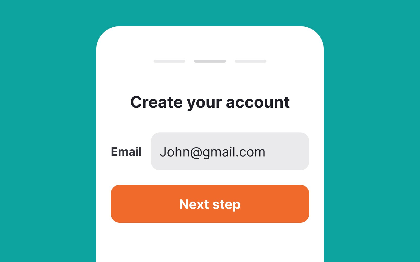
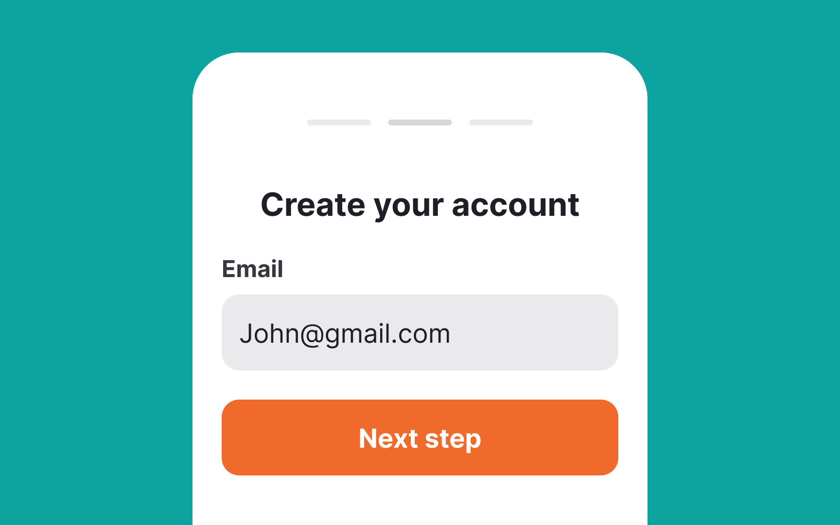
With desktop forms, you have more freedom with space and can place labels on the left or right. On mobile, extra horizontal room is a luxury, so top alignment works best, especially for labels of varying lengths.
Additionally, top-aligned labels always stay visible when an onscreen keyboard is activated, taking up a large portion of the screen. Users don't need to strain their memory to remember what type of information they're asked to type in.[1]
Top contributors