Default typefaces
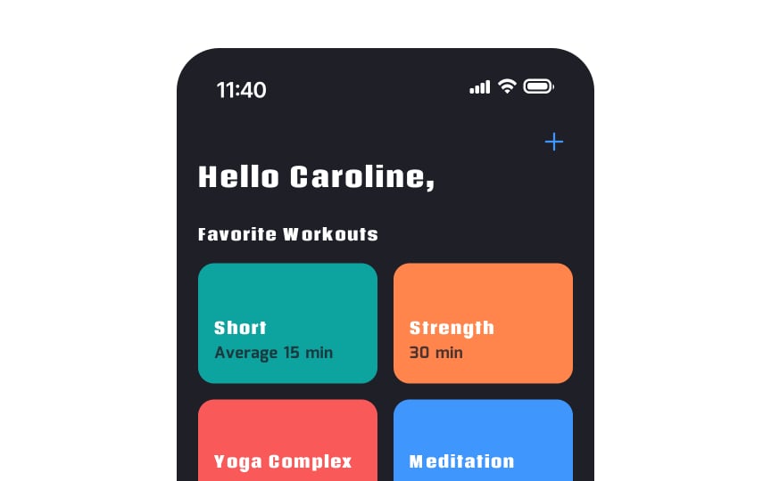
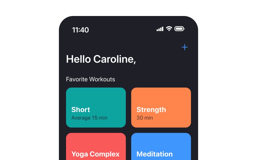
San Francisco and New York are the default typefaces on iOS devices. San Francisco is a neo-grotesque sans-serif typeface that most people associate with Apple products. With the release of iOS 14, designers can combine different font styles of the default typefaces to create a more robust visual hierarchy or to highlight semantic differences in content.
Can you apply custom typefaces in your apps when designing for iOS? Certainly, but they should be legible enough and used only if you want to highlight your brand or create a unique gaming experience. iOS guidelines also recommend using custom fonts for display text only and sticking to system fonts for reading or interface text.[1]
Pro Tip: Use fewer typefaces in your app's interface to make it easier to read and to make the typography more appealing.
References
- Typography | Apple Developer Documentation | Apple Developer Documentation


