Keep the UI simple
The KISS principle (keep it simple, stupid) is vital when it comes to design for wearable devices like smartwatches, fitness bracelets, or medical sensors. Their screens are tiny and can only contain as much information as users can consume in under 10 seconds.
What can you do to simplify UI on wearables?
- Focus on user needs. You can't decide what information is essential and what can be removed if you don't know what your users need. Conduct user interviews and user testing to find out if the app meets user expectations.
- Choose colors wisely. Most wearable screens use black backgrounds, so designers should follow dark mode principles and minimize visual clutter. Careful color choices ensure readability and contrast.
- Choose legible typefaces. Sans serif typefaces are considered more legible, help scan information more efficiently, and don't distract users from reaching their goals.
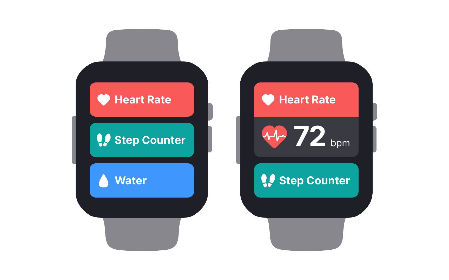
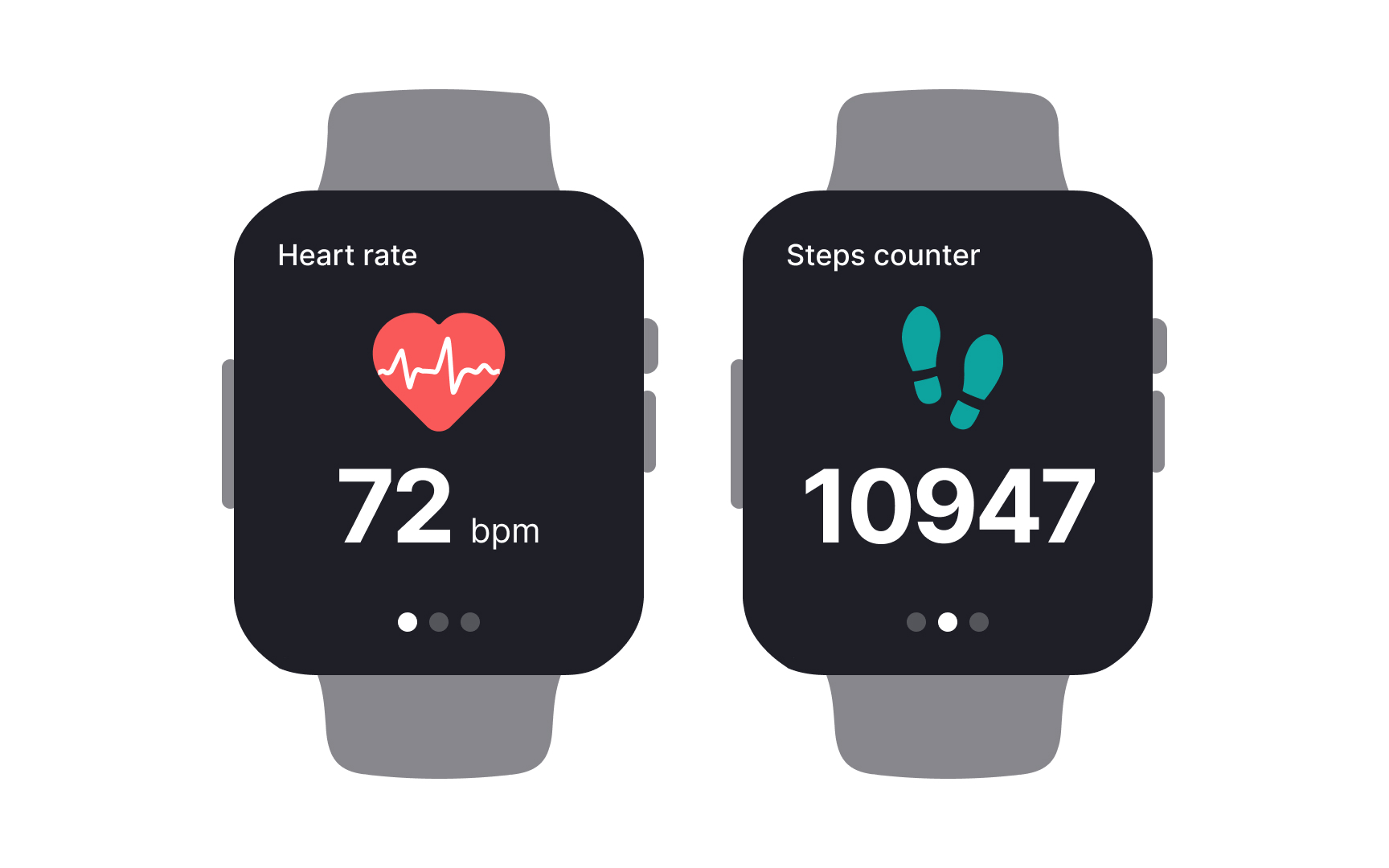
- Use simple UI elements. Avoid menus, lists, accordions, breadcrumbs, or other UI elements that ask for too many interactions to reveal information. Keep relevant data visible or break it into several screens with simple swipe navigation.
- Provide enough space. If users can't scan and read information, your app will fail to serve its purpose, so make sure elements are adequately spaced and don't overlap.
