Design dashboards for clarity
Good dashboards emphasize clarity over quantity by showing only the most important information. Research shows that people can process only a limited amount of data at once, so cramming in every metric creates overload rather than insight.[1] A useful dashboard answers specific decision-making questions instead of displaying data for its own sake.
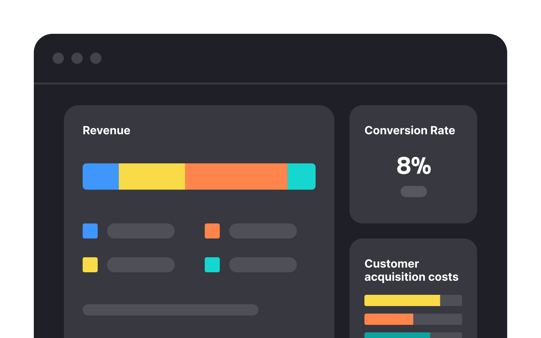
Visual hierarchy helps direct attention to the metrics that matter most. Use size, color, and placement to highlight key indicators, while keeping secondary metrics accessible but less prominent. For example, revenue might appear at the top in a larger chart, with supporting metrics like conversion rates and customer acquisition costs displayed below in smaller visualizations.
Grouping related metrics makes performance easier to interpret. When metrics are shown in isolation, they can feel disconnected and even lead to conflicting decisions. A well-structured dashboard tells a coherent story rather than a collection of numbers.
References
- Information Processing Theory in Psychology | Verywell Mind
Top contributors