Tooling, Templates, and Tech Stacks
Build practical systems that turn metrics into actionable insights using familiar tools and streamlined templates
Organizations often struggle with tracking metrics because their tools are either too complex or disconnected from daily workflows. Creating lightweight implementation systems within easy-to-use platforms can significantly improve adoption and consistency. These accessible solutions eliminate barriers to data entry and retrieval, making metrics a natural part of work rather than an administrative burden.
The right tooling approach balances visibility with simplicity, prevents information overload, and maintains focus on actionable insights rather than vanity metrics. When selecting tools, prioritize integration capabilities, customization options, and collaboration features that support your specific measurement needs. Remember that even the most sophisticated tracking systems fail when they create friction or generate more noise than signal. Well-designed templates and thoughtfully selected tech stacks transform metrics from theoretical concepts into practical decision-making resources.
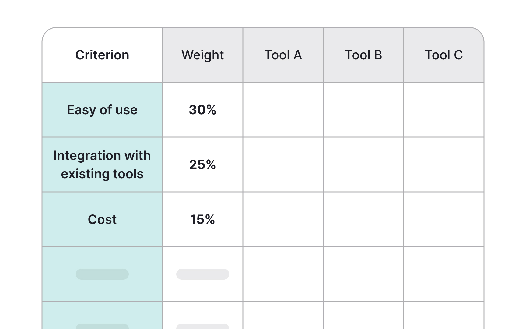
Choosing the right tools for tracking metrics can make the difference between successful adoption and abandoned initiatives. When evaluating options, consider 3 key factors: ease of use, integration capabilities, and scalability. Simple platforms like Notion and Google Sheets allow for manual tracking, while tools like Asana combine project management with goal tracking for teams that need both functions integrated.
Integration capabilities determine how seamlessly your metrics system connects with existing workflows. For example, Lattice connects performance management with goal tracking, making it valuable for HR-driven metrics programs. Profit.co provides strong integration with Microsoft tools, benefiting organizations heavily invested in that ecosystem. Tools like Agentic AI and Zapier can help connect your workflows together.
When choosing a tool, ensure it has the ability to grow with your organization’s needs.[1] Create a weighted scorecard showing different metric tracking tools with ratings for key evaluation criteria like ease of use, integration capabilities, cost, and scalability.
Pro Tip: Conduct small pilots before full implementation to identify potential limitations.
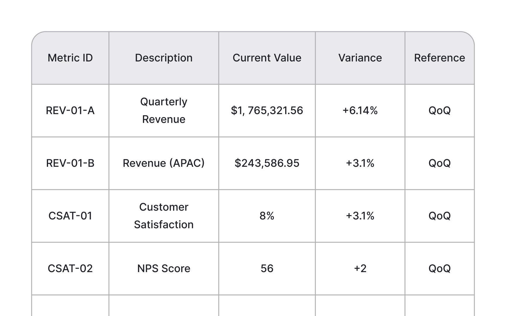
Metric templates should balance structure with flexibility to accommodate various tracking needs. A good template clearly defines the metric, its purpose, and how it connects to broader organizational goals. This clarity prevents misinterpretation and keeps everyone aligned on what's being measured and why.[2]
There are two primary types of metric templates worth considering:
- Time-series metrics templates track performance over regular intervals, focusing on trends rather than single data points. Include the metric name, definition, frequency of measurement, historical baselines for context, current performance, trend indicators, and visual representations like line charts. This approach helps teams identify patterns, understand seasonal variations, and avoid overreactions to temporary fluctuations in performance data.
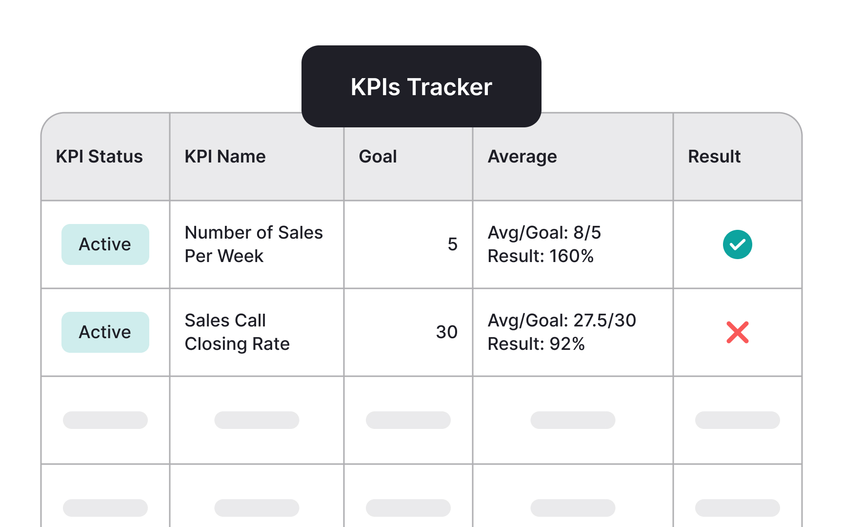
- Status/progress metrics templates, by contrast, focus on advancement toward specific goals. These should include the metric name with clear definition, the strategic objective it supports, baseline value, current value, target with deadline, percentage progress toward goal, recent actions taken, planned
initiatives , and accountable owner. This structure creates clear accountability while maintaining focus on closing the gap between current performance and targets, making it ideal for OKR tracking and strategic initiatives.
Both template types should prioritize clarity and actionability over complexity. The information should be immediately understandable without extensive explanation, enabling quick identification of areas needing attention. Start with minimal necessary fields and expand complexity only as your organization's measurement practices mature and specific needs emerge.
Pro Tip: Test your template with the least technical team member. If they can understand and update it easily without training, you've hit the right level of simplicity.
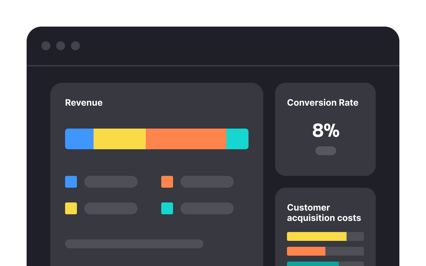
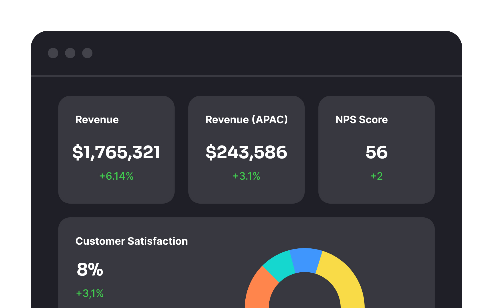
Good dashboards emphasize clarity over quantity by showing only the most important information. Research shows that people can process only a limited amount of data at once, so cramming in every metric creates overload rather than insight.[3] A useful dashboard answers specific decision-making questions instead of displaying data for its own sake.
Visual hierarchy helps direct attention to the metrics that matter most. Use size, color, and placement to highlight key indicators, while keeping secondary metrics accessible but less prominent. For example, revenue might appear at the top in a larger
Grouping related metrics makes performance easier to interpret. When metrics are shown in isolation, they can feel disconnected and even lead to conflicting decisions. A well-structured dashboard tells a coherent story rather than a collection of numbers.
Automation can transform metrics from burdensome administration into seamless operations that provide ongoing value. The most successful metrics programs minimize manual data entry by connecting directly to source systems where the data naturally lives. For example, linking customer service metrics to help desk software eliminates the need for agents to separately report their activities.
Focus automation efforts on repetitive, high-frequency data collection tasks first to maximize impact. Daily or weekly metrics updates often create the most friction when done manually, while quarterly strategic reviews might justify more hands-on analysis and preparation.
Start with simple integration points rather than complex custom development. Many popular tools offer pre-built connections through platforms like Zapier or native integrations. Salesforce-to-Slack automations that post daily sales updates show how even basic automation can significantly reduce the overhead of keeping teams informed.
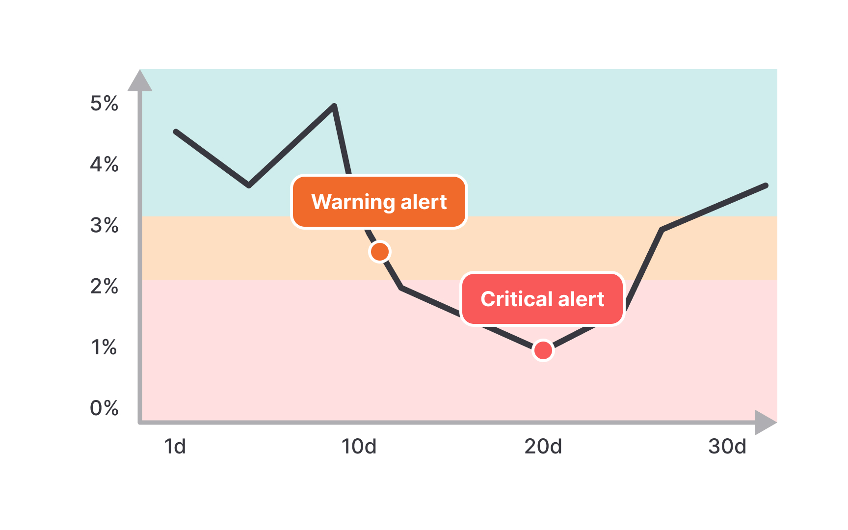
Alert thresholds define the specific values or conditions at which a monitoring system triggers notifications about a metric's performance. Think of them like temperature alerts on a thermostat; you set boundaries that, when crossed, prompt action. These thresholds transform passive metrics into active monitoring systems that enable timely intervention.
When setting thresholds, balance the need for early warning against the risk of alert fatigue from too many notifications. Most metrics naturally fluctuate, so thresholds should account for normal variation rather than triggering on every minor change. For example, if your normal website
Use historical data to establish reasonable thresholds based on typical performance patterns. Implement tiered alert systems that escalate based on severity and duration.
Getting your metrics to show up in
Start by identifying where your important data comes from. Common sources include your customer database, website analytics, sales software, or even simple spreadsheets. Each source needs a reliable way to send information to your visualization tool, whether through built-in integrations or third-party connectors like Zapier.
When setting up these connections, focus on getting accurate and relevant data consistently rather than having instant updates for every metric. For most metrics, daily updates are perfectly fine and much more reliable than systems that try to update every minute. Make sure to document how data flows from each source to your dashboards so anyone can understand where the numbers come from.
Progressive disclosure helps teams navigate metrics by revealing information in manageable layers. This prevents overwhelming team members with too much data while allowing your measurement practice to grow sustainably over time.
A good metric system works like a well-organized website. The homepage (
Start with tracking just 3-5 core metrics that directly connect to your most important business outcomes. Companies often fail by trying to measure everything at once, creating systems that are overwhelming and unsustainable. As you grow, you can gradually add more sophisticated measurements, but keep these foundational metrics at the center of your dashboard.
Integrating metrics into the tools teams already use dramatically increases adoption and engagement. When metrics appear in familiar workflows rather than requiring separate logins or applications, they become part of daily work rather than an additional burden. This integration removes a major friction point that often causes metric
Consider where your team already spends their digital time. Engineering teams might benefit from metrics displayed directly in Jira or GitHub, while sales teams would prefer CRM integration. Slack or Microsoft Teams channels can be ideal for sharing regular metric updates with broader audiences who don't need to actively track numbers but should remain aware of performance.
The complexity of integration should match the importance of the metric. High-priority metrics justify deeper integration work, while secondary measures might use simpler approaches.
Metric systems should strike the right balance between comprehensive data for experts and accessible insights for everyone else. Too technical, and most people won't engage with your metrics. Too simplified, and you risk losing the nuance needed for good decisions. Finding this middle ground is essential for widespread adoption.
Consider creating different views of the same metrics tailored to different audiences. Executive summaries might show high-level trends and outcomes, while team
Use visual cues and plain language to make metrics more accessible without sacrificing depth.
References
- okr templates | Notion Marketplace | Notion
- Information Processing Theory in Psychology | Verywell Mind
Top contributors

Topics
From Course

Share


