Simplify dashboards
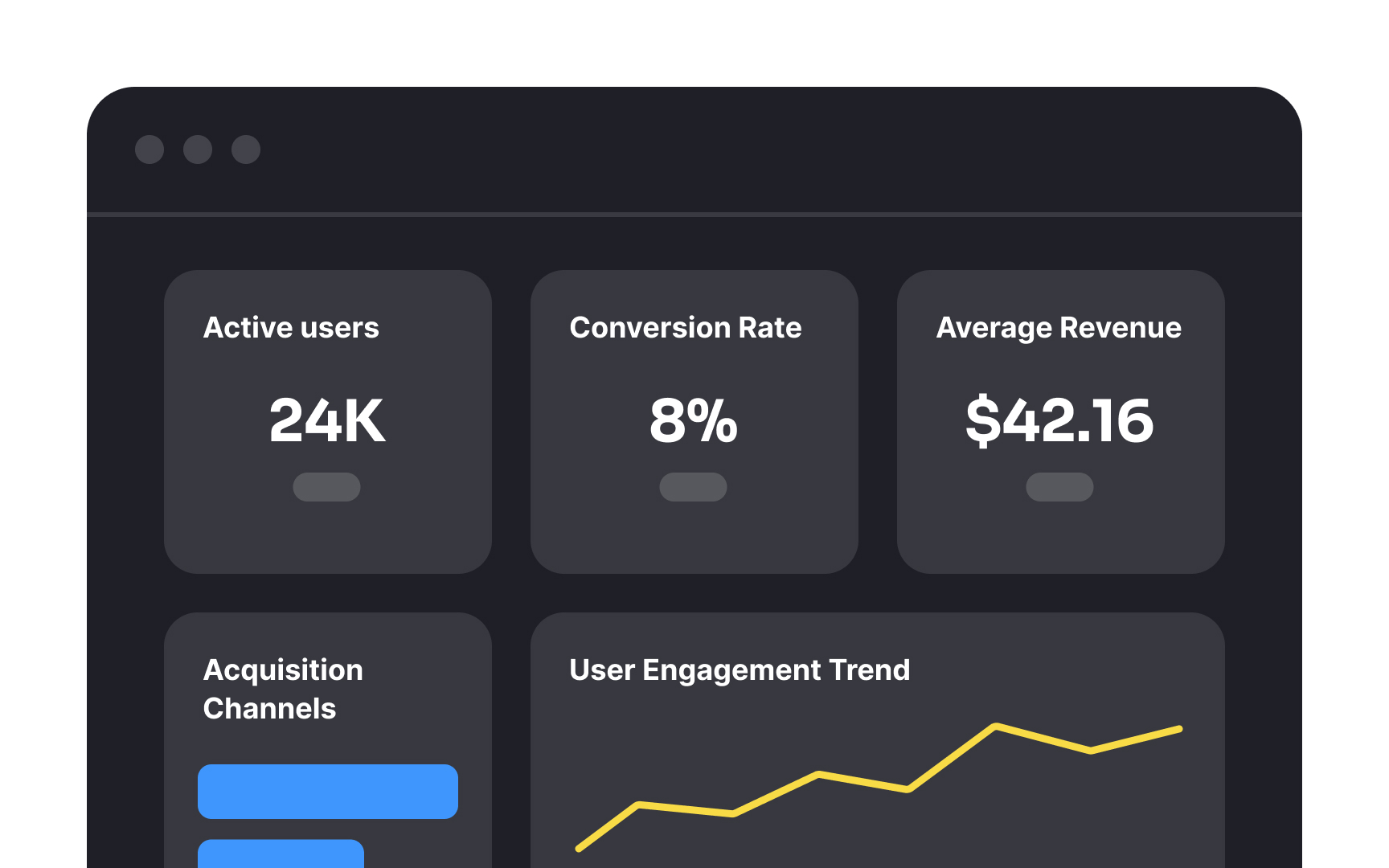
Dashboards compile key metrics into a visual interface that helps you monitor performance at a glance. Effective dashboards highlight the most important information first, typically in the upper left corner where the eye naturally begins scanning. They present data in context, showing trends over time rather than isolated numbers.
A well-designed dashboard follows the principle of progressive disclosure, showing high-level metrics first before revealing detailed breakdowns. This organization allows you to quickly identify areas needing attention without getting overwhelmed. Dashboard elements should maintain visual consistency in colors, fonts, and styling to reduce cognitive load.[1]
