Place login & signup options nearby
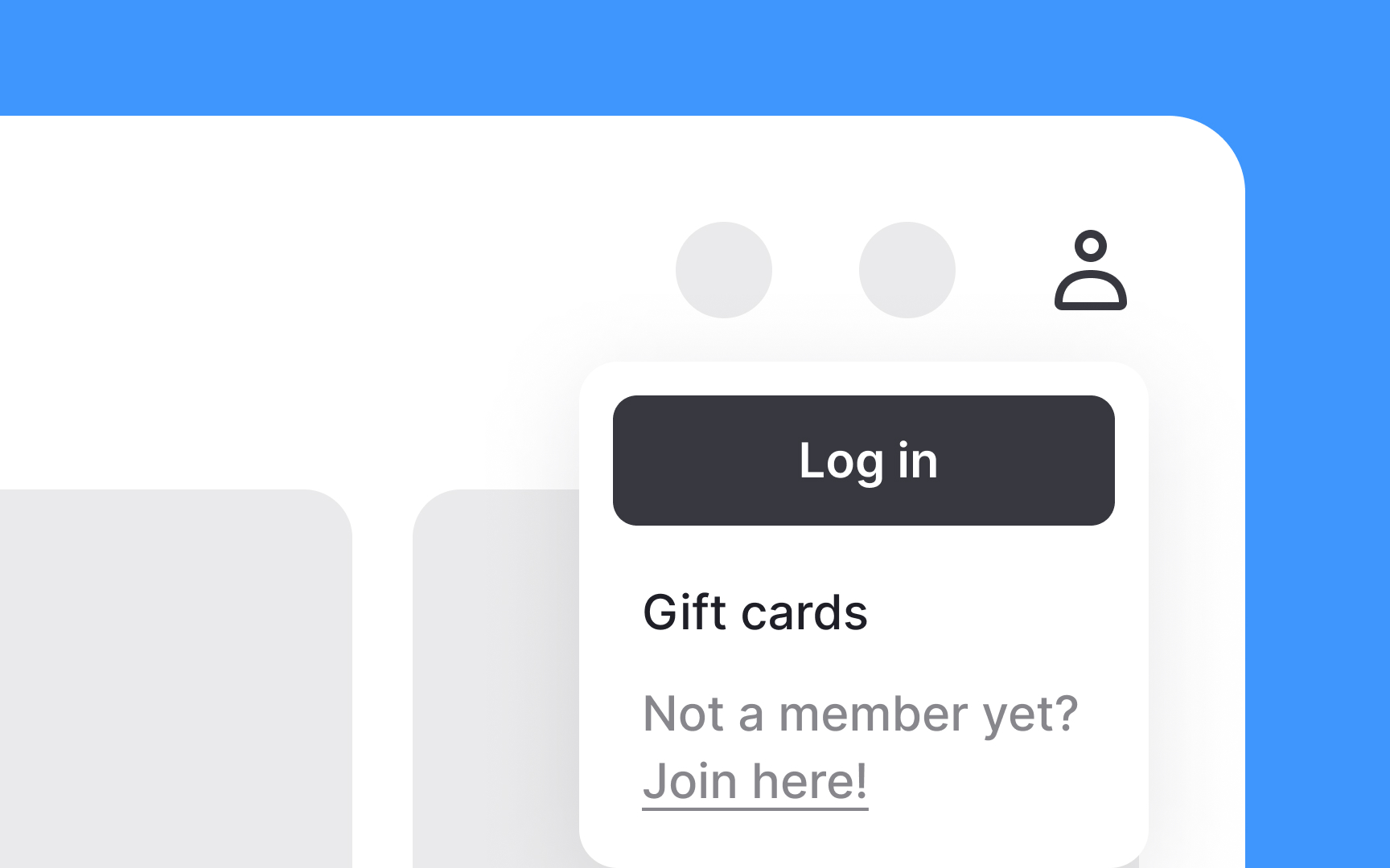
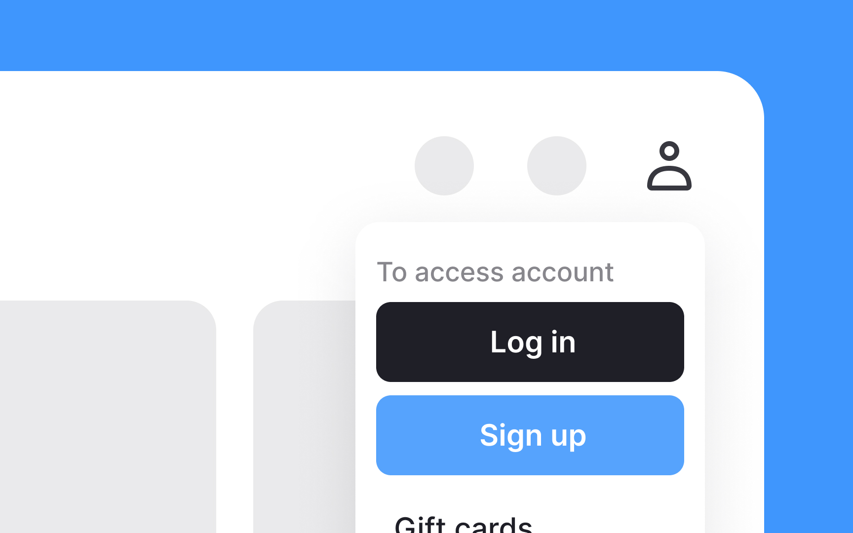
To make your website user-friendly, place the login and signup options next to each other in the utility navigation, usually at the top of the page. Having these options side by side makes it easy for new users to sign up and for returning users to log in. Label them clearly as "Login" and "Signup" to avoid confusion.
Use distinct buttons or links with noticeable colors to draw attention. When clicked, these options can lead to a new screen dedicated to logging in or signing up. Ensure the forms on these screens are simple and quick to complete. This placement improves the overall user experience by making it convenient for users to access their accounts, encouraging more frequent visits and engagement.
Top contributors