Ensure you have enough horizontal space
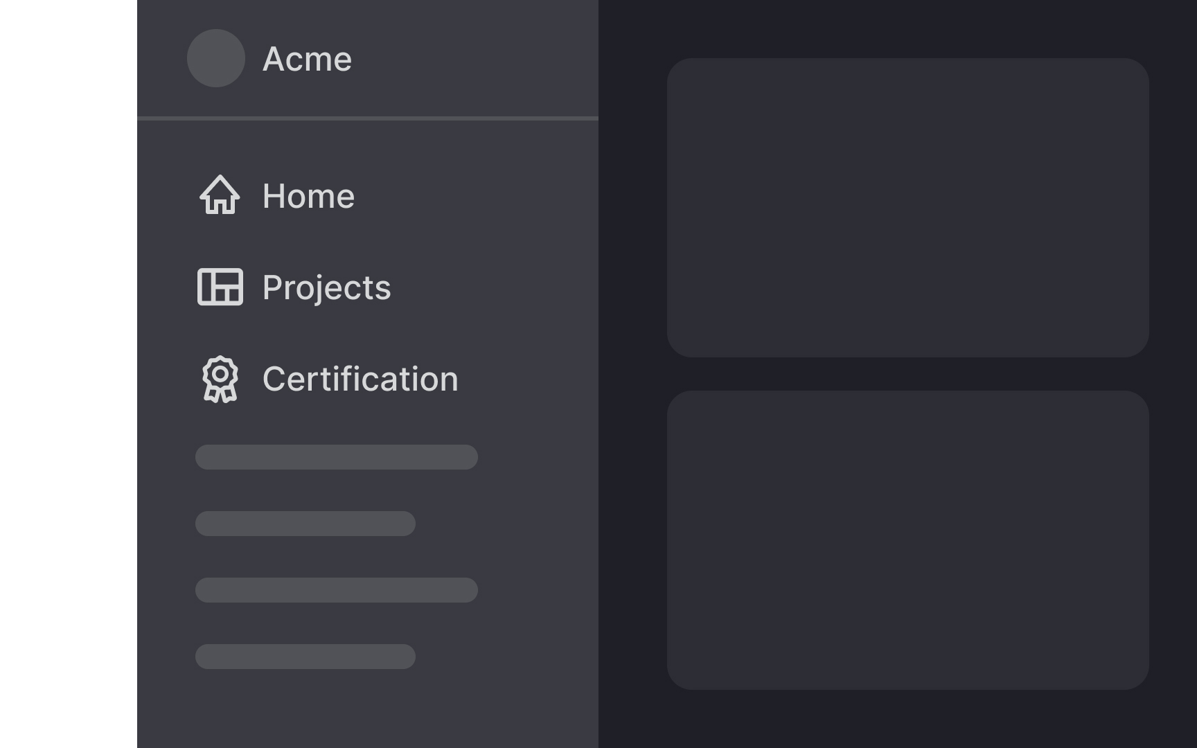
One drawback of vertical navigation is that it takes up more screen space, leaving less room for content compared to horizontal navigation. This can lead to a lower content-to-chrome ratio (the total amount of space your site uses for navigation elements), particularly challenging on smaller displays or tablets.
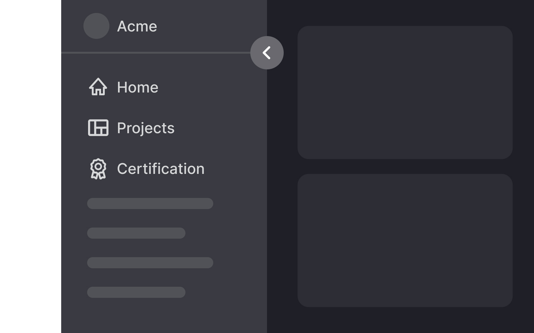
Designers working with responsive designs need to carefully consider how vertical navigation impacts different screen sizes and decide on the best UI for various breakpoints. For instance, on a smartphone, vertical navigation might take up too much space, making it hard for users to view content without excessive scrolling. In such cases, you might opt for a collapsible menu or a different navigation style.
Conversely, on large monitors, vertical navigation is less intrusive as the extra screen space can accommodate both navigation and content without issue. Weigh these considerations when choosing vertical navigation, ensuring it enhances rather than hinders the user experience.
