Gradient button
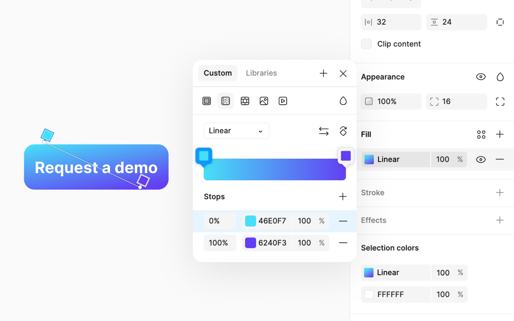
Applying gradients to a button can greatly enhance its appeal, making it an eye-catching call-to-action (CTA) on your page. Here are some tips for effective gradient use on buttons:
- Aim for smooth transitions. Sharp color changes can reduce visual appeal and affect accessibility.
- Choose colors with similar hues for a soft and attractive gradient.
- Avoid greyish tones in the center, as they can create unattractive grey areas and clutter the design.
Pro Tip: While traditional linear gradients with a darker hue at the base are classic, adjust the gradient angle to create a modern and fresh look.
