Auditing existing typography before redefining the system
A type audit helps understand how typography is used today before creating a new system. It shows what works, what repeats, and what needs to be fixed. A good starting point is checking the semantic structure with tools like the WAVE Chrome extension. It reveals the header outline of each page and makes it easy to see issues like missing h1s, skipped levels, or pages where small headers appear above larger ones. When header levels follow a clear order, the interface becomes more predictable and easier to navigate .
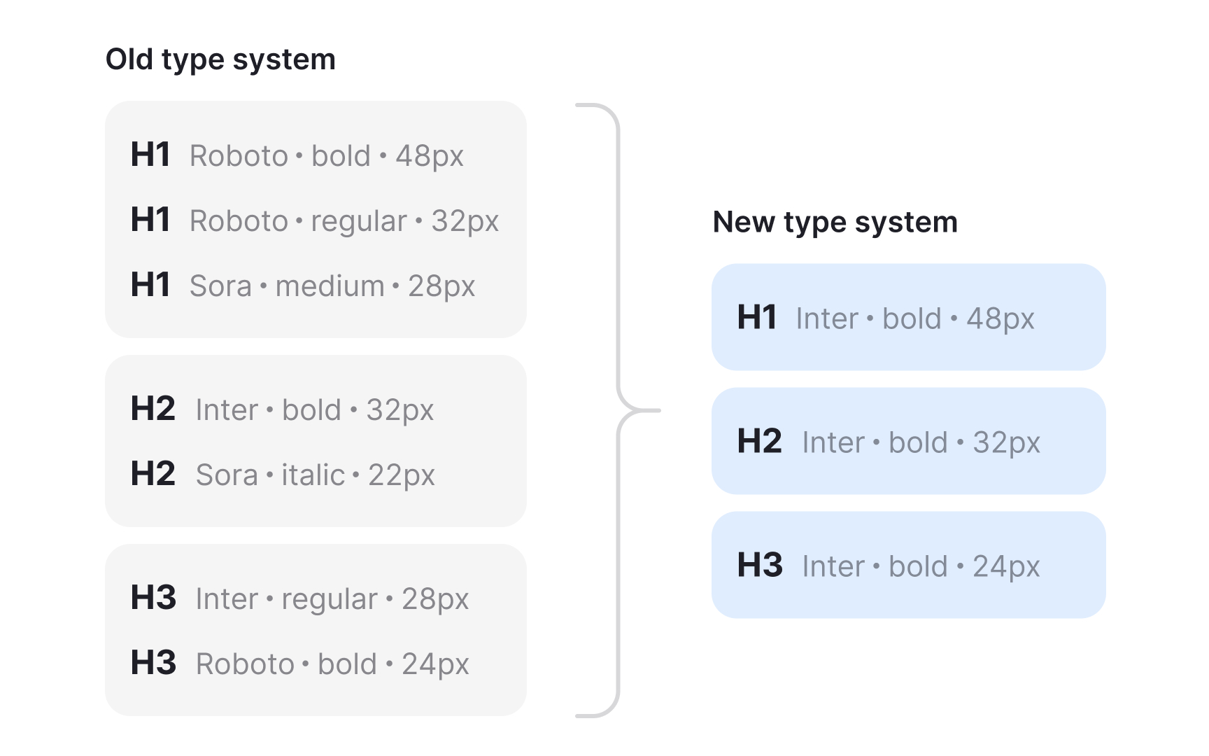
The next step is reviewing the visual hierarchy. Listing all current text sizes and weights helps spot patterns and inconsistencies. Some products end up with many similar sizes or styles that do not relate to each other. Seeing them together makes it clearer which ones are unnecessary and which styles appear often enough to keep. This gives a starting point for defining a cleaner, more intentional set.[1]
Pro Tip: Check several screens, not just one. Inconsistent patterns show up only when you compare pages side by side.