Connecting component tokens
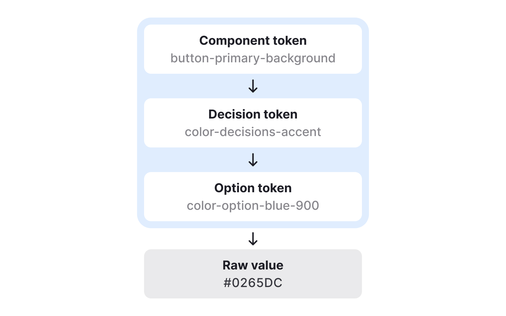
Component tokens map decision tokens to specific parts of the interface and describe exactly where styles are applied. They show how semantic choices become concrete visual rules inside components. For example, a primary button might use a decision token for its background color, another for text color, and additional tokens for its disabled state or spacing. This mapping helps teams understand how abstract design logic becomes a complete, functional UI element.
Component tokens do not always correspond to a single technical component. A “button” might be a coded component in one product, but in another it may simply be an HTML element styled through design tokens. In both cases, component tokens ensure the same visual decisions are applied consistently. They can group several decision tokens at once, such as background, text, and border values for different button variants or states.
Because component tokens describe the exact styles for each part of a UI element, they remove guesswork for developers. They clarify how to apply decisions across states like hover, pressed, or disabled and can extend beyond color to include spacing, radius, or elevation. This provides detailed control and ensures that even complex components stay aligned across platforms and design tools.
