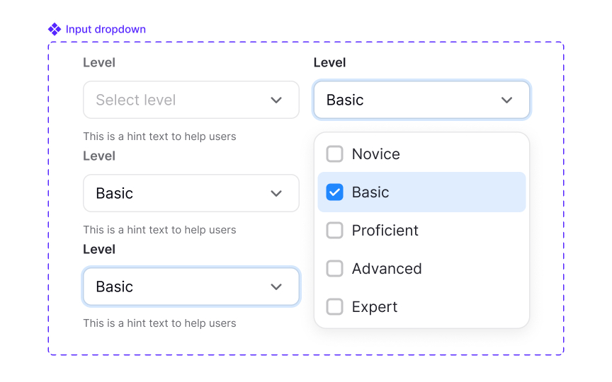
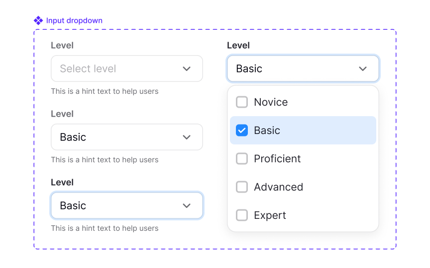
Applying spacing to create hierarchy
Spacing helps readers understand which elements belong together and which ones serve different purposes. When spacing follows clear rules, the layout develops a visual structure that feels natural to scan. Smaller gaps connect related elements, while larger gaps create separation. This relationship guides users through the content without requiring additional visual cues.
Hierarchy also depends on how spacing interacts with scale and whitespace. Increasing space around an element can make it feel more important, while reducing space can signal that items belong to the same group. Regular rhythm, created through repeatable spacing patterns, helps users predict how the layout behaves as they move down the page. Lists, cards, and sections become easier to read when they follow the same spacing logic, since users quickly learn what each distance communicates.
Spacing can be adjusted optically when needed. Some components may require subtle changes because their visual weight affects how gaps appear. These adjustments should be treated as exceptions to the core spacing rules. If they are used more than once, they need to be documented and tokenized so they remain consistent and intentional without breaking the overall system.
Pro Tip: When unsure whether two elements should sit closer or farther apart, check if they serve one action or two different ones.


