Handling edge cases and functional conflicts
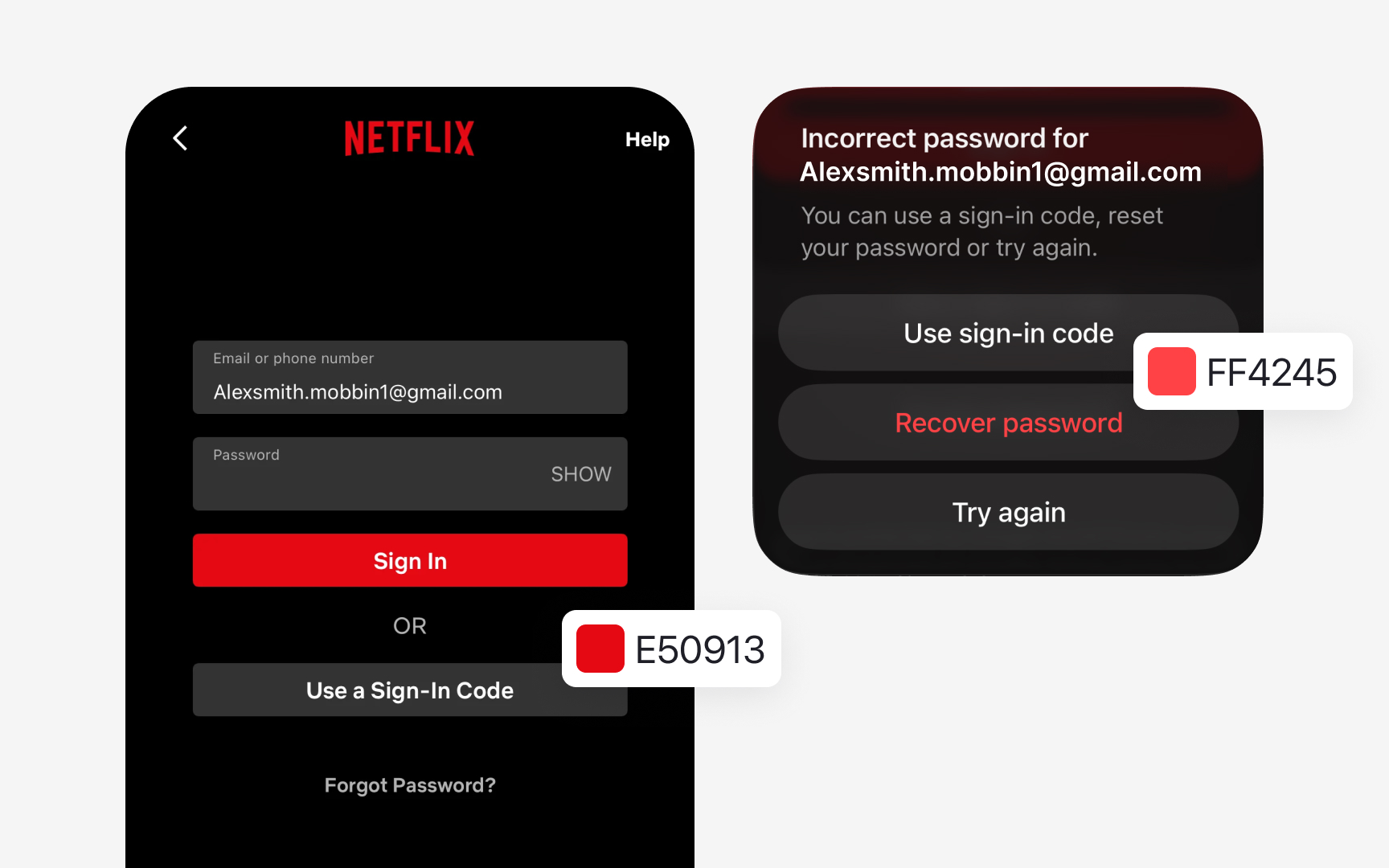
Some products have brand colors that conflict with functional meanings. Imagine the brand color is #FF4A4A, a bright red. If this shade is close to the error color used in the UI, users may confuse branding with feedback. Instead of adjusting the brand color, introduce a dedicated error color family that stays visually distinct. For example, define error colors starting at #D32F2F, then build lighter or darker variations from it for containers or states. This keeps functional messages clear while preserving the brand’s identity.
Some interfaces also rely on colors that appear rarely, such as lines in charts or data segments. If the product uses such colors, for example, for graphs, create a small “Data Colors” group instead of letting these values exist as one-offs. This controlled set can include three to five colors that support visualizations without expanding the main palette.
