Defining functional colors through UI needs
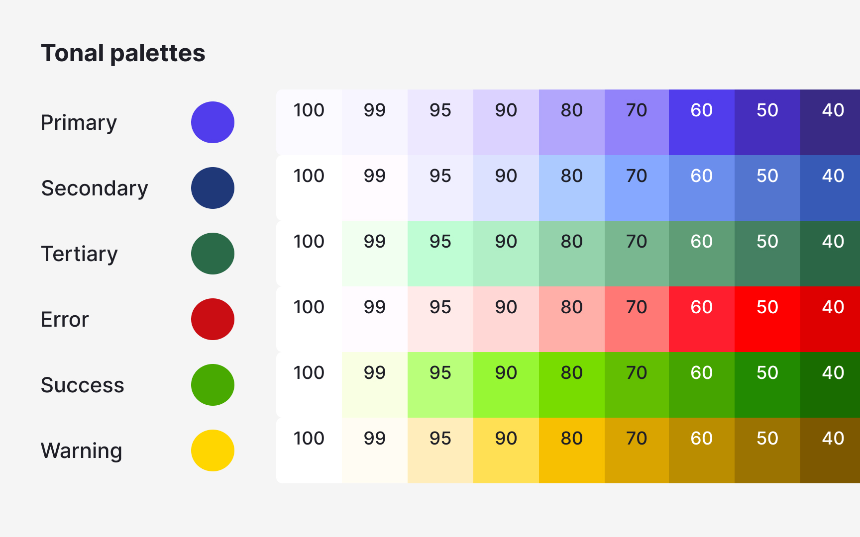
Functional colors come from the product’s real feedback requirements. During an interface audit, some hues appear repeatedly in states like errors, warnings, or confirmations. These colors should be documented as part of the system because they already carry meaning in the UI.
A typical audit reveals several similar shades used for the same function. Instead of keeping them all, teams select one reliable value and replace near-duplicates. This reduces noise and prevents slightly different reds or greens from appearing across new screens. After selecting the main functional colors, they should be checked against common backgrounds to make sure text or icons remain readable.
Pro Tip: When merging similar functional colors, keep the one that appears most consistently in important UI states.
