Using contrast for accessibility
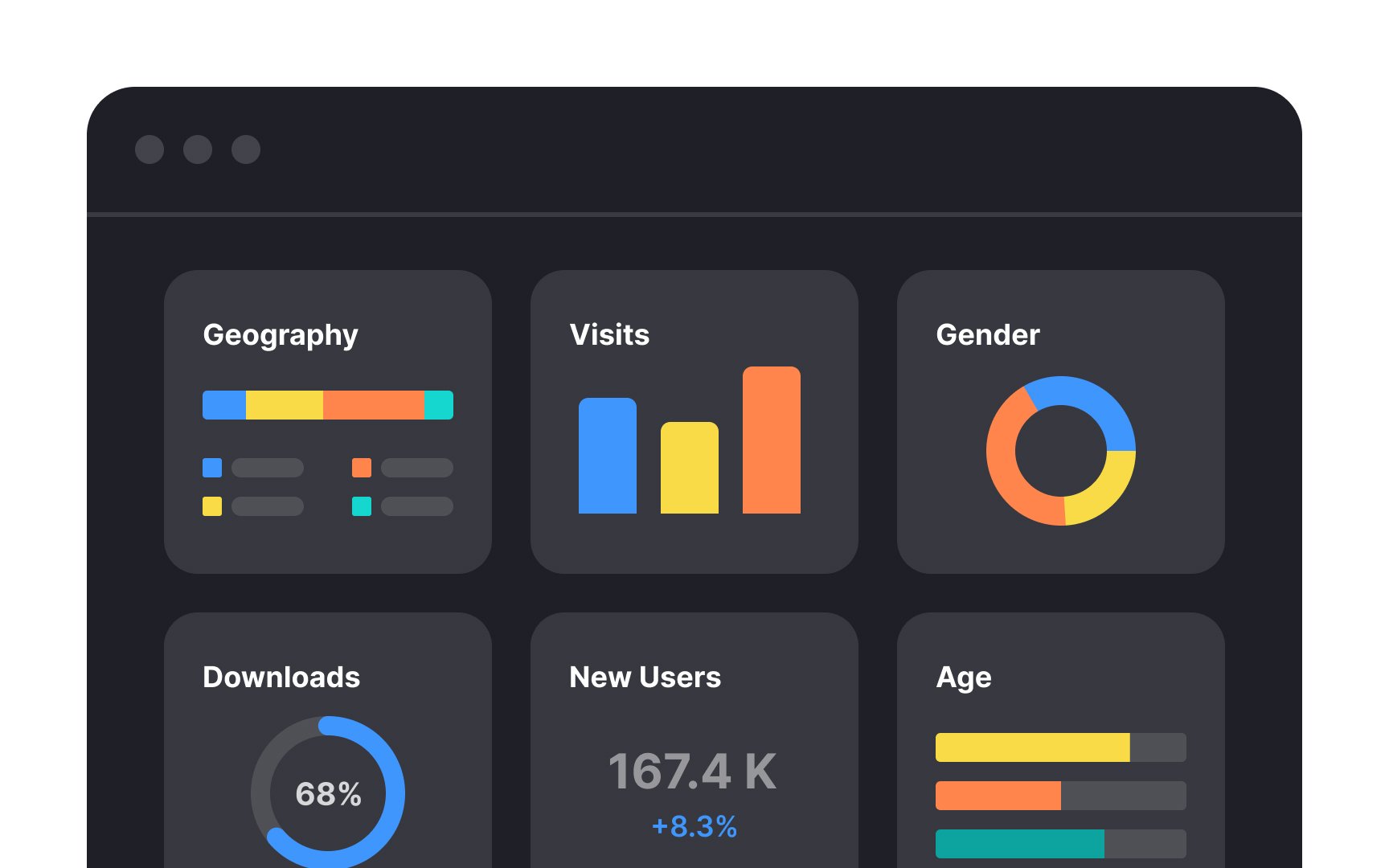
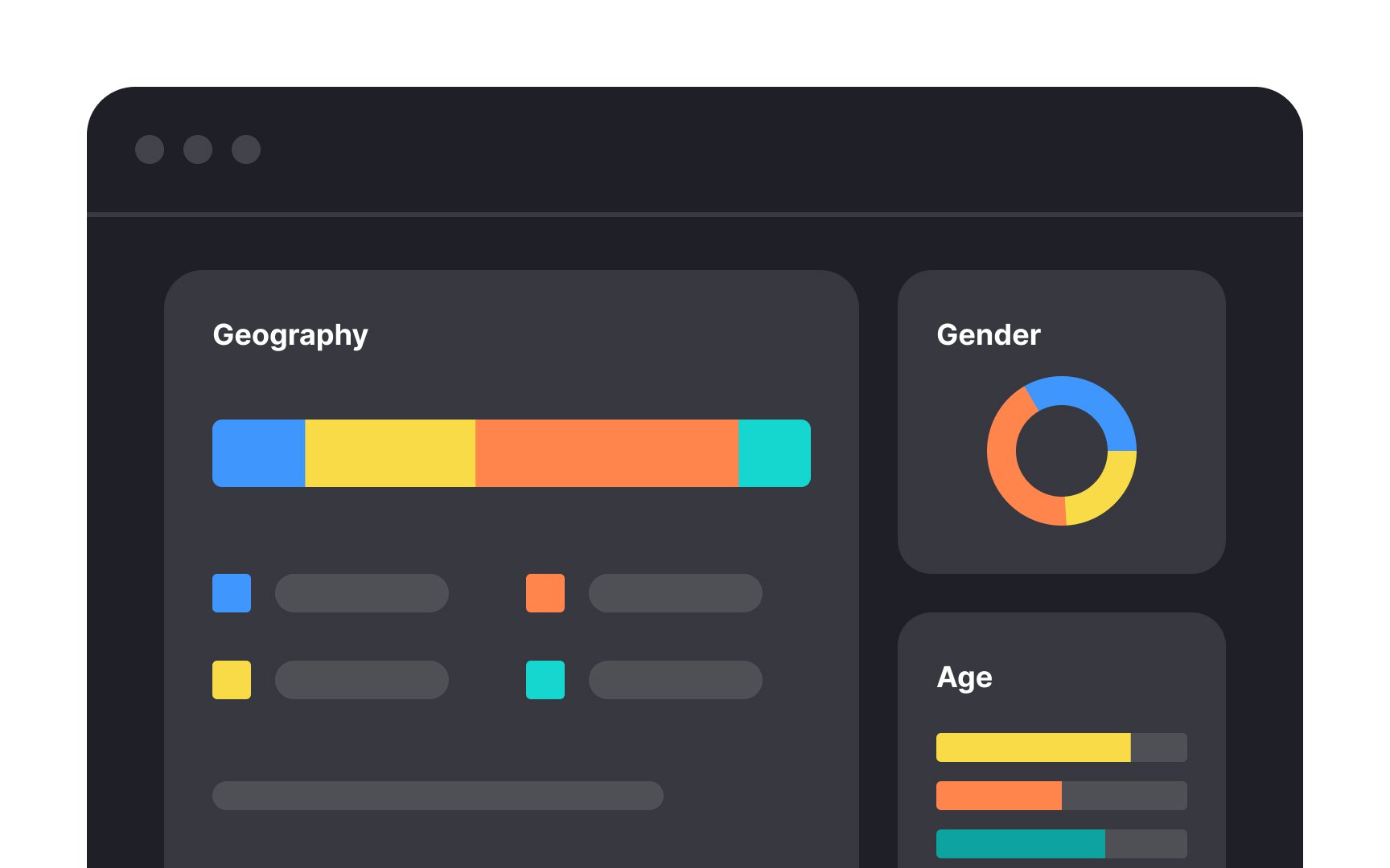
Contrast is what makes the difference between two or more elements. Designers use color, alignment, size, fonts, spacing, and other tools to achieve this. Contrast helps users instantly understand what's important and where to look first.
One of the most effective ways to create contrast is through size. Enlarging the most important elements, like headings, containers, or critical information, immediately draws the eye and establishes a clear hierarchy. When everything is the same size, nothing stands out. When size varies intentionally, users know what to focus on.
Grouping also plays a major role in contrast. By placing related content close together and separating unrelated content with space, you create visual boundaries that help users process information faster. Grouping reduces cognitive load and makes the interface feel organized rather than cluttered.
Top contributors