The rule of thirds
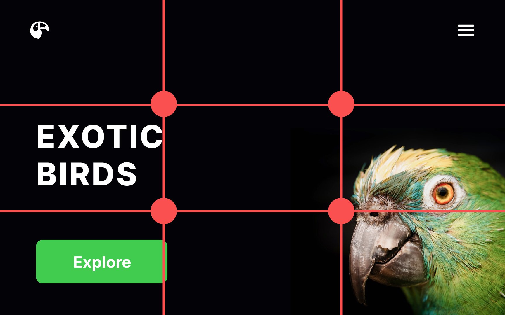
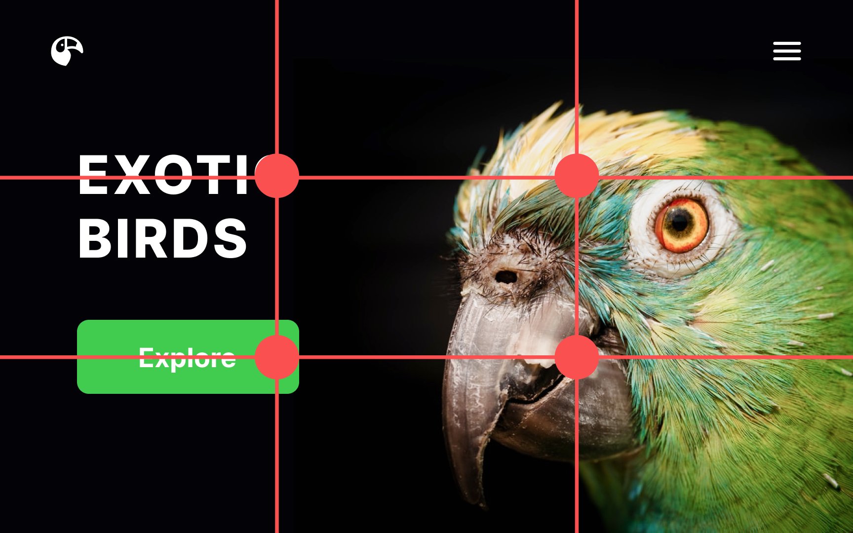
The rule of thirds is a fantastic compositional tool that came to digital design from the world of photography. Imagine the screen divided into equal horizontal and vertical thirds by invisible lines. Our gaze intuitively gravitates toward the intersections of those lines.
According to the rule of thirds, those intersection points are the ideal spots to place key elements, like CTA buttons, headlines, and hero images. They’re most likely to grab users’ attention in these focal points.[1]
References
- The Rule of Thirds: Know your layout sweet spots | The Interaction Design Foundation
