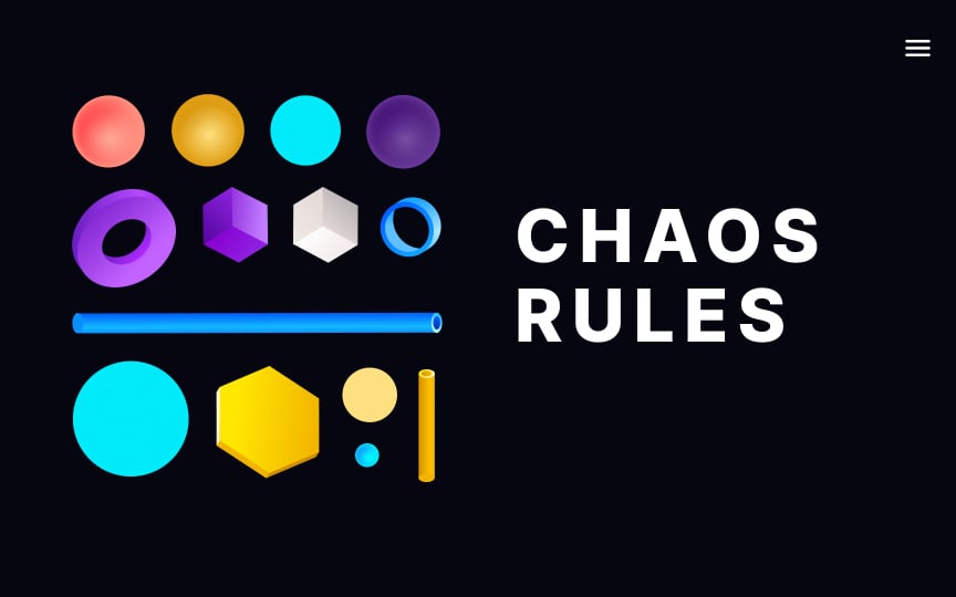
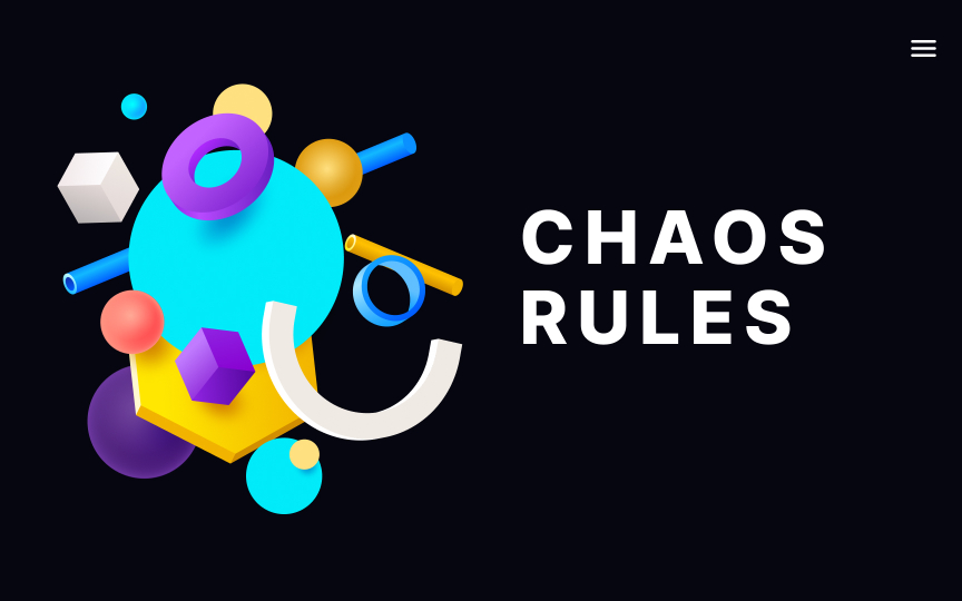
Add asymmetry to make your designs visually interesting
As the chaos theory states, chaos is just a form of order. In web and app design, symmetry has visually pleasing benefits but can be difficult to achieve and is not appropriate in all contexts.
Symmetry works well for traditional designs and those that want to portray an aura of trust. One can say that symmetrical designs feel balanced and unthreatening.
Asymmetrical layouts don't have to be unbalanced. Notice how the bulky title on the right counterbalances the fluid element on the left. Asymmetrical designs look more modern and dynamic. They also allow drawing the users' attention where you want it to go — for example, to the CTA.


