Make important information clear

Ambiguous labels, cryptic error messages, or unclear instructions create unnecessary cognitive load and can trigger anxiety responses. When users encounter vague or confusing information, they may second-guess their actions, fear making mistakes, or abandon tasks entirely. Clarity becomes particularly crucial in high-stakes interactions like financial transactions, account settings, or form submissions.
Simple, direct language helps users understand exactly what's required and what consequences their actions will have. For example, instead of "Submit," a button labeled "Send Payment - $50" clearly communicates the action and its outcome. Similarly, error messages should explain what went wrong and how to fix it, rather than displaying generic codes or technical jargon.
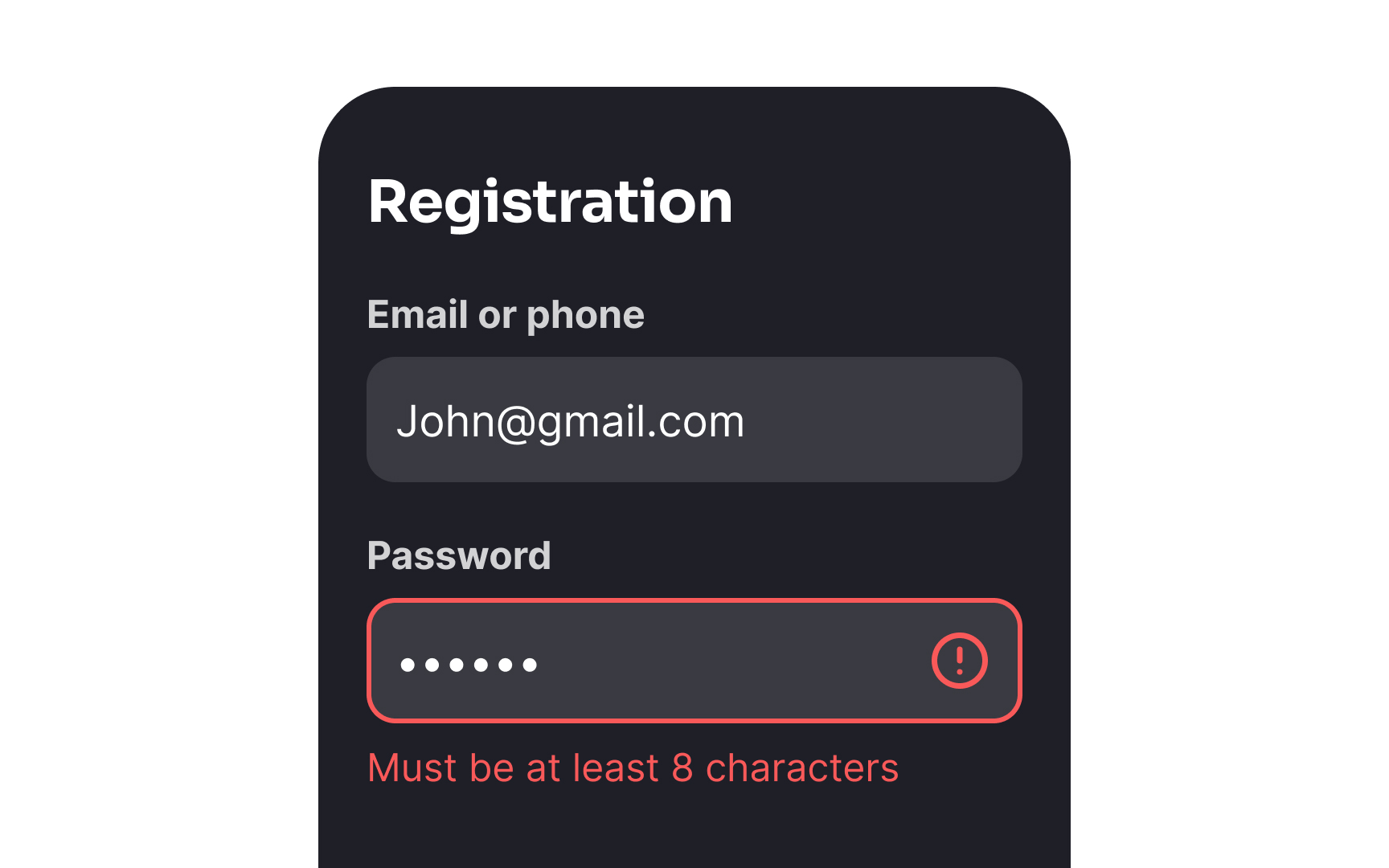
Clear field labels, input requirements, and success confirmations also create a supportive environment where users feel confident in their actions. For instance, showing password requirements before validation errors occur helps users succeed on their first attempt.
Top contributors