Make your CTAs easy to spot
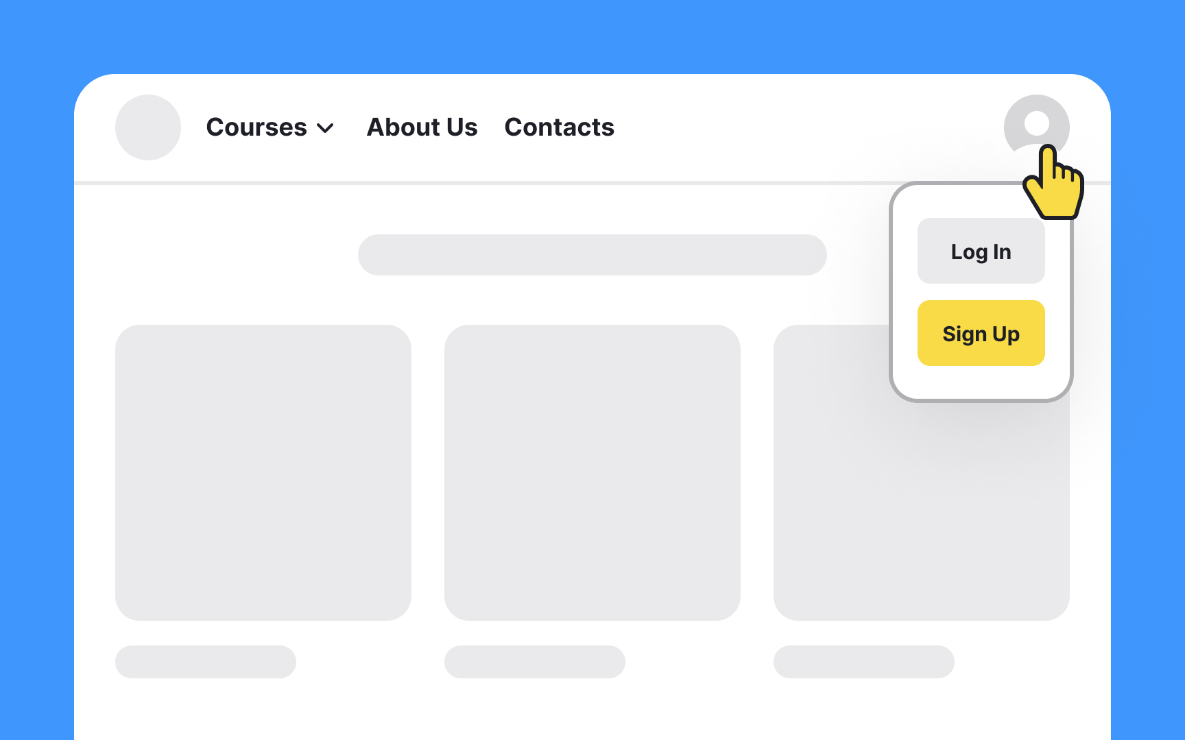
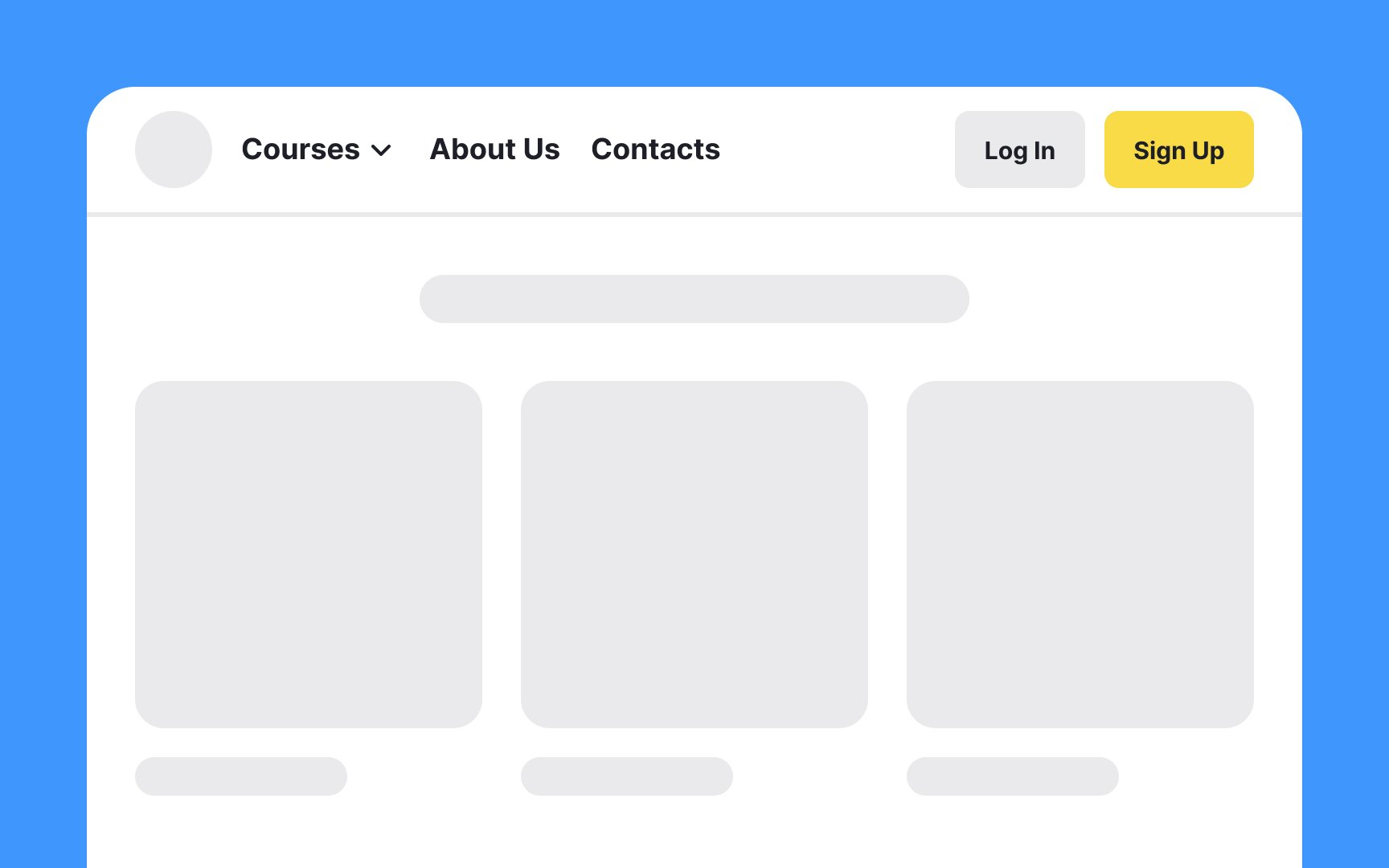
In many digital products, the login and signup pages serve as the gateway to the user experience. They're not just initial steps; they're critical touchpoints that can make or break the user's perception of your design. Therefore, the placement of the login and signup buttons is vital.
While the exact "sweet spot" might vary depending on your layout and user flow, a common best practice is to position these buttons where they are immediately visible and accessible — often in the site's header or upper navigation area. This reduces the cognitive load on users and makes it straightforward for them to take action, whether they're new to your platform or returning for another session.
Pro Tip: The main brand color can come in handy here to draw users' attention to the Log In and Sign Up buttons.
Top contributors

