Clearly explain to users why the page is empty
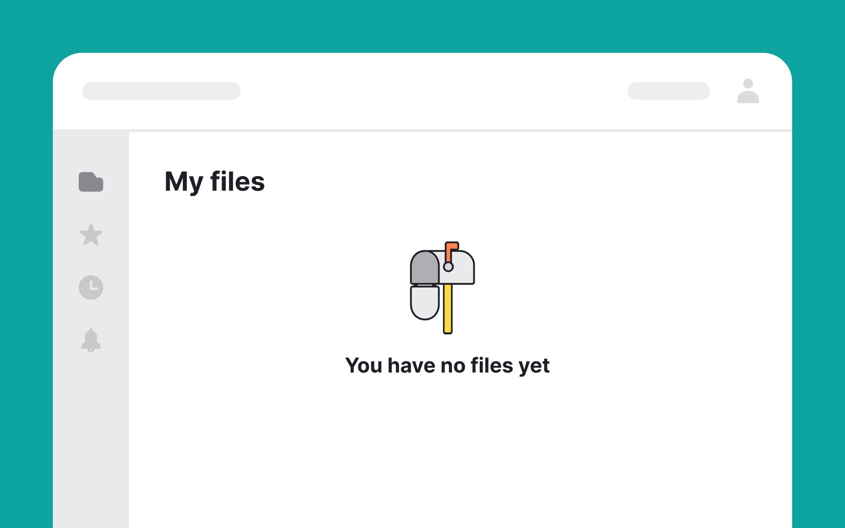
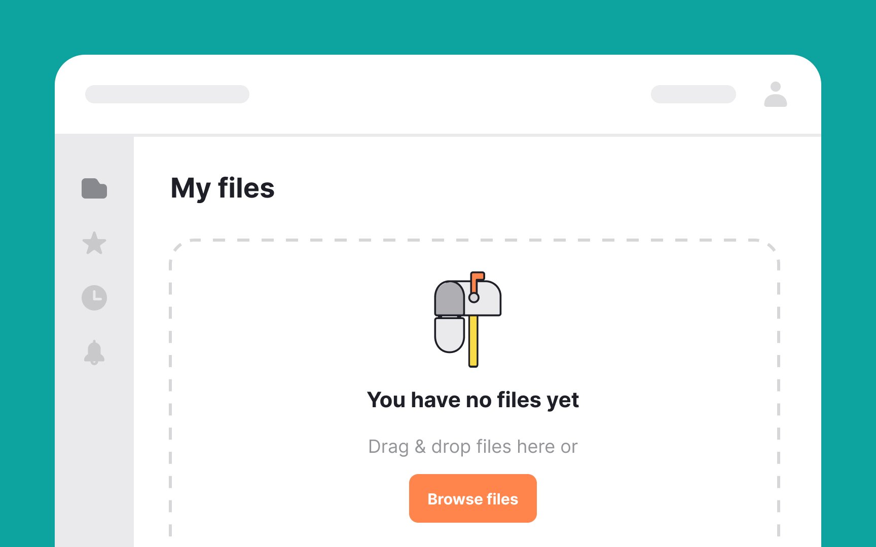
When designing empty state pages, it's crucial to communicate the reason behind the emptiness clearly. Rather than using generic phrases like "No tasks found," opt for something more descriptive and motivational. For instance, "You're all caught up! Add a new task to stay productive."
This not only informs users that they have no pending tasks but also guides them on what to do next. The goal is to blend clarity with encouragement, guiding users through an intuitive and positive interaction with your app or website.[1]
References
- Designing Empty States in Complex Applications: 3 Guidelines | Nielsen Norman Group
Top contributors