Multiple CTAs in empty states
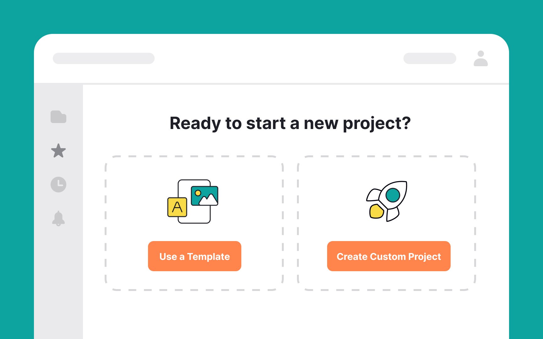
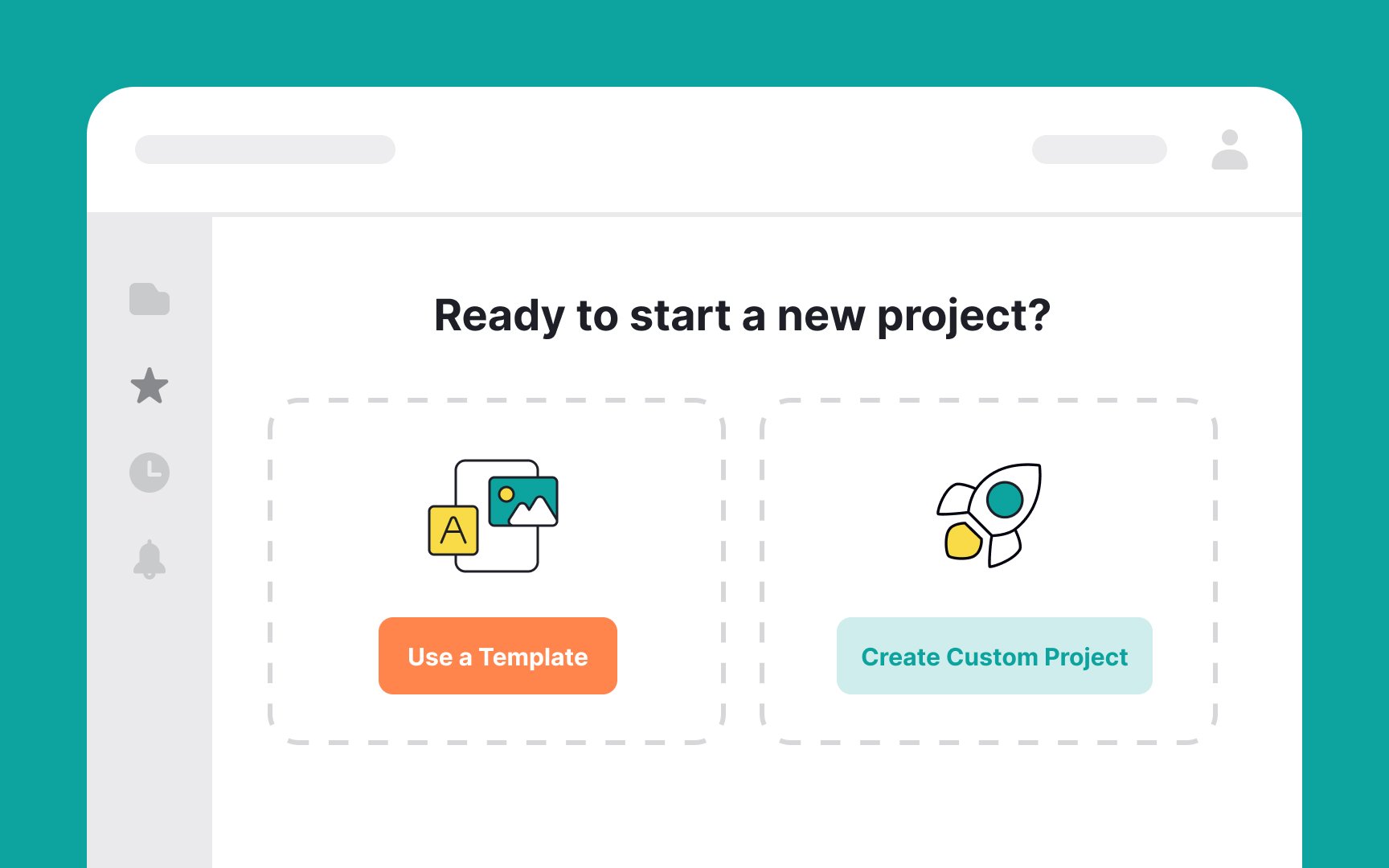
When presenting CTAs on an empty state page, it's crucial to differentiate between actions of varying importance to prevent user confusion.
Imagine you're working on a website-building platform. When users encounter an empty state, presenting them with two clear options can streamline their experience. The primary action, CTA 1: "Use a Template," stands out as the recommended, straightforward choice for quick website creation. On the other hand, the secondary action, CTA 2: "Create Custom Project," is presented as an alternative for those seeking a more tailored experience.
This method of prioritizing and distinguishing between primary and secondary actions helps users make more informed, stress-free decisions in their website-building journey.
Top contributors