Show hover states when selecting the date range
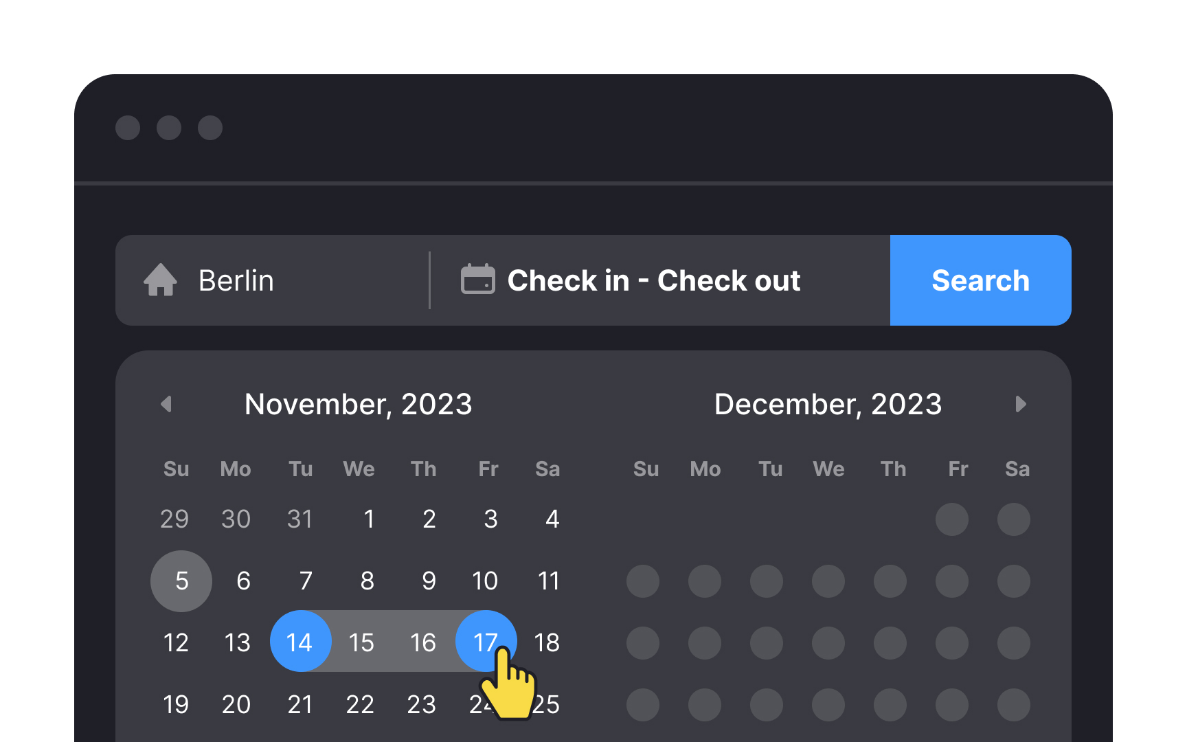

When offering a date picker, ensure that the selected dates are prominently highlighted. Include hover states to indicate the range when users are selecting multiple dates. Use autofill for the date inputs as soon as the date range is selected by users to reduce the chance of errors.
Also, it's vital to make today's date easily noticeable.[1] Users shouldn't have to spend time searching for it on their phone or laptop calendar. A clear and obvious display of the current date streamlines the booking process, enhancing user efficiency and minimizing the risk of date-related errors.
References
- How to Design a Date Picker that Makes Your UI Shine | Studio by UXPin