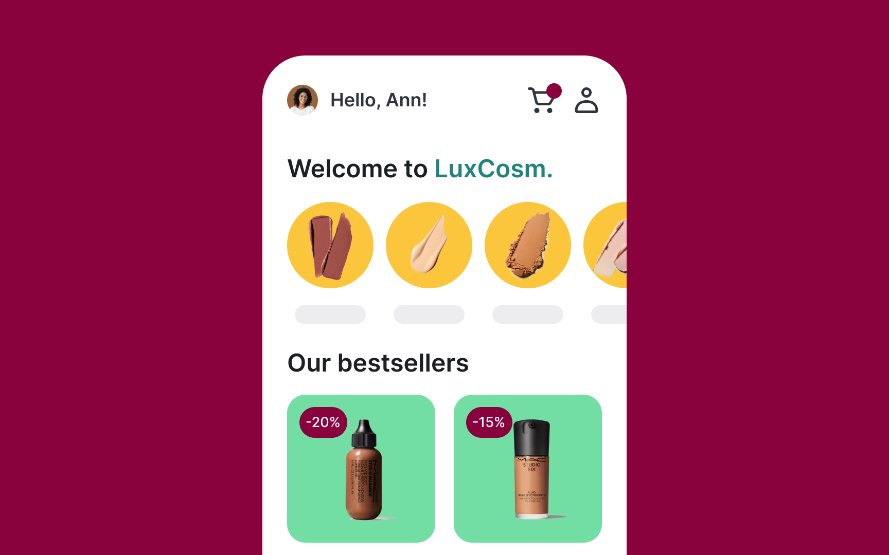
Creating a more sophisticated palette
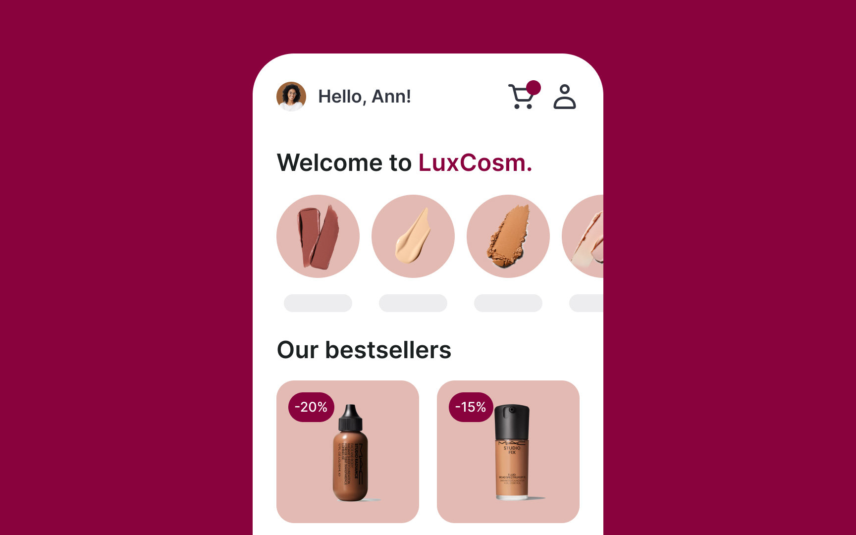
Magenta is a purplish, pinkish color that has a few different versions. It's located exactly midway between red and blue on the color wheel. Magenta is an extra-spectral color, meaning that it's not associated with a single visible light wavelength.[1] On its own, it evokes the feeling of mystery and magic.
Magenta also carries a sense of sophistication that you can emphasize by adding other colors. You can keep the color palette monochromatic by using different shades, tints, or tones of the same color. For example, light blue, medium blue, and dark blue. These are all versions of the same hue.
If you want a bit more variety, you can use analogous colors. These are colors that sit next to each other on the color wheel. For example, blue, blue-green, and green. Since they’re close together, they still feel harmonious. Then, add neutrals like grey and black, both of which are considered elegant and sleek.
References
Top contributors