Segmented controls
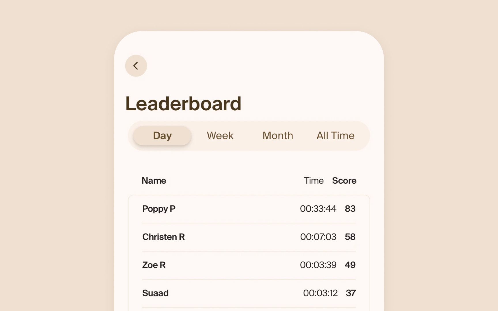
Segmented controls help users switch between related options. A common example is the grouping in the Photos app (All, Months, Years).
HIG specifies clear styling for segments:
- Equal sizing. Each segment needs enough width for its content, equal height across all segments, and clear active states
- Clear states. The selected segment stands out visually. The selected segment uses a filled style while others remain plain
- Brief labels. Segments work best with similar-length options. Text labels should be short and descriptive and fit without truncation. Having too many segments or uneven content makes controls harder to use
Pro Tip: Keep the number of segments between 2-5 — more options become hard to read and tap accurately.
