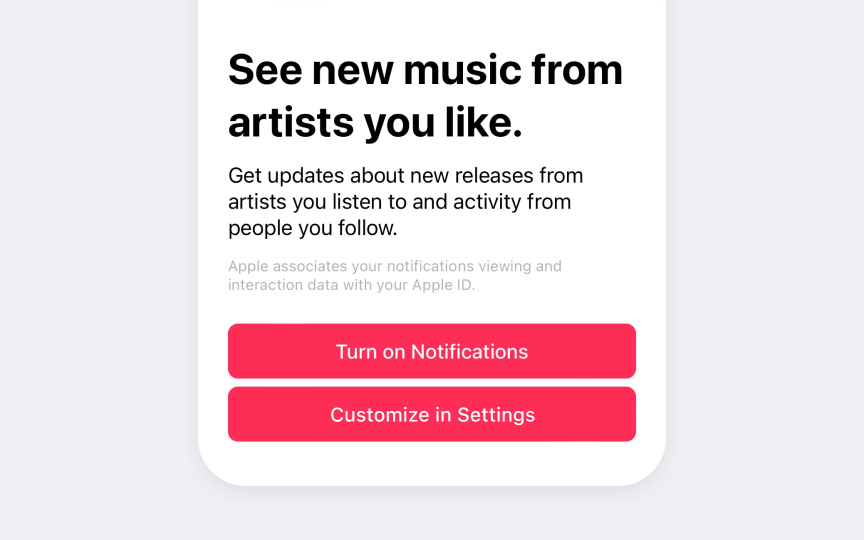
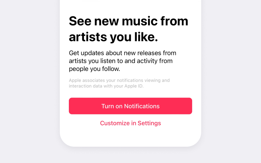
Primary action buttons
Primary action buttons guide users toward key tasks. In Apple's interfaces, these buttons use a filled style and prominent placement to show they represent the main action on screen.
HIG requires specific styling for primary buttons. They need solid background color, high contrast with surrounding elements, and clear labels that describe the action. The filled style helps them stand out from other interface elements.
Primary buttons must follow consistent patterns across an app. Main actions like Save, Continue, or Done use the same styling everywhere they appear. Different screens can have different primary actions, but each screen should have only one primary button.
Common primary button patterns include:
- Clear verbs. Action words that show what the button does
- High contrast. Filled style that stands out visually
- Consistent style. Same styling for primary actions across screens
Pro Tip: Use only one primary button per screen — multiple prominent buttons can confuse users.


