Foundations of Apple's iconography
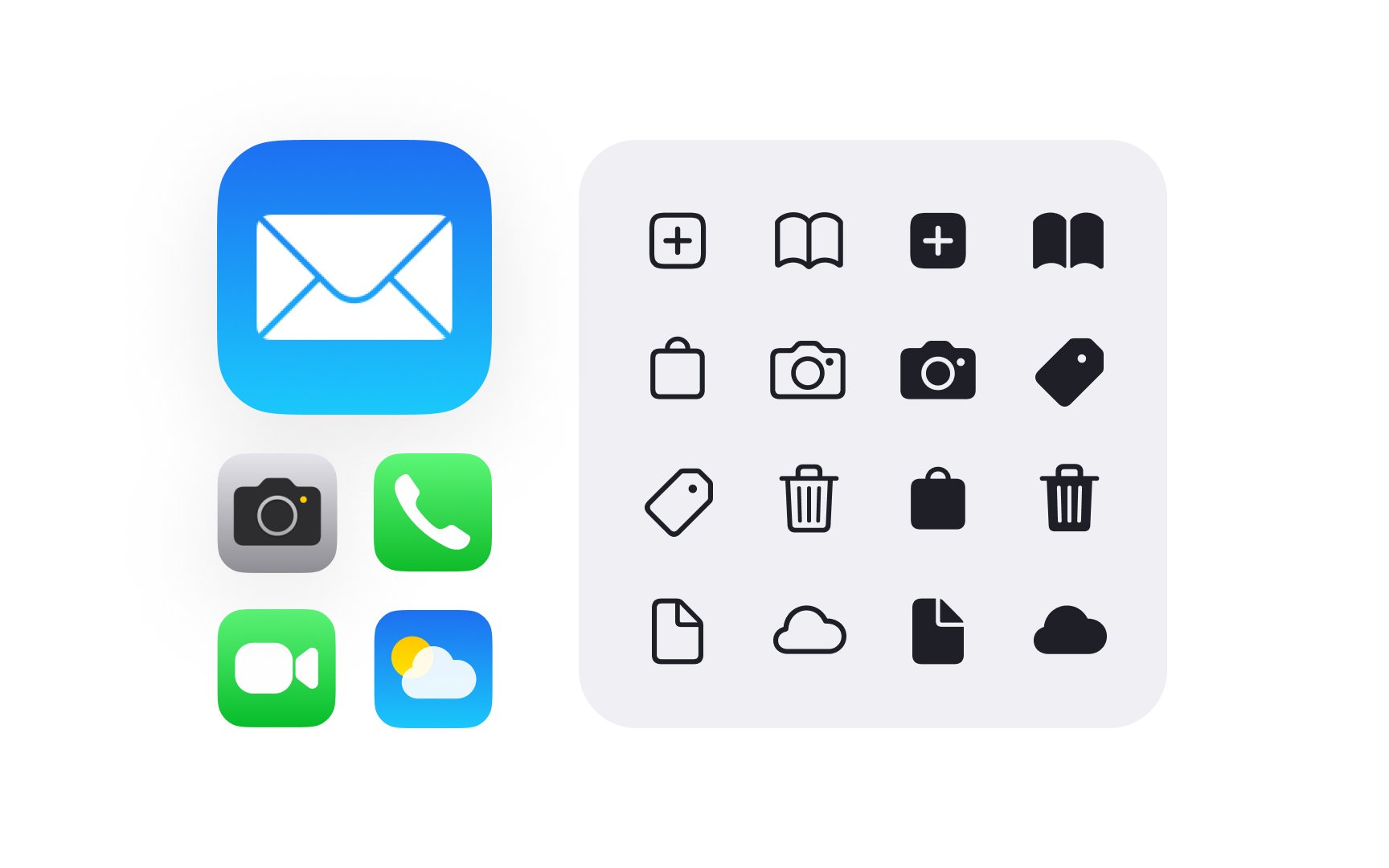
Icons in Apple interfaces communicate purpose through consistent metaphors and symbols. SF Symbols form the foundation of this visual language, offering a vast library that feels at home across all Apple platforms.
Well-designed icons share key characteristics that make them instantly recognizable and functional:
- Clear silhouettes — easily identifiable at any size
- Simple shapes — reduced to essential elements
- Consistent stroke weights — matching system typography
- Optical alignment — properly balanced with text
- Systematic layout — following platform grid guidelines
Apple's icon system extends from tiny menu items to large app icons. Each type has specific roles and requirements, but all follow core principles that ensure visual harmony. SF Symbols provide the building blocks for this system, while custom icons expand it for unique needs.[1]
Pro Tip: When choosing icons, prioritize clarity over cleverness — users should instantly understand what each icon means.
References
- Icons | Apple Developer Documentation | Apple Developer Documentation