Toggle switches
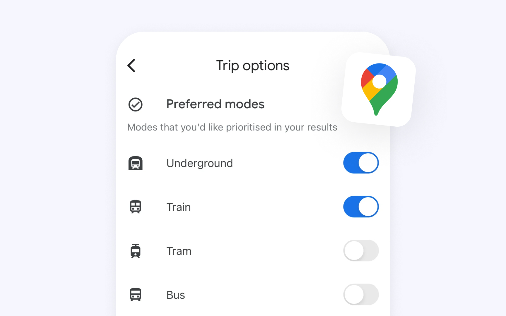
Every interface needs a clear way to manage settings and features. Apple's toggle switches serve this purpose by controlling functions that can be either active or inactive, such as enabling notifications or activating dark mode. Unlike buttons that trigger immediate actions or menus that offer multiple choices, toggles are specifically designed for binary state changes.
Key guidelines from Apple’s Human Interface Guidelines (HIG) include:
- Purpose: Toggles are exclusively for state management. They should help change settings or features but never trigger actions or present a list of choices.
- Visual feedback: The design should make it instantly clear whether a setting is on or off.
- Accessibility: Toggles should use multiple visual indicators beyond color, such as shape changes, fills, and symbols, ensuring clarity for all users.
- Interface context: They should be paired with clear labels or list content that explicitly states what the toggle controls.
- Alternative options: When used outside of lists in iOS and iPadOS, toggles should be able to transform into special buttons with toggle behavior.
Pro Tip: Use checkboxes when settings have parent-child relationships — their visual style makes hierarchical relationships clear through alignment.
