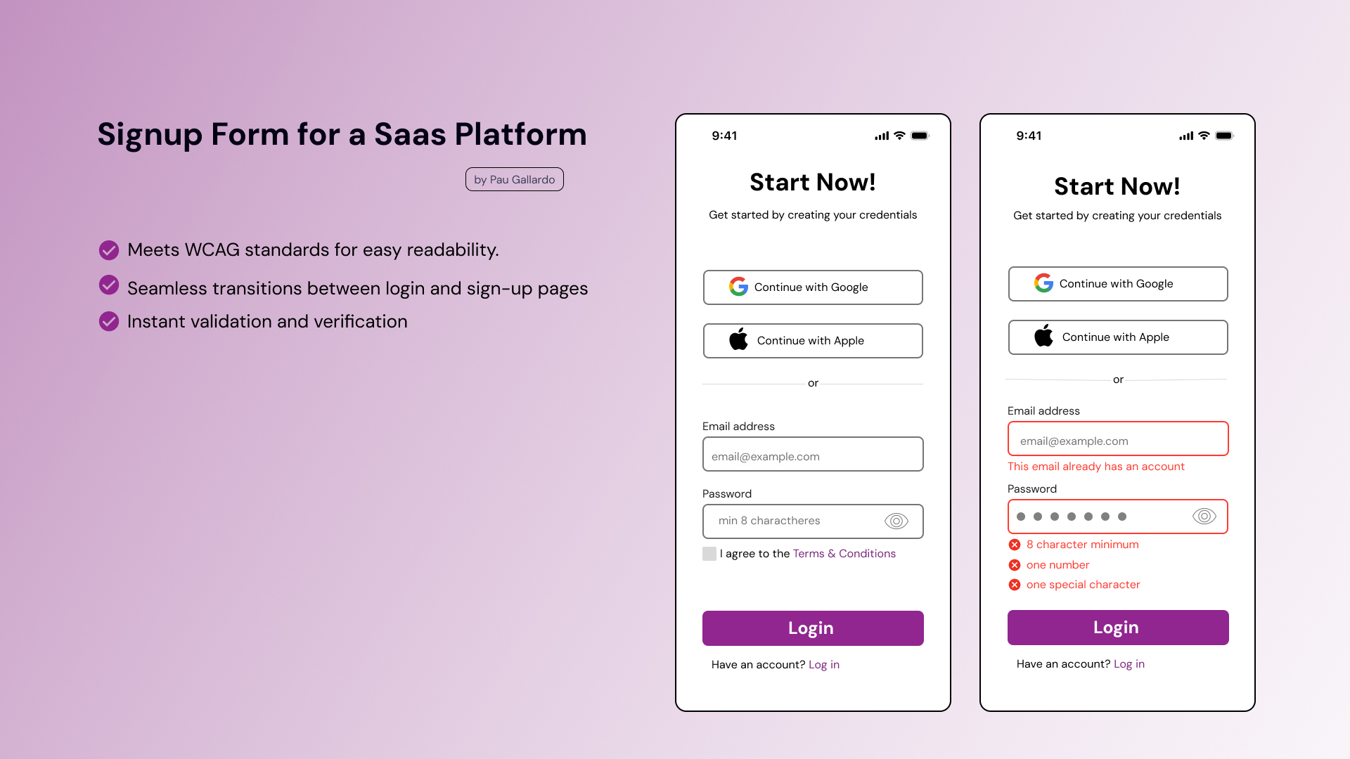
Whitelabel Signup and Login

This is the first project I do on Figma. I needed to learn how to use it first to make the wireframe and I hope to make more screens for this simple signup/login page.
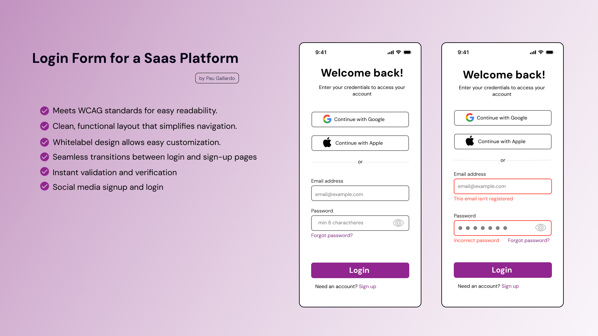
- Start with a whitelabel platform to ensure consistency across platforms and reduce cognitive load.
- A clean and functional layout where the logo and colors can be easily customized, providing a flexible experience for different brands.
- Social Login/Signup and auto-recognition to enhance user experience.
- Seamless Transition Between Login and Sign-Up
- Instant validation and verification of inputs.
- Content is clear and functional for all users.
- Users are able to interact with the interface elements without issues.
- The information of the interface is clear and understandable as they interact with it.
- Color contrast and correct and clear labeling.
I'm not a pro on Figma yet to make a interactive prototype, but looking forward for feedback on the design.
Tools used
From brief

Topics
Share
Reviews
3 reviews

Paulina hi! Great start with learning Figma! 😊 However, I’m a bit unclear on the project's purpose—are these wireframes or UI designs? Either way, here are a few tips for your future projects:
1. Clarify Fidelity: The current design looks like a high-fidelity wireframe or UI due to the use of colors and icons. If it's meant to be a wireframe, try using placeholders instead of detailed icons. If it's UI, incorporate more brand colors.
2. Wireframe Tools: If you're aiming to create wireframes, Figma offers several plugins to help streamline your process and save time.
3. Research is Key: Login and sign-up screens may seem simple, but even these common elements vary greatly in design. Always conduct a bit of research before starting any project. I recommend using platforms like Mobbin for inspiration.
Keep up the great work!
/Yuliia

I think you did well if this is your first time using Figma.
What I like:
- The simple UI
- the specific error codes
- Status bar
- the big login button at the bottom
What could be changed:
- alignment of field text
- alignment of Google and Apple text
- alignment of text under login button
I was a bit confused about what this is. If this is a wireframe, I think it is a bit too high-fidelity, This looks more like a hi-fi version. It would be nice to see more colors throughout this page. I saw you used purple at the bottom button, maybe you could use the same color for the fields or the 'Start Now!' text? Research can help determine which features you could add or remove.
Well done! Simple, but sweet.

Well done with your first Figma project! You have done a great job - it can be difficult getting grips with things when you start! To help you with your design I have a few suggestions.
Did you use a grid for alignment? This can be great for text alignment which I can see is slightly off in places. Maybe you could also give a little more space to the next below and above the text boxes. For instant email address and this email has an account.
One thing you could add to this piece is showing how your reached this design. Did you sketches or any wireframes before reaching this higher fidelity version?
You might also like

Smartwatch Design for Messenger App


Bridge: UI/UX Rebrand of a Blockchain SCM Product


Pulse Music App - Light/Dark Mode


Monetization Strategy


Designing A Better Co-Working Experience Through CJM


Design a Settings Page for Mobile
Visual Design Courses

UX Design Foundations


Introduction to Figma

Design Terminology
