Vault - 404 page error
The scenario
You’re a UX designer at a finance organization which can include a bank, an investment firm, or a fintech company. Your goal is to strike a balance in the finance platform’s interface and copy, blending respect and professionalism with friendliness and support.
Your task
Select a platform and the device type for your design.
Design a helpful 404 error page for any platform.
Ensure it's functional and provides a solution.
Make it visually appealing.
Maintain the brand voice and style expected from a finance organization.
Explain the rationale behind your 404-error page design.
Use the provided mobile or desktop templates to showcase your designs
My Process
1 - Determine a brand - Vault, a new , digital first bank, trying to disrupt the market
2 - Define the brand - Vault
A name that feels both secure and cutting-edge — where your money isn’t just stored, it’s working for you.Short. Memorable. Digital-first.
Brand Personality:
Straight-talking. Future-facing. Relatable.
Straight-talking – says what it means, no financial fog
Future-facing – tech-smart, but human-led
Relatable – not a suit and tie, but a trainer and tee
With the modern twist, and considering the role AI would naturally play, I added the idea of an assistant and decided that would best allow a personality to come through as a robot character that could take personal accountability for the system (as it would with financial management etc)
3 - Define a Tone of voice: Bold but approachable. Think: the cool financial coach who knows their stuff but doesn’t preach.
4 - Align with a Typograpy
Modern sans-serif (Manrope)
5 - Create elements of a basic 404 layout
Explain what happened
Make users crack a smile
Put some effort into the copy
Add on-point visuals
Guide users to your best content
Make the CTA stand out
Provide a search input
Represent your brand
Avoid clutter
Don't go overboard
Integrate interactivity
7- Define a logo (modern, a reaction to traditional banking brands) and used these colours as a base palette for the design.
8 - outline a simple 404 wireframe
9 - Added content and writing to match the style and brand outlined above.
Note - I removed the popular pages links as these did not feel more useful than the search / homepage link and kept the page simpler.
10 - Refine the final design - 
11 - I added the idea that the creation of a 404 error would generate a ticket to be investigated (no promise of a fix) which would give confidence to the user that Vault were proactive, approachable and responsible. This was easier to do with the robot character being the focal point of responsibility for this action.
Tools used
From brief
Topics
Share
Reviews
2 reviews
Great job! Really informative. I think the allignment can be a bit more consistent and your design would be perfect!
Great job on the 404 page—the illustration is really cute and adds a playful, lighthearted tone that fits the moment perfectly.
That said, the search bar currently feels like the main focal point of the screen, and I think it slightly overshadows the “Return to Homepage” button. From a user flow perspective, it’s usually better to guide users toward the primary action first, especially on a 404 page where they might be unsure of what to do next. The homepage button should feel like the default “safe route,” while the search is there as a secondary option if they’re looking for something specific.
I’d suggest tweaking the visual hierarchy a bit—maybe by adjusting size, contrast, or placement—so that the return button grabs attention first, and the search field supports that path without competing for it.
You might also like
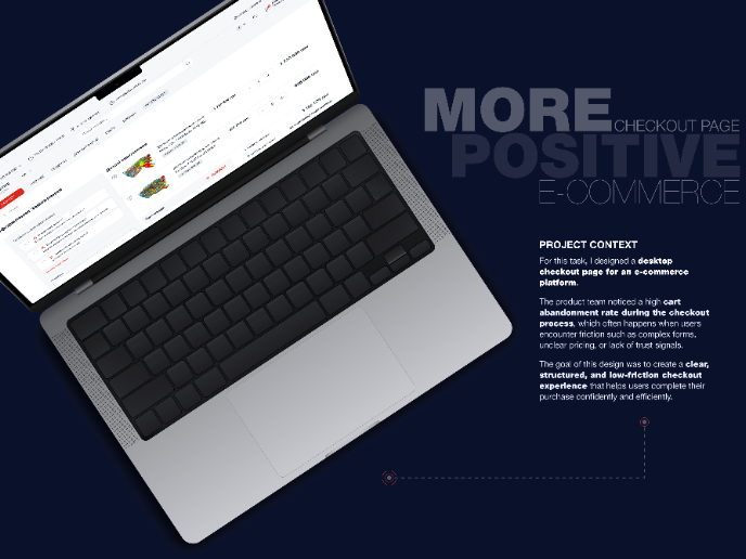
🖥 Desktop Checkout Flow Design
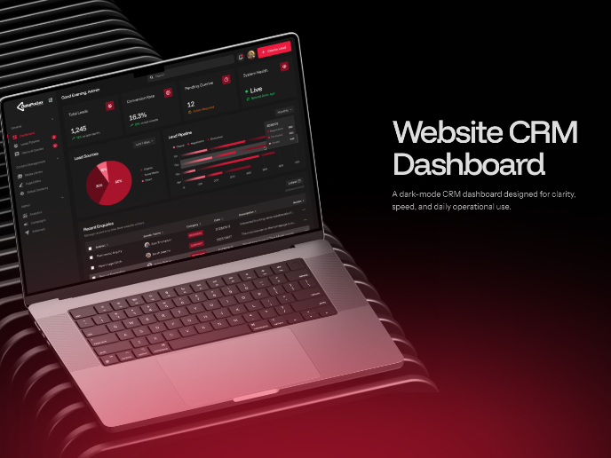
Website CRM Dashboard
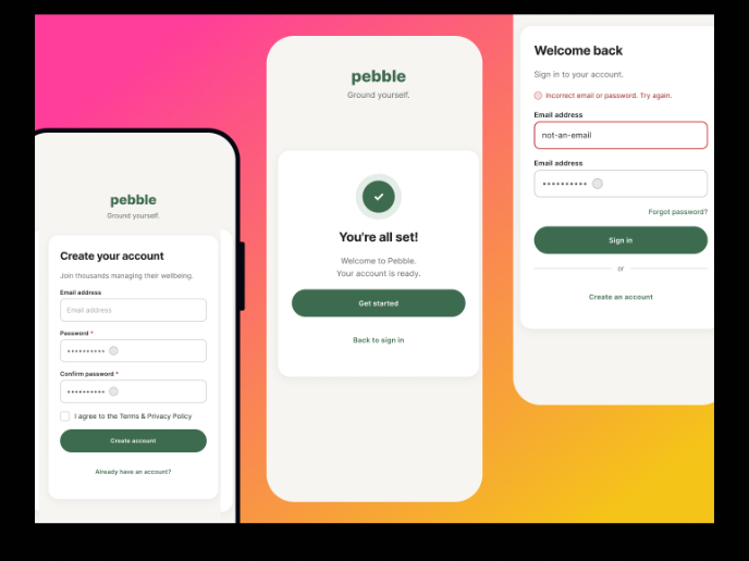
Pebble Accessible SAAS Signup Flow
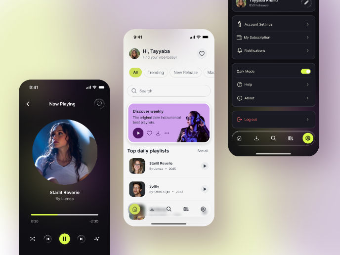
Music Player UI - Light & Dark Mode
Create a UX Research Survey
Nestra from homepage to checkout process
Content Strategy Courses

UX Writing

Common UX/UI Design Patterns & Flows


