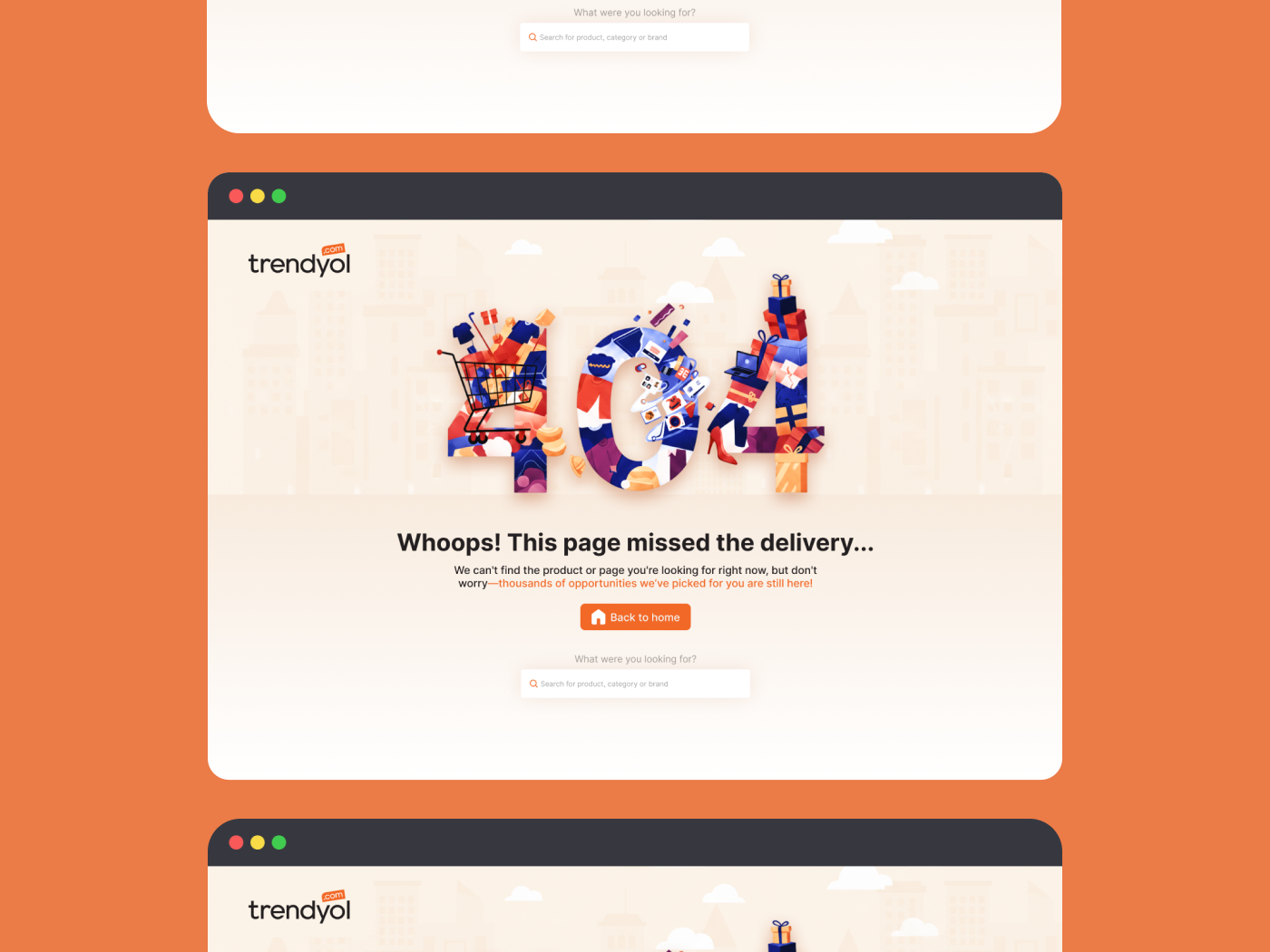
Trendyol - 404 Error Page

🎯 Objective
The objective of this project is to transform Trendyol’s 404 error page into a recovery-focused experience that maintains user trust, minimizes frustration, and encourages users to continue their shopping journey. Instead of a dead-end error screen, the design aims to:
- Guide users back to meaningful actions such as browsing, searching, or returning to the homepage.
- Preserve brand consistency aligned with Trendyol’s friendly identity.
- Reduce bounce rates caused by broken links or navigation errors.
- Reinforce trust during sensitive shopping and payment flows.
🔍 Research & User Needs
Research Insights:
- User Behavior: Users encounter 404 pages with frustration and may abandon the platform without a clear recovery path.
- Brand Alignment: Trendyol’s voice is friendly and commerce-driven; the visual language must emphasize warm colors and clear CTAs.
User Needs:
- Clarity: Immediate understanding of why the page is unavailable.
- Recovery Paths: Fast access to resume shopping.
- Speed: Minimized cognitive effort to return to the task.
🎨 Design Considerations
- Visual Hierarchy: A hero-centered composition for immediate comprehension.
- Style: Playful yet professional illustrations reflect Trendyol’s trustworthy personality.
- Typography: Prioritized readability and accessibility for both desktop and mobile.
- Space: Calm and structured visual flow through intentional padding.
📝 Content Strategy
- Headline: Uses an empathetic tone ("Oops!") to soften the error experience.
- Supporting Text: Clearly explains the situation and provides reassurance.
- Primary CTA: A dominant "Back to Home" button.
- Search Field: A critical recovery tool allowing users to find their original intent.
- Tone of Voice: Optimistic, helpful, and strictly aligned with Trendyol’s identity.
🧠 User Experience (UX)
- Recognition: The large "404" visual hierarchy ensures the error is recognized instantly.
- Guidance: The primary action is visually dominant, leading users toward recovery.
- Continuation: The search field supports task continuation without forcing a restart.
- Focus: Minimal distraction by removing global navigation, keeping the user on the recovery path.
🚀 Final Result & Impact
The final design successfully turns a technical dead-end into a strategic recovery point. It caters to both exploration-driven users via the CTA and goal-oriented users via the integrated search bar.
Key Takeaway: By combining Trendyol’s vibrant brand identity with functional recovery tools, we ensure that a "missing link" never leads to a "missing customer."

Reviews
3 reviews

This is a really good start, However, I don't think the aesthetic of the 404 itself really matches Trendyol's branding. It's very visually busy and cartoony, and Trendyol seems to market itself as a trendy, fast-fashion marketplace similar marketing to Shien. I don't get that from the 404 image used. Something a bit sleeker while still remaining somewhat casual.
I also don't think "Return to Home" is the best CTA for a 404 page. You want to encourage users to continue shopping rather than backtracking. "View Similar Products" would be ideal if the store's database would be able to figure out what the user may have been searching for. "View Top Products" or "Continue Shopping" would also be more clear in encouraging users to continue on the user journey.

Hi Ebrar!
🧭 First reaction this 404 feels playful without being annoying, which is honestly the sweet spot 😄✨ Error pages can be frustrating, but this one seems to soften the blow.
I like that it still feels aligned with Trendyol’s brand energy. It doesn’t look like a random generic “Page Not Found” template. There’s personality there, but it doesn’t forget the main job: helping users recover 👌🛍️
If I’d elevate it, maybe add a stronger recovery path like recommended products or trending categories to keep users browsing 🚀 But overall, nice balance between fun and functional.

This is fun and well done @Ebrar 😄
The illustration gives the 404 page personality without being distracting, and the message feels friendly and reassuring.
The CTA is clear and helps users recover quickly. Nice balance between brand, humor, and usability.
You might also like

Notification microcopy - Project


El Mandoub-GovTech App


MalishaEdu Counselor Workspace


Goal Creation Flow


Portfolio website

MalishaEdu - Website Design
Content Strategy Courses

UX Writing


Common Design Patterns


Building Content Design Systems
