Seekho Login & OTP Screen Redesign

Updated design based on feedback from @Aitor Pérez Barrera & @Luciana Tiemi Caraça
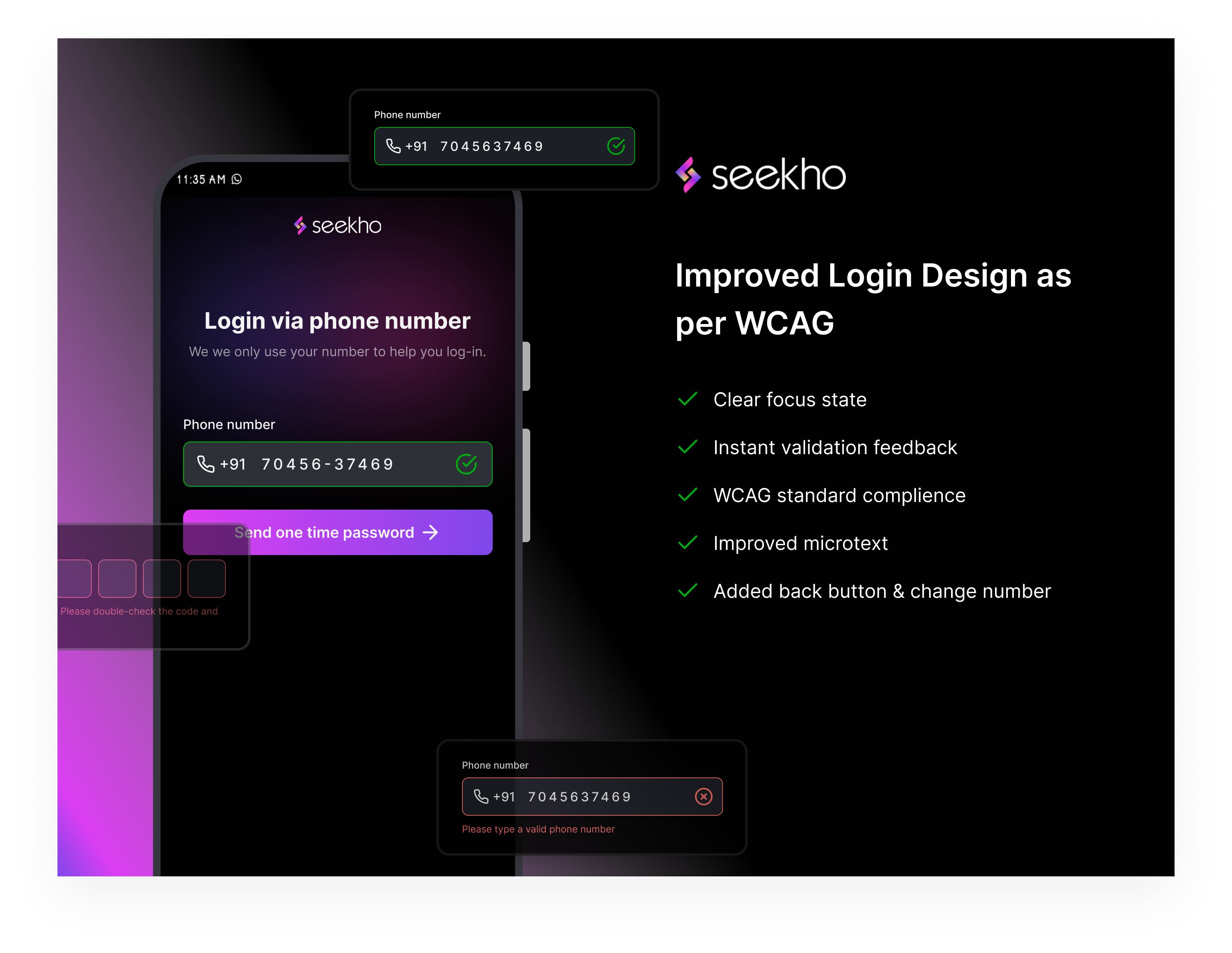
- Enhanced accessibility based on WCAG guidelines.
- Improved color contrast for better readability.
- Added clear error messages and instructions.
- Simplified navigation for a seamless user experience.
- Ensured compatibility with screen readers.
This redesign ensures an inclusive and user-friendly interface.
Tools used
From brief

Topics
Share
Reviews
3 reviews

The design is visually pleasing and quite polished, there are some good UX ideas overall, and it is sticking to known patterns. Nonetheless, there's some areas of improvement that you might want to consider.
On the first screen, the main problem resides on assuming that the user knows how a login with one-time password works.
- Don't write an uncommon acronym as OTP. Instead, just write it in plain human language: "Send a one-time password"
- The "Send OTP" button has an odd separation from the form field. Since they are closely related (you need to enter a phone number to get an OTP), they should be physically closer
- "Please type your phone number" is not a clear error message, what should the user do? Instead, say something like "Please type a valid phone number"
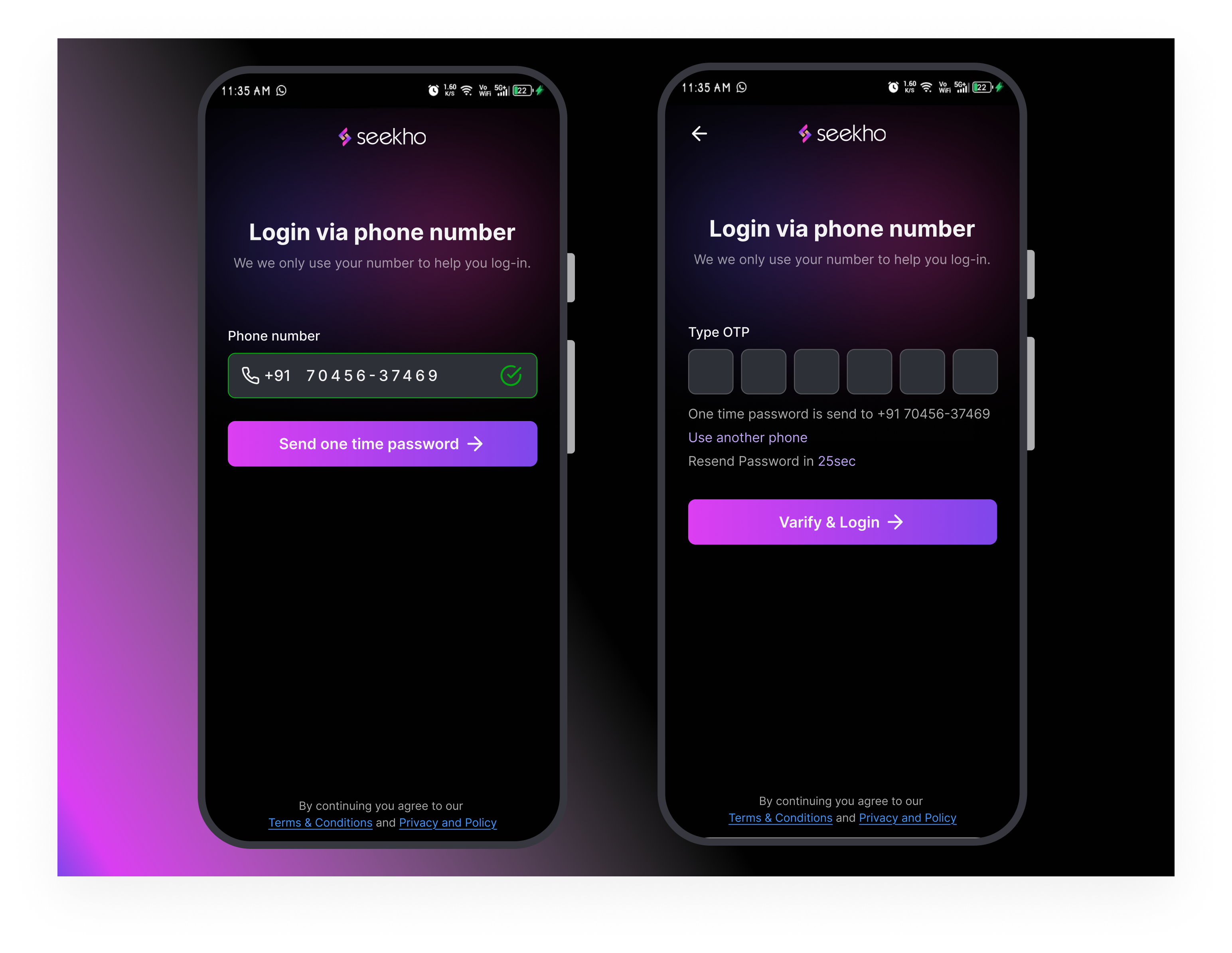
- The "your details are safe with us" is unclear (what details?) and probably misplaced (if it's about the phone number). Instead, move it below the input field, as a helper text and say something like "We we only use your number to help you log in".
- As a bonus, you could also consider disabling the button when there's no input, that way there's no change the user skips the input field.
On the second screen, the main problem is the task we're giving to the user might not be clear. You're spelling many different actions related to an OTP ("Enter OTP", then "OTP is sent", then "Type OTP", then "Verify OTP"). Users might be confused about what exactly is it they need to do.
You could solve this with something along these lines:
- Title: Login via phone number (why changing it, if we're still on the same process?)
- No subtitle
- Input field: Type the one-time password recieved in your phone
- CTA: Verify and log in
- Helper text: A one-time password was sent to xxxxxx
- Helper actions: Resend password in XXsec | Use another phone
Keep it up! 👋

Very beautiful interface and improvements!
In addition to Aitor suggestions, I'd make the input field more visible in the default state as well, increase the font size of Change Number and Request new code/Send OTP again, and make sure the user can input the number by voice.
Great work!

The Seekho login and OTP redesign is a well-executed update that focuses on accessibility and user experience. By adhering to WCAG standards, it ensures better inclusivity with features like improved color contrast, clear focus states, and screen reader compatibility. The real-time validation feedback and detailed microtext make it easy for users to avoid errors and navigate confidently. Additional improvements, like the back button and the option to change the phone number, enhance overall functionality, making the process seamless and intuitive. A thoughtful design that successfully balances aesthetics and usability!
You might also like

Smartwatch Design for Messenger App


Bridge: UI/UX Rebrand of a Blockchain SCM Product


Pulse Music App - Light/Dark Mode


Monetization Strategy


Designing A Better Co-Working Experience Through CJM


Design a Settings Page for Mobile
Visual Design Courses

UX Design Foundations


Introduction to Figma

Design Terminology
