Rosetta Stone Color system

Rosetta Stone is a language learning product that allows users to learn languages online and through mobile use. This project focuses on brand color systems and accessibility in alignment with WCAG standards. While I was not able to include full UI mockups at this time, I’ve outlined a clear rationale for color selection and their emotional, psychological, and usability impact. I am currently learning how to build UI components in Figma and plan to update this project as my skills progress. Apologies in advance for the missing UI examples.
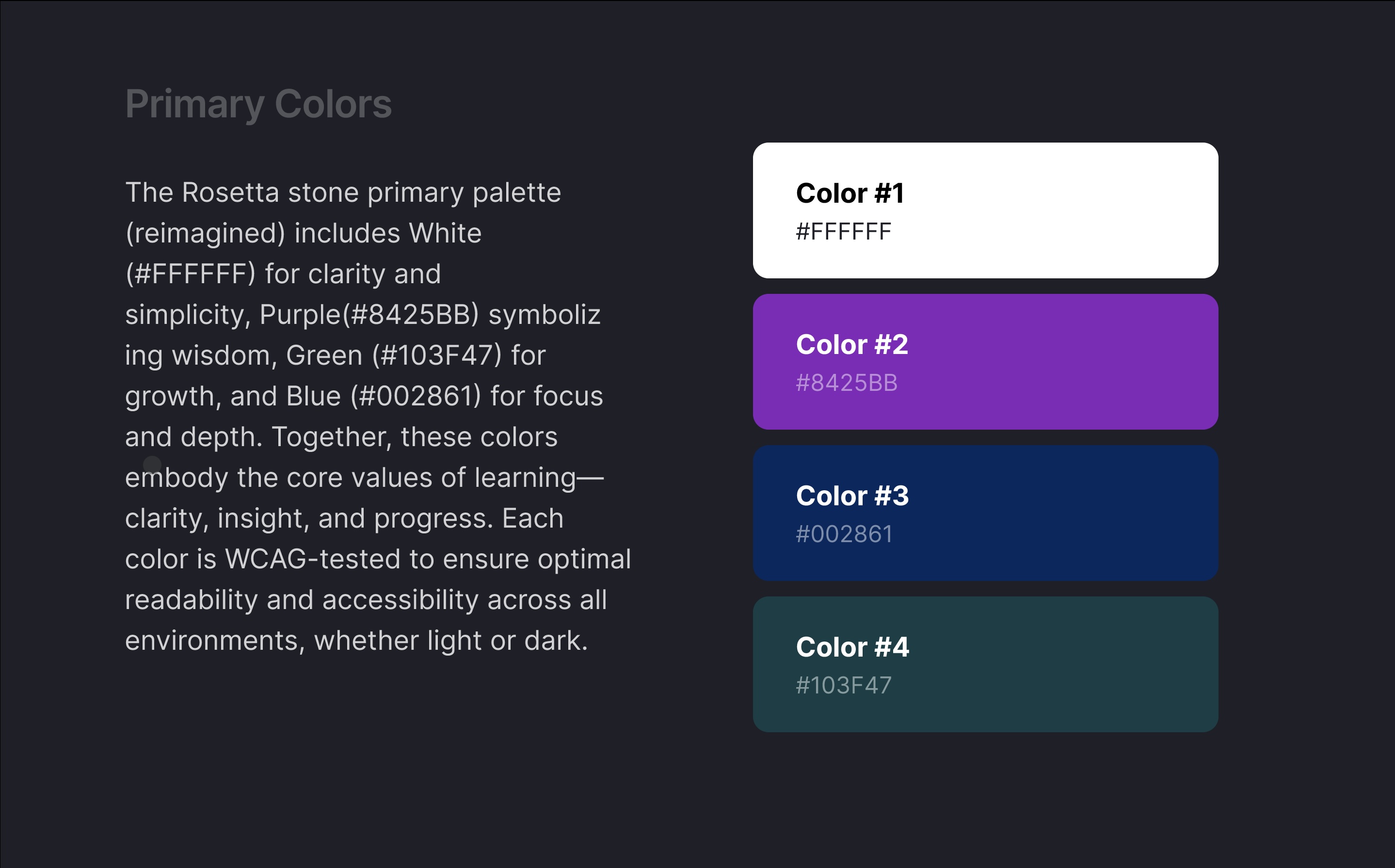
Primary colors are used as the Brand of the Design. These colors are used for major UI Elements and consistent brand across the design Colors have an effect on the emotional relationship between users and the usability of the product. I chose these colors to represent a deeper purpose in the design. White for clarity, Purple for wisdom, Blue for focus, and Green for growth which are all principles when learning a new language.
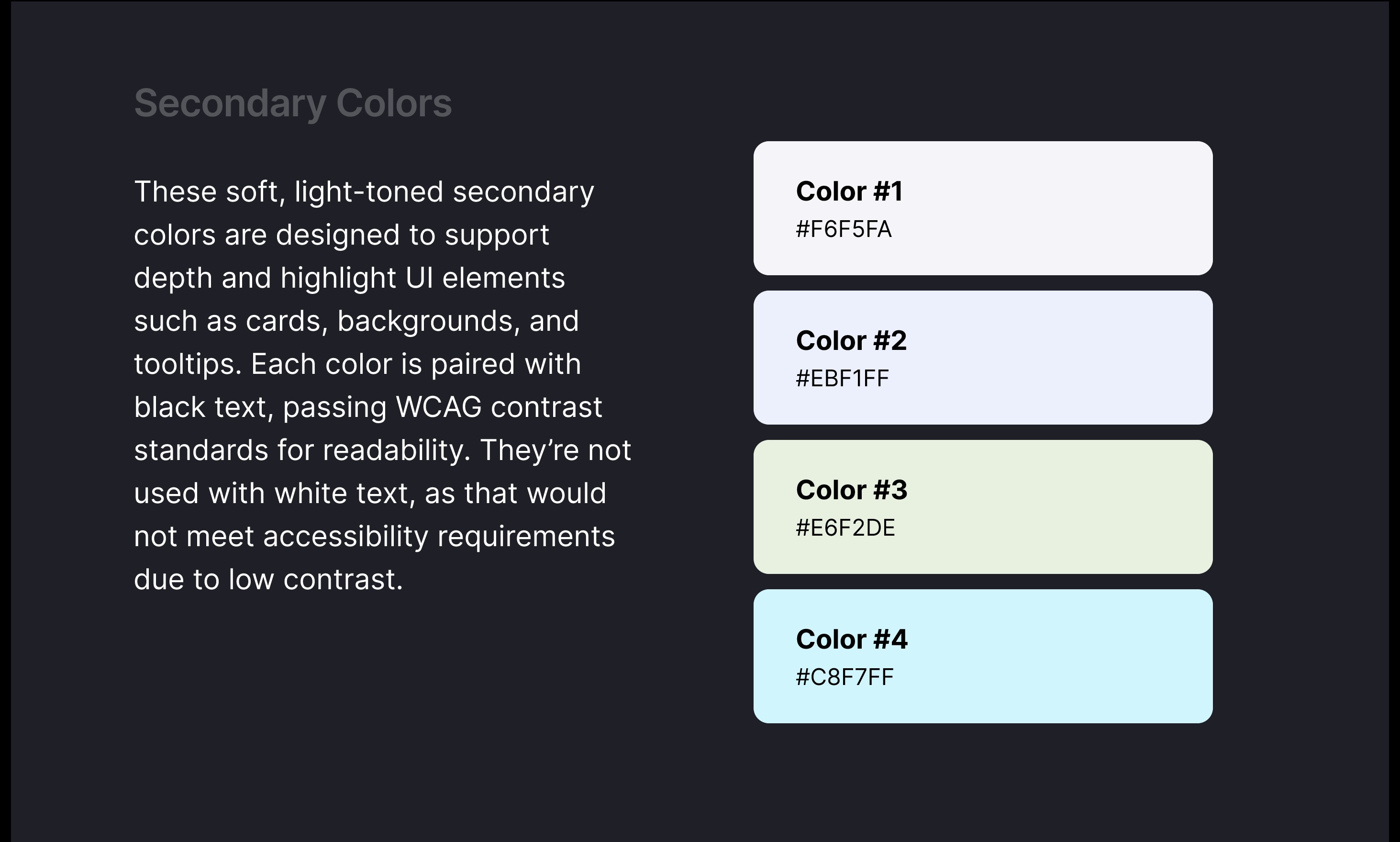
Secondary Colors are used to Highlight and bring clarity to the design. I chose softer versions of the primary colors to achieve depth and contrast. These colors would be used for buttons, hover states, cards, and accents.
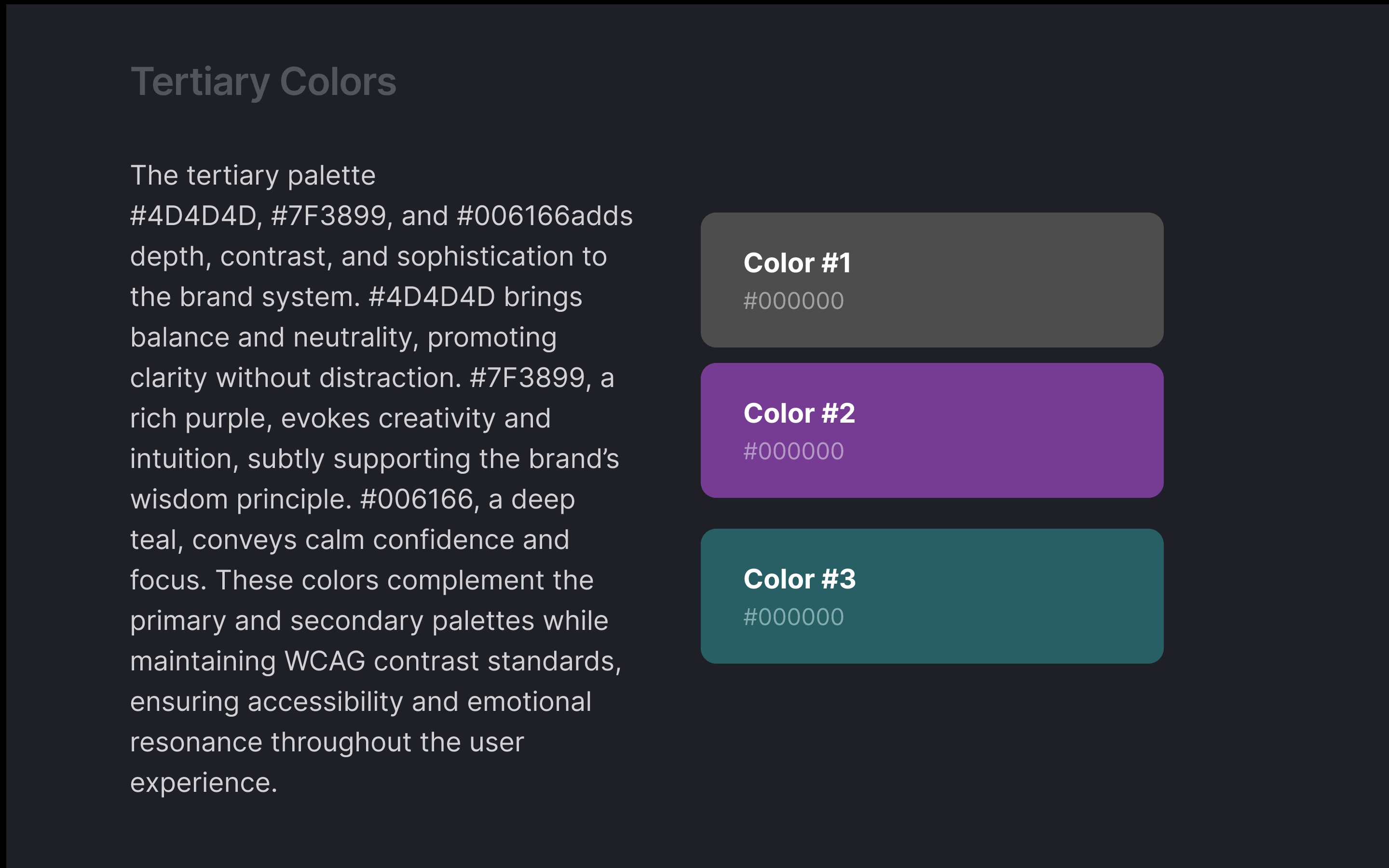
The Tertiary Palette offers nuances and emotion to the design which also brings more dimension as well. This palette would be used for minor UI elements, text accent, Shadows, Icons and backgrounds.
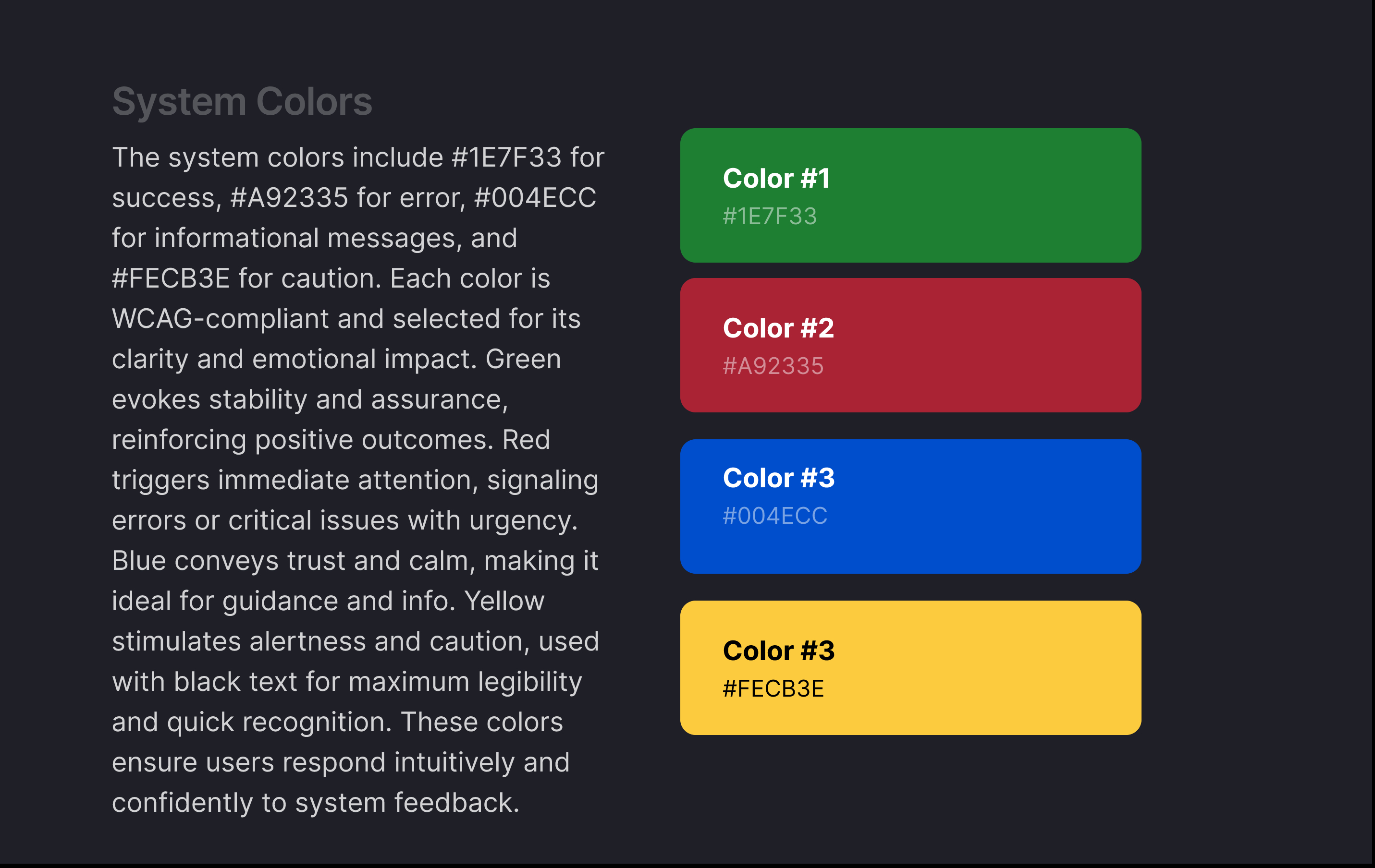
System Colors Guides the eyes of Users by giving clarity on what the users are doing by highlighting their actions. Giving warnings, cautions, success feedback and errors.
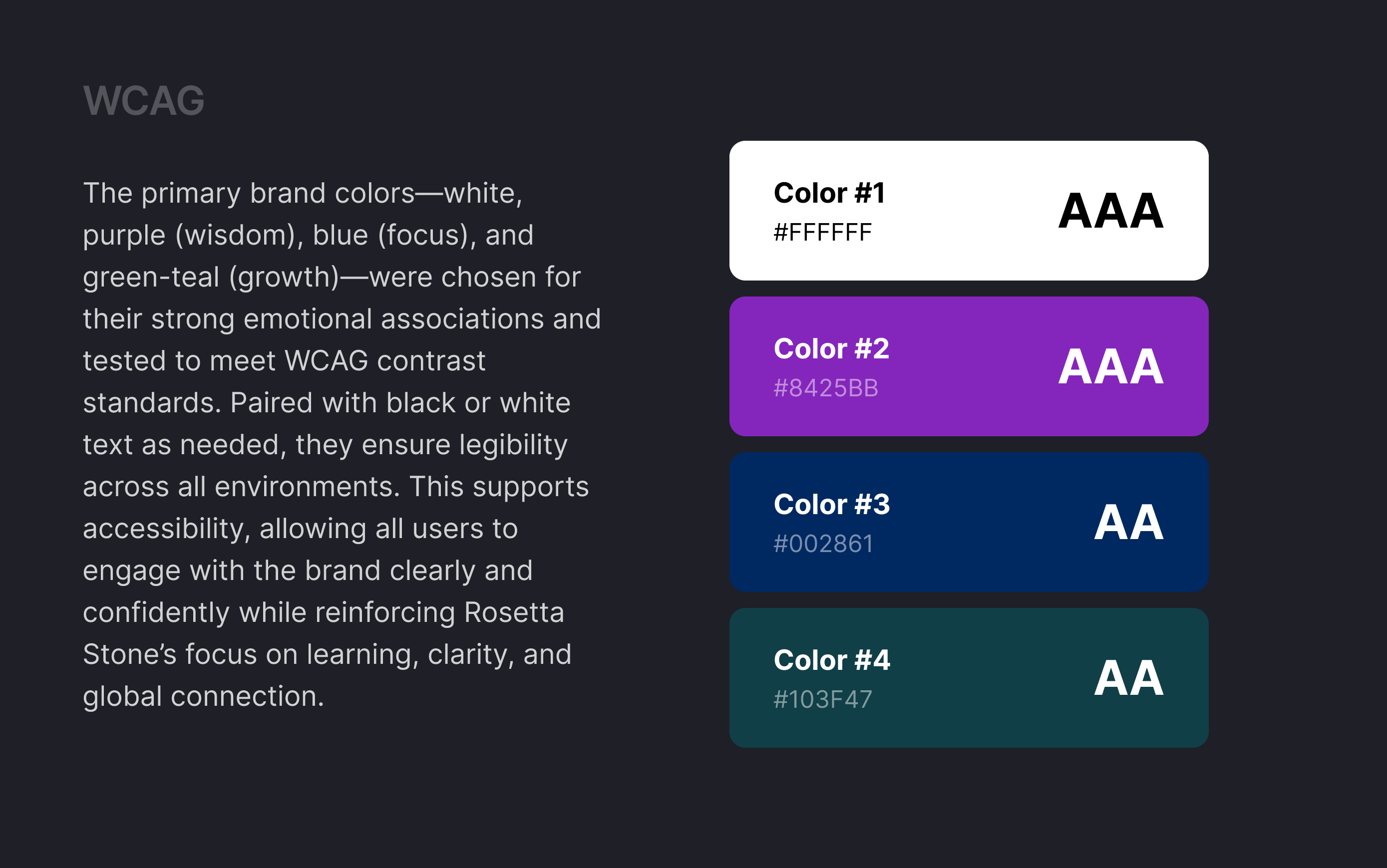
These colors create a strong emotional and visual identity for Rosetta Stone, supporting an experience that feels intelligent, grounded, and engaging. Each color was tested against WCAG Standards to ensure contrast for both light and dark environments, making the interface accessible and readable for all users in different lighting conditions. White offers clarity and minimalism, while the deep tones maintain brand strength and ensure legibility with both black and white text.
Thank you for taking the time to acknowledge my project. I apologize for not having the UI element for an example, I am still learning how to use Figma and will repost once I learn how to properly use it.

Reviews
2 reviews

Great work Krishael, you hit the nail right on the head with this one.
Each of the colors that you have picked out works really well with the intended business/brand. The purple for wisdom really stood out to me, and really set the tone of the rest of the color system.
The rationale that you give for choosing each color, and the detailed descriptions after each section, really show that you did your research, and understand the color theory very well.
Awesome effort on this one, good luck with learning Figma, I'm looking forward to seeing more of your work.

Hi there,
I just finished exploring your Rosetta Stone Color System case study, and I want to take a moment to say how much I appreciate the clarity and intentionality behind your work. Designing a color system for a brand as globally recognized as Rosetta Stone—fictional or real—requires striking a careful balance between legacy, trust, and usability, and I think you’ve managed that challenge with great nuance.
🌍 What You Did Exceptionally Well
1. Respectful Brand Evolution:
It’s clear you’ve thought deeply about how to evolve Rosetta Stone’s identity without losing its familiarity. The refreshed palette still feels rooted in the brand’s essence—educational, credible, and human-centered—but introduces a more modern and accessible aesthetic. That shows design maturity and strategic thinking.
2. Purpose-Driven Palette Choices:
Each color in your system has a reason to exist. The warm accents soften the digital experience and inject friendliness, while the blues anchor trust and professionalism. This thoughtful segmentation between functional and emotional tones ensures the system supports both utility and engagement.
3. Strong System Logic:
The way you’ve organized your palette into roles—primary, secondary, neutrals, and semantic states (like success, warning, and error)—demonstrates an understanding of real-world application. This is the kind of system developers and designers love to work with because it's intuitive and scalable.
4. Accessibility Awareness:
You’ve clearly taken contrast and legibility into account, which is essential for an international product used by people of all ages and abilities. Your work here doesn’t just look good—it works well, and that’s what great design is all about.
💡 Opportunities to Push It Further
1. Include Token Naming or Documentation Notes:
To make this even more useful in a design system context, consider adding color tokens or naming conventions. For example: color-primary-500, color-background-light, etc. It helps with handoff and consistency across teams.
2. Add Sample Screens to Show Application:
Seeing the color system applied to key UI screens—like a lesson page, dashboard, or onboarding screen—would really help contextualize your choices. It bridges the gap between theory and execution.
3. Explore Global & Cultural Implications:
Given Rosetta Stone’s global user base, it might be valuable to touch on how your color system accommodates cross-cultural interpretations of color (e.g., red meaning danger in some places, luck in others). Even a mention of that consideration would show elevated UX thinking.
4. Consider Light/Dark Mode Variants:
If you’re looking to take this system even further, exploring how it could adapt to dark mode would be a smart addition—especially for modern web and mobile platforms. It could also showcase the flexibility and longevity of your palette.
🌟 Final Thoughts
This is more than a color palette—it’s a visual foundation that feels respectful to the brand’s roots while future-ready. Your work is not just visually thoughtful; it reflects a deep understanding of how color supports function, emotion, and identity at scale.
You’ve built something strong, usable, and scalable—and with a few small additions like applied mockups or tokenization, it could become an even more impressive piece in your portfolio.
Thanks for sharing your vision and care with the community—Rosetta Stone would be lucky to have this system.
You might also like

PLANTIST


Lumen

NORTHSIDE - Coworking space Customer Journey Map


Accessible Signup Form for Monkey Survey


Crave Corner - Bakery App Design

Uxcel Halloween Icon Pack

Visual Design Courses

UX Design Foundations


Introduction to Figma

Design Terminology
