Raiz Website


Manage your money with products designed to make finances easier.
Reviews
2 reviews

The website's design is visually appealing, with clean and well-used colors and images.
However, the logo and company name appear disproportionate. Adjusting their sizes can create visual balance
Thank you for the feedback!

your color palet preference and hero page design looks great
Thank you! I'm glad you like the color palette and hero page design.
14 Claps
Average 4.7 by 3 people
You might also like

Project
Customer Journey Map for a Co-Working Space

In this project, I made a Customer Journey Map (CJM) for a co-working space. The goal of this project is to understand how customers feel an
Project
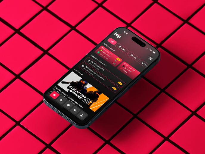
Blip - Esport app design (Light & Dark UI)

Bonjour, comrades! Today I present the case of Blip - an esports hub app for gamers where you can check esports news, learn about upcoming t

Project
Reimagining Asana's Color System

I created a color system based on Asana's current project management tool. Accessibility and the emotions the colors evoke were the primary

Project
Latios - Free Portfolio Template for UX/UI Designers

Overview I built Latios because I kept seeing the same problem: designers with solid experience getting stuck trying to launch their portfol
Project
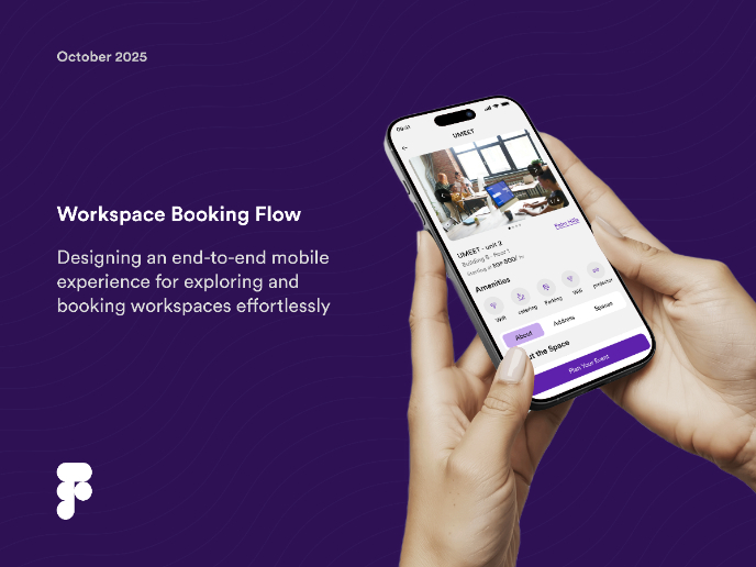
Workspace Booking Flow - UI/UX Design

Project
Responsive Main Screen

Popular Courses

Course
Design Composition

Learn the fundamental principles of visual layout, balance, and structure to create compelling and effective design compositions that engage and intrigue users.

Course
HTML Foundations

Learn the fundamentals of HTML, from basic formatting and structure to advanced elements and best practices, to create accessible and responsive web pages.

Course
CSS Foundations
Learn the basics of CSS, including the box model, element style, and content positioning, to improve communication, design handoff, and web decision-making.