Portfolia Investing App

Client
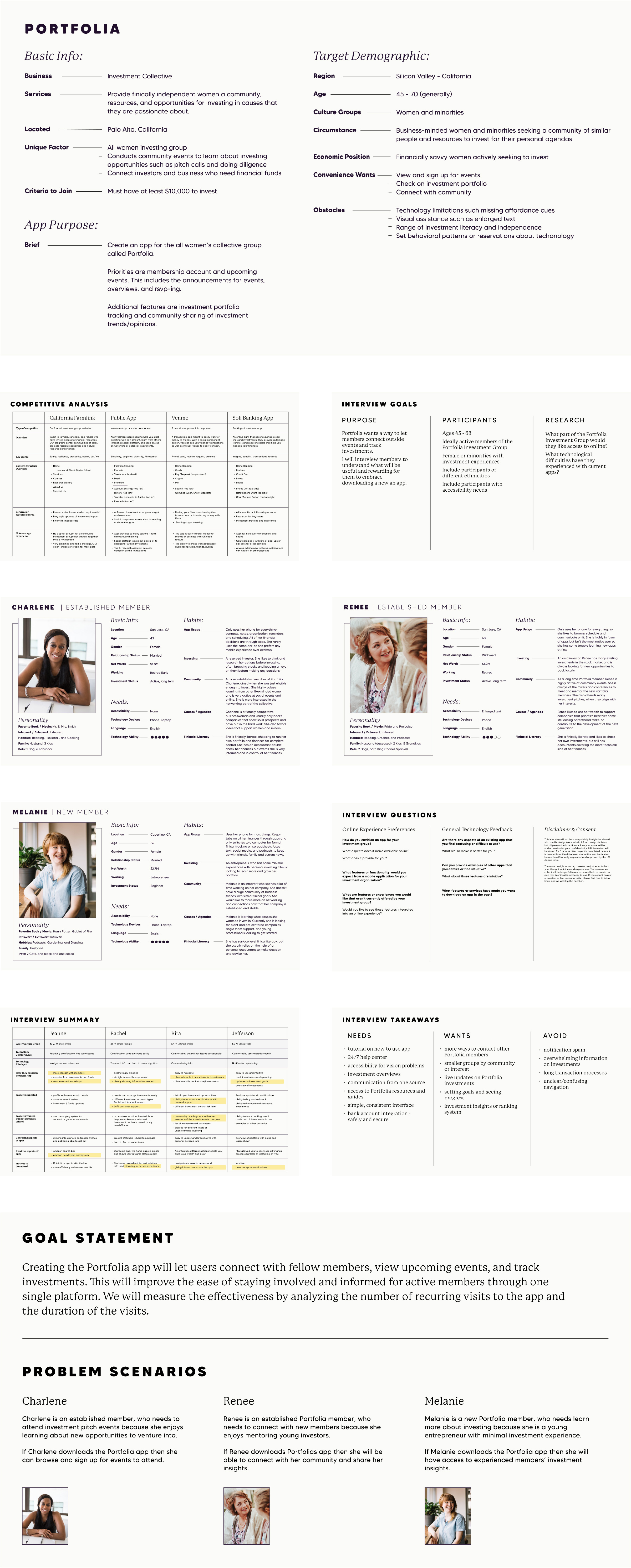
Portfolia is an investment collective in California for business-minded women and minorities seeking venture communities and resources to invest.
Problem to Solve
Currently, Portfolia members can only connect in person or on multiple social media platforms. There is also no group announcement or investment hub for the members to get updates between meetings.
Goal Statement
Creating the Portfolia app will let users connect with fellow members, view upcoming events, and track investments. This will improve the ease of staying involved and informed for active members through one single platform. We will measure the effectiveness by analyzing the number of recurring visits to the app and the duration of the visits.

Research
To understand the problems and start gathering data to solve them, I started by trying to fully understand the Portfolia group and community. I had to understand the target demographic, current functions, and where it fits into the overall finance and investment world.

Ideation & Design
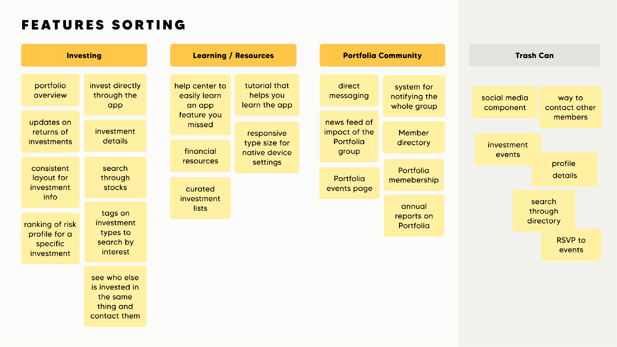
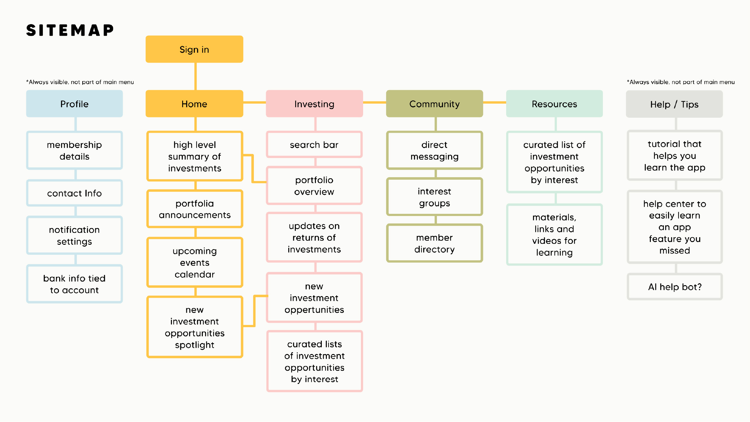
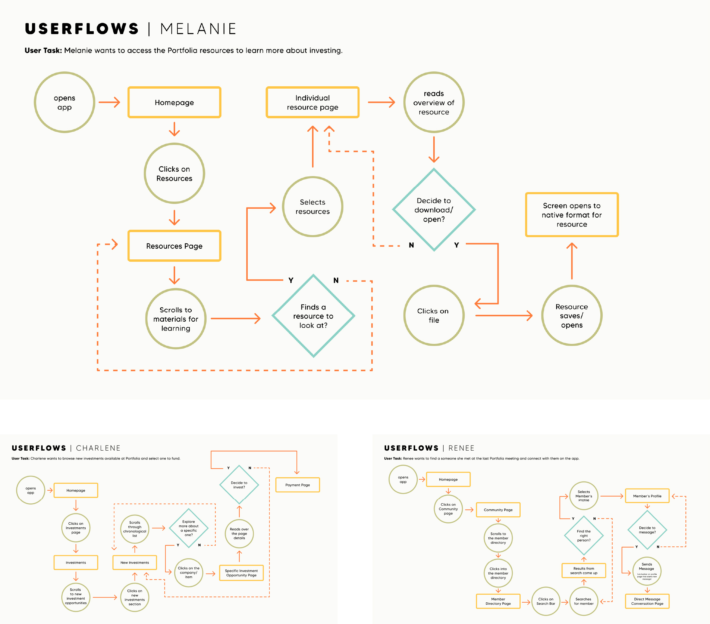
After brainstorming some solutions, I started grouping htem into buckets that might solve the user needs and painpoints. From there I used the solutions to build the app architecture, and then tested it with a few users flows that had different tasks.

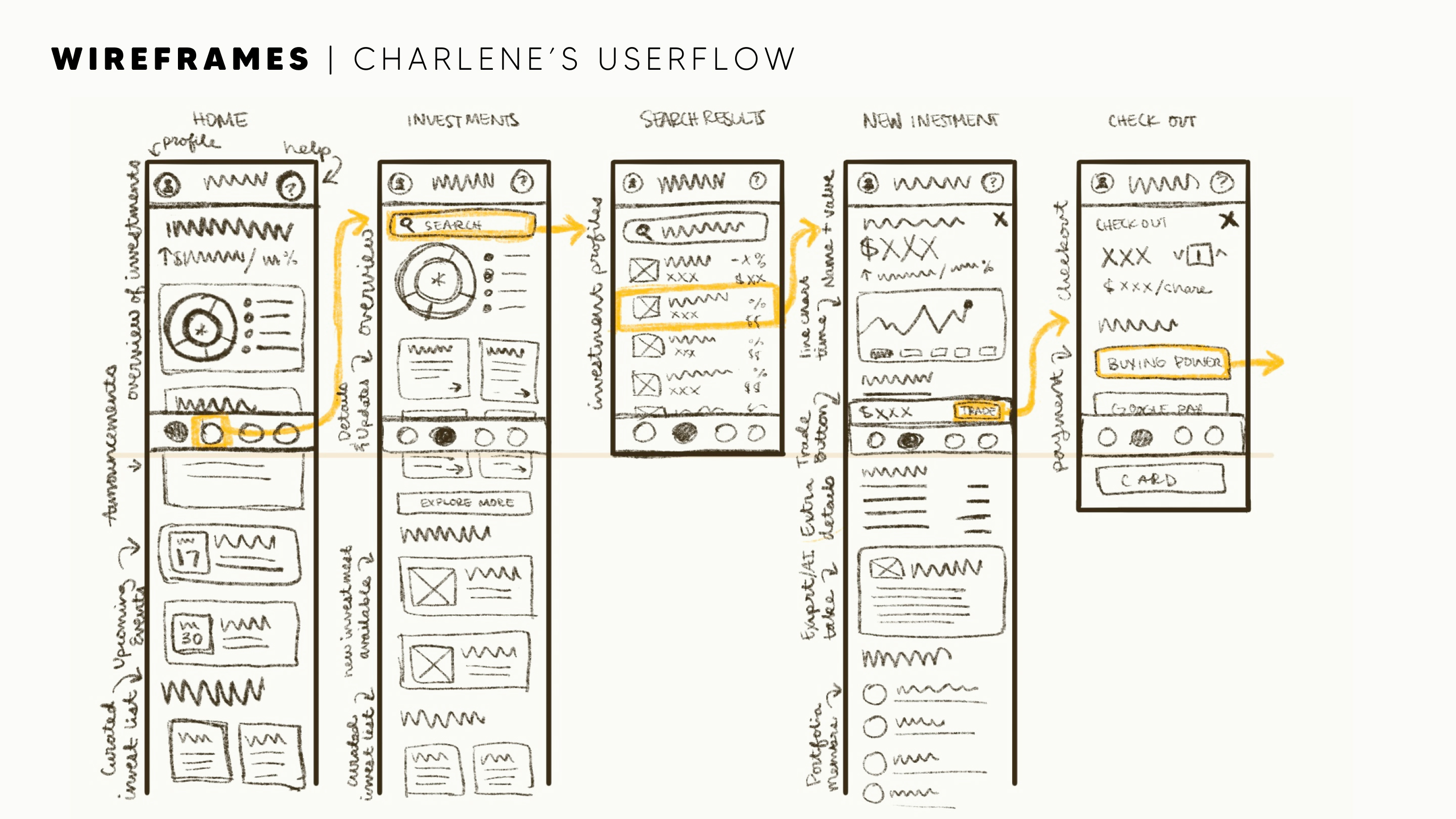
Wireframe
Charlene’s user flow was used to help inform some isolated task wireframes.
The app only focused on solving the task of browsing for a specific investment and funding. This allowed for more layout ideation and focusing on the app’s usability before building out to every page.

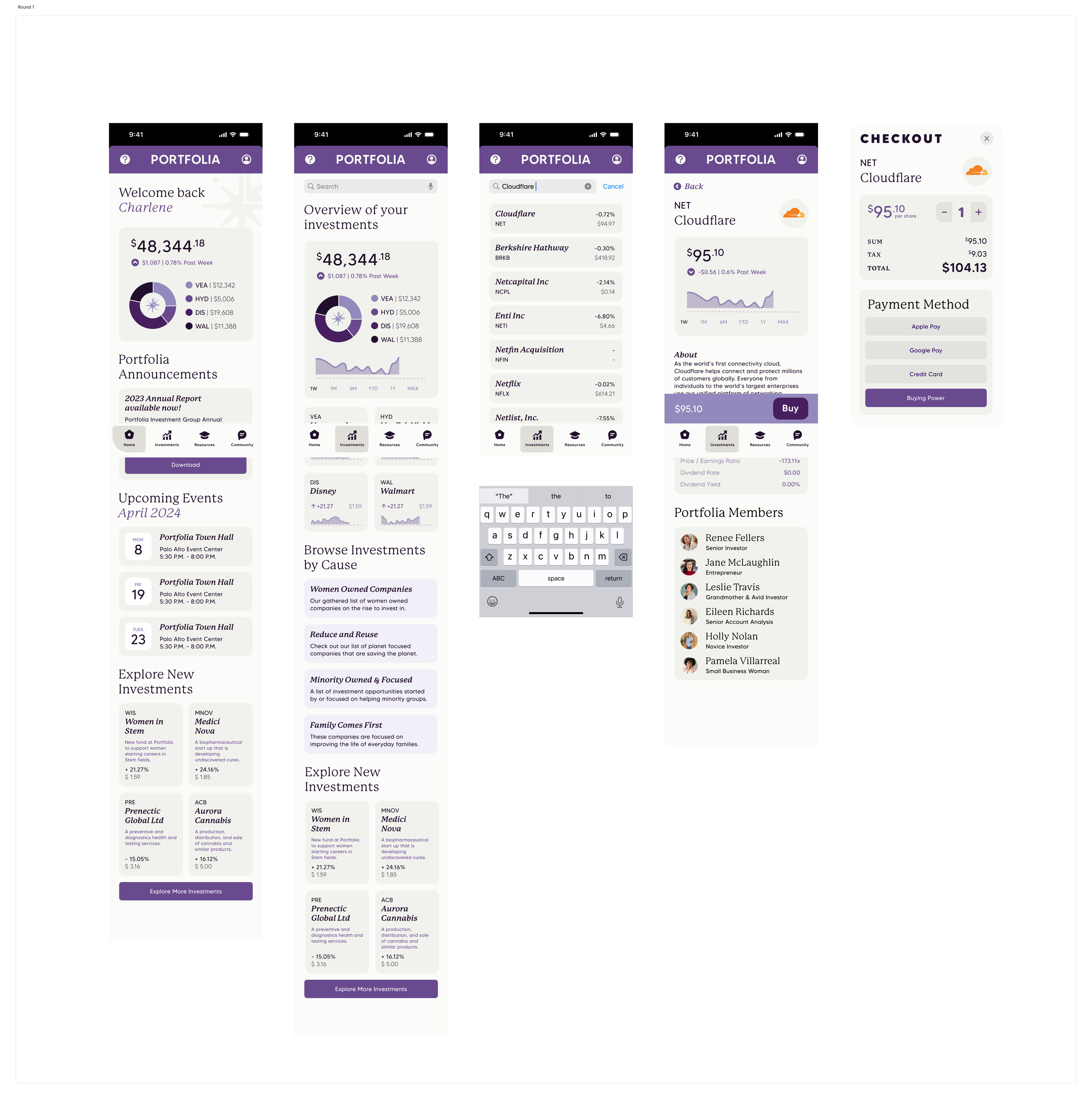
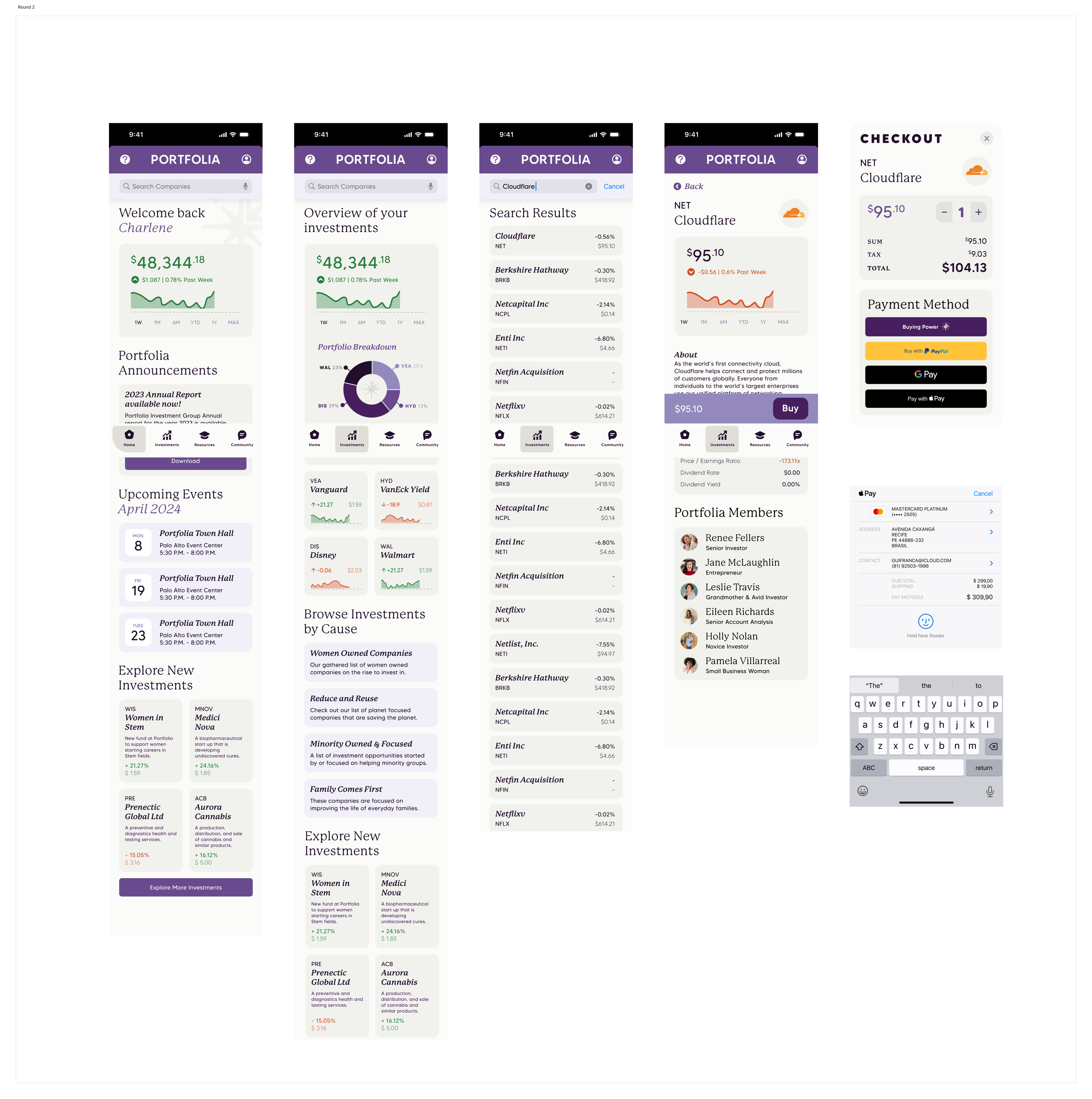
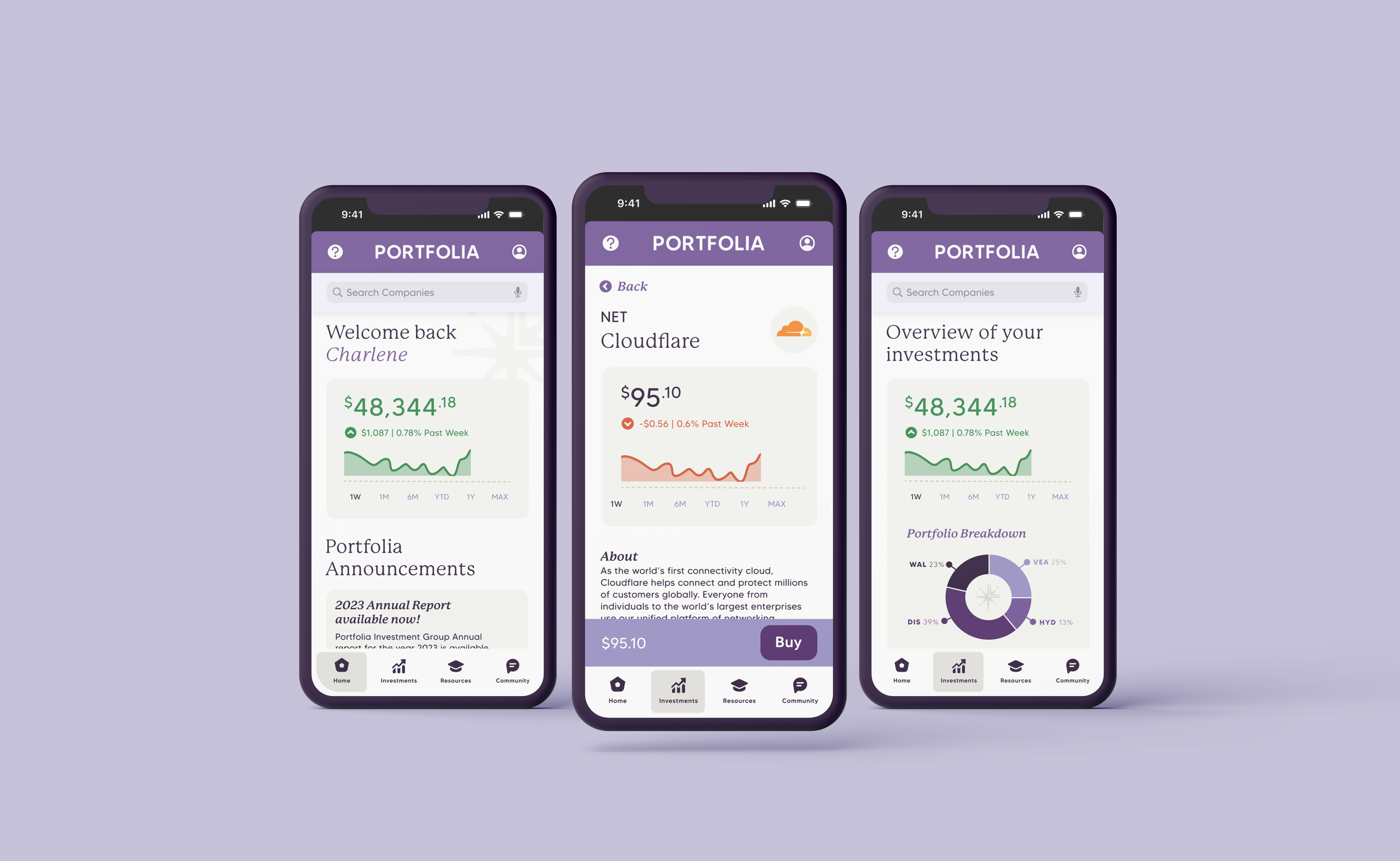
Prototype
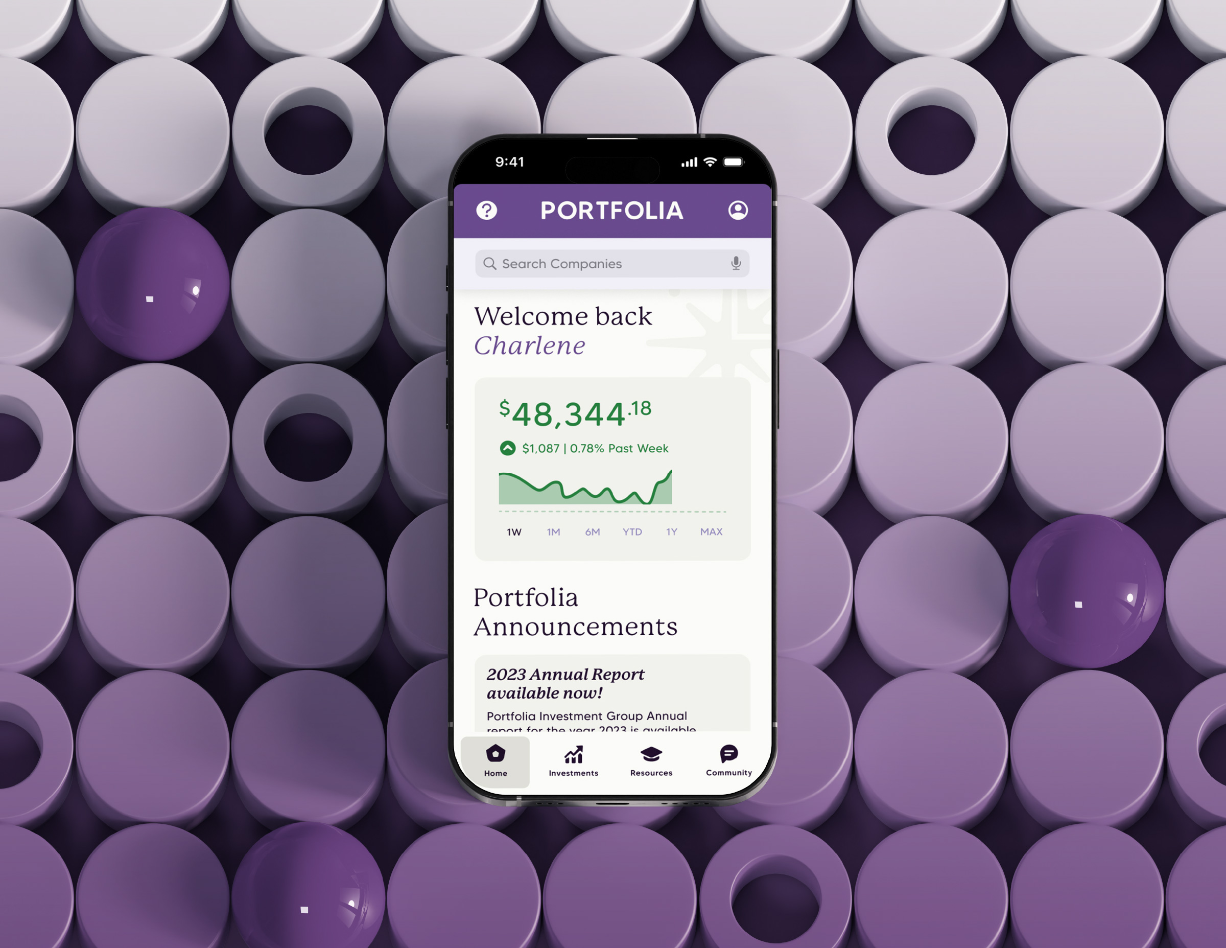
The first prototype focused on the user’s journey from opening the app to searching for a specific share called “Cloudflare” and buying it.

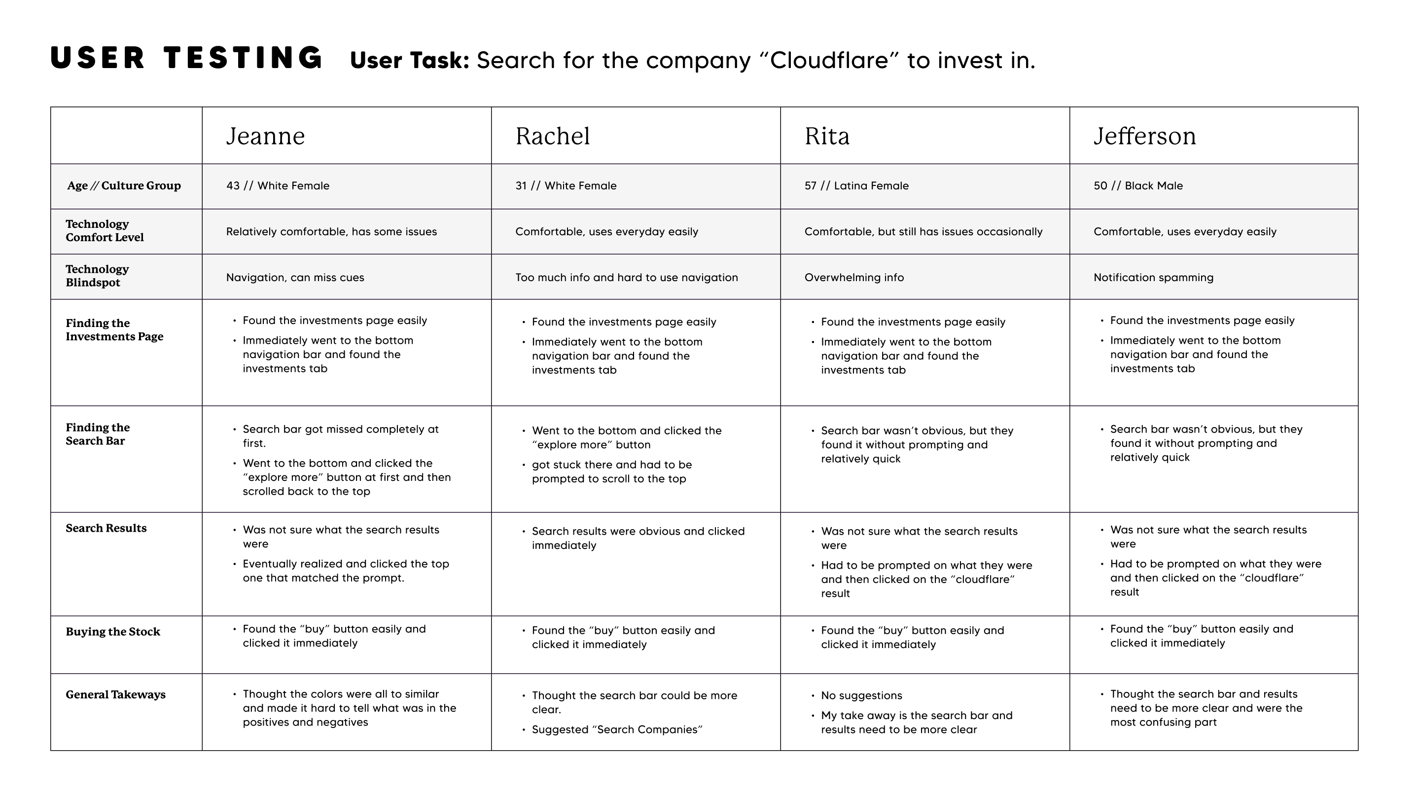
User Testing
Taking the first prototype, I interviewed more users to see what was working well or what was causing confusion. I found three user problems and brainstormed possible solutions to help fix the experience.
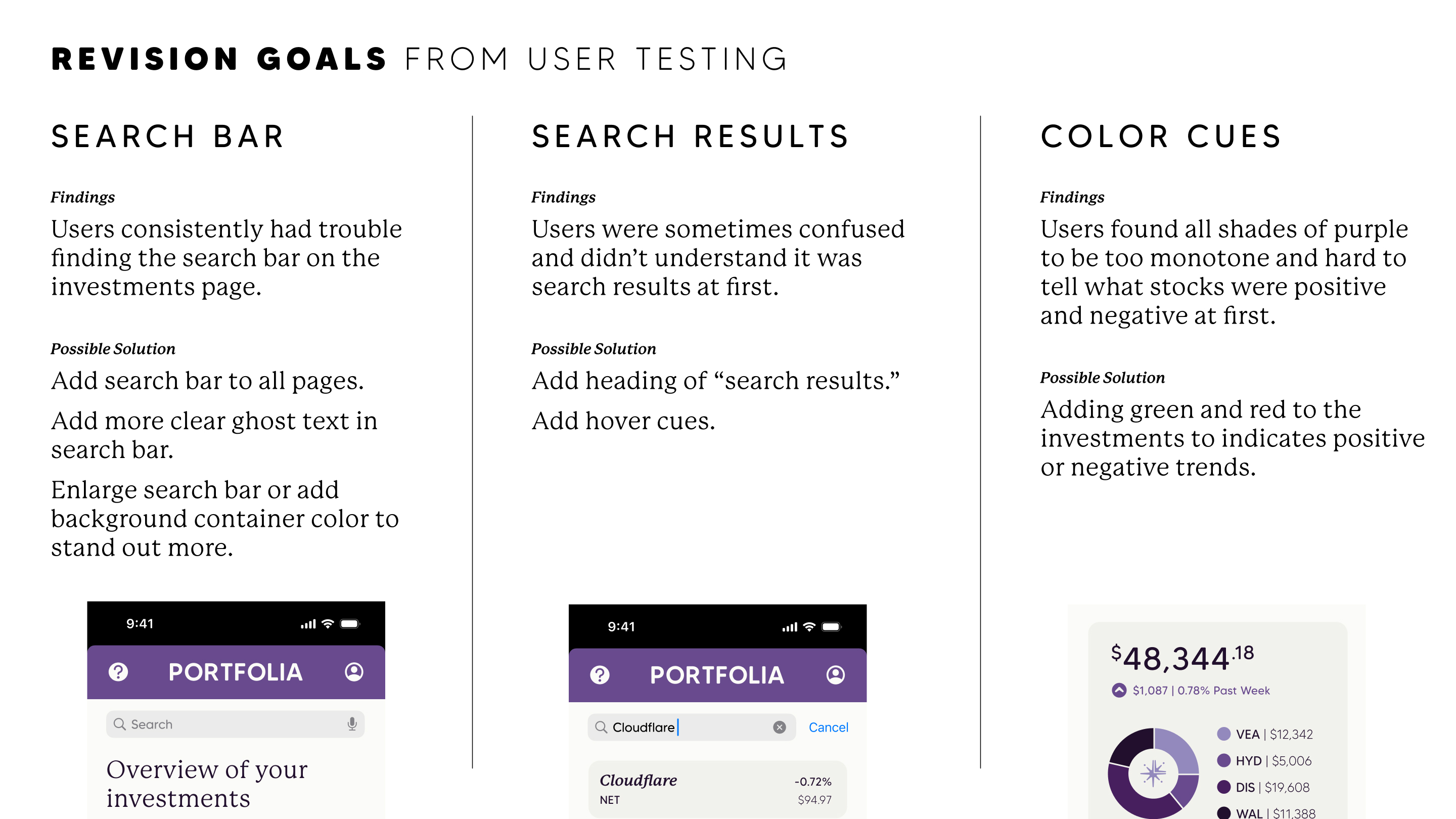

Revisions
The revised prototype makes it easier for the user to access investments by adding additional navigation points. The search bar is also clearer and sticky at the top of the page. Lastly, the app’s color is not so monochromatic and now incorporates traditional red and green colors to indicate whether a stock is going up or down.

Conclusion
Roadblocks
Every project comes with roadblocks. For this one, I found it challenging to contact Portfolia members or generally similar interview candidates for research.
There was also the challenge of time. The deadline was accelerated, which led to the decision to create the one-task prototype for testing and pitching, which allowed me to use my time wisely while still presenting a well-designed user experience.
Successes
The one-task Portfolia app was a success! Users found the issues from the initial prototype to be well resolved and were able to complete the task easily. The client was happy with the function and direction, so the app is on its way to being built out.
If you want to check out the full Figma file, here is the viewing link: Portfolia App in Figma
Tools used
Topics
Share
Reviews
4 reviews

Thanks for your sub, Ashley!
I would like to congratulate you on this work! I would like to see more of a UX-oriented project like yours. Great job exposing the flows and testing!
You have a great advantage by focusing on UX instead of UI. What I can recommend to you is to try to read Adham Dannaway's book (give me a dm so that I can give you the link). You need to level up the visuals on your visuals.
Great vibes only! Keep it up!


The structure of the project is excellent, with the index making it easy to navigate. The prototype walkthrough was smooth and intuitive. You can tell a lot of careful consideration went into every design phase. The two final flows brilliantly tie everything together. Well done!

The content is well-researched and presented in a clear and concise manner. However, the visual elements could be further enhanced to improve the overall presentation.
With some additional attention to the visuals, this project has the potential to be even more impactful.

Everything about this is well though out. The project index made the file very easy to navigate and it was very easy to step through the prototype. Obviously lots of thought and effort has went into each stage of the design process. I especially appreciate the two flows at the end which bring it all together. Great effort.
You might also like

SONZ - Entertainment platform


Camp & Travel Explorer - App Design


Solar system Dashboard Utility

Uxcel Halloween Icon Pack


Signup page for a SaaS website


Color System

Popular Courses

Introduction to Figma


Product Decisions & Trade-offs


The Product Development Lifecycle & Methodologies
