Reviews
3 reviews
Hello Ameer,
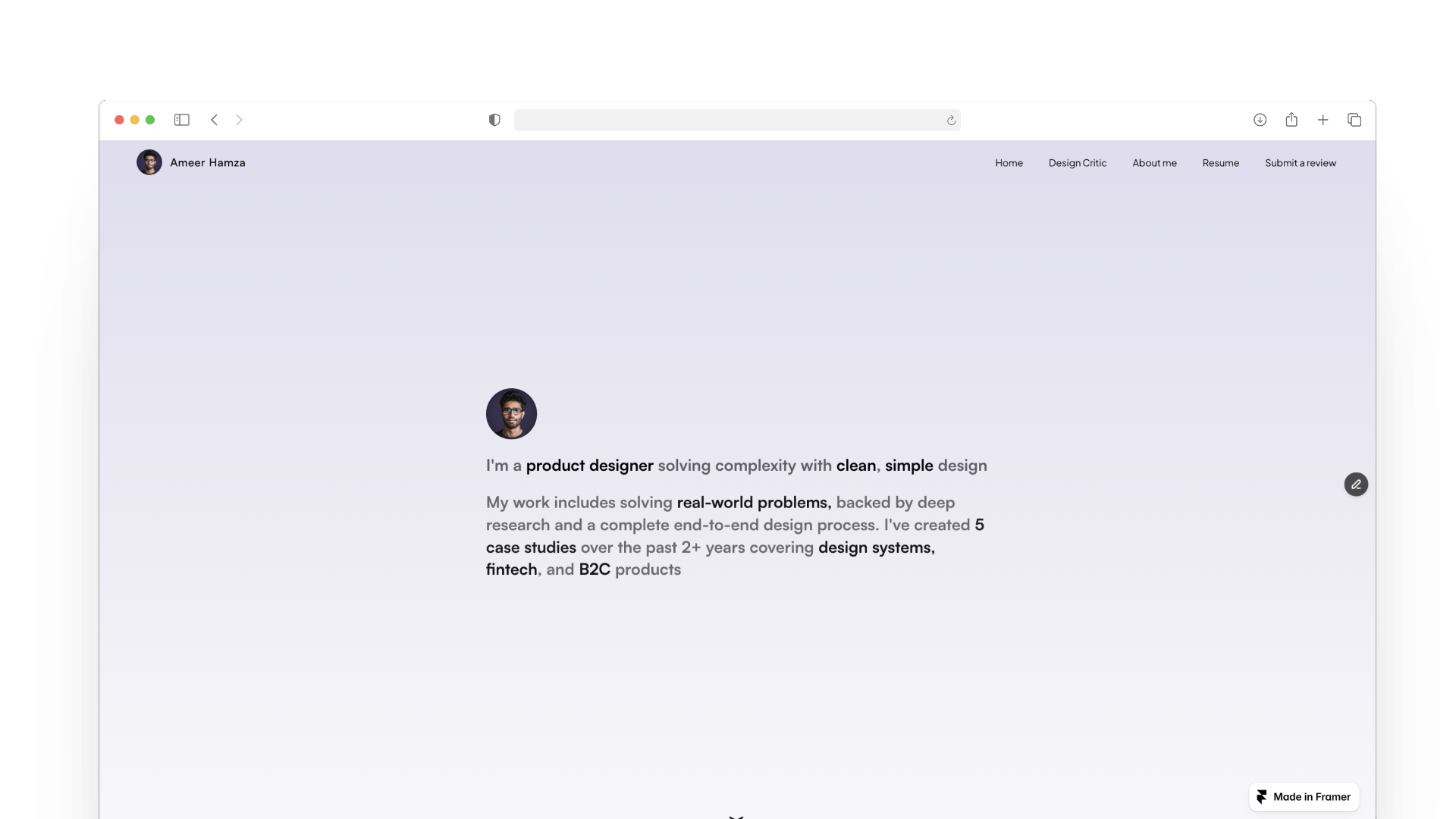
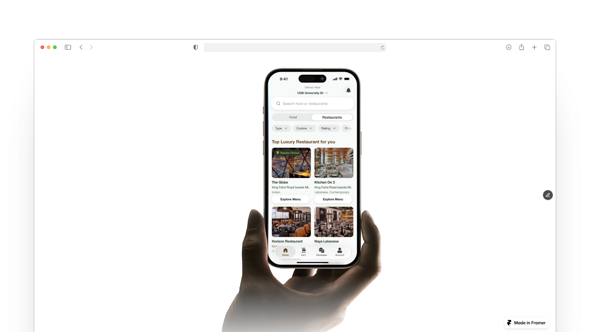
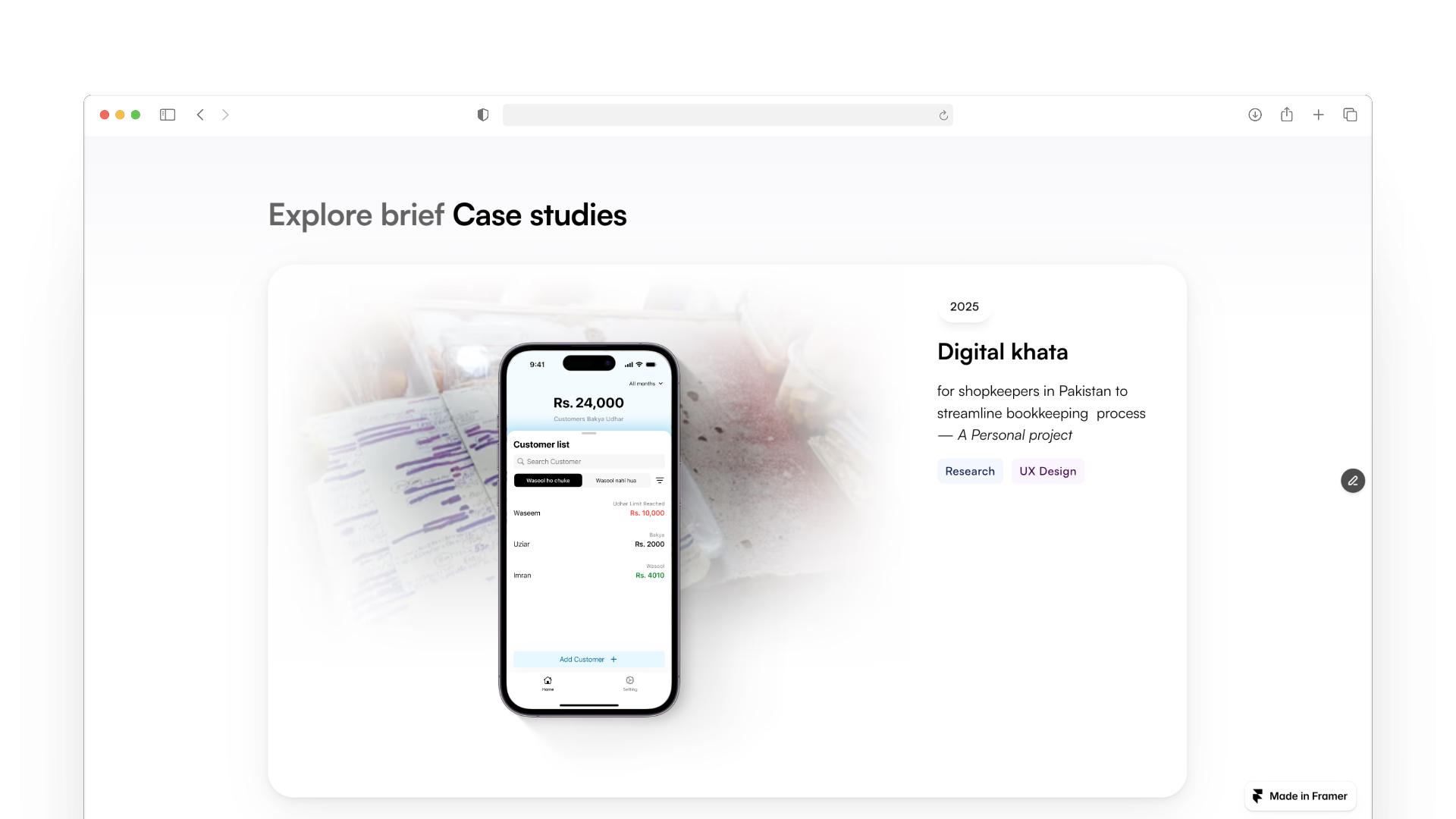
Great portfolio — very polished and well organized. I love the clear case-study previews, the mobile screens, and the inclusion of a design system and testimonials — they all help build trust and show your process. The site is easy to navigate and visually cohesive.
Hey Ameer,
Your portfolio looks really polished and easy to navigate, love the clear case studies and clean design. A couple of things to think about: maybe simplify the top-left avatar so it doesn’t feel repeated, and find a way to balance the playful Memoji with the overall vibe. Also, smoothing out the gradient banding in the testimonials would make things look even cleaner. A few short project descriptions could add nice context too. Keep up the great work!
Exquisitely modernist, Ameer ✨ Your site reminds me of the work of the legendary designer duo Benjamin DC & Michael Villar (previously at Stripe), particularly Benjamin's personal portfolio that used to be at the bdc.vc URL. The resemblance radiates pleasantly. What stood out to me are:
- The social-like avatar in the top left corner. Your face card is so distinct (which is a good thing), but when you have to represent it twice (top left and hero) it feels somewhat aggressive. The top left says, “ʰᵉˡˡᵒ ⁱᵐ ᵃᵐᵉᵉʳ” and the hero section says, “Hello, I'm Ameer again, but bigger” 😄 I'm not sure if this is a Framer's default that was brought to the front, but I think it would make more sense if the top left only had the text “Ameer Hamza” or a different visual other than your face card, like a dedicated logo or shape.
- The Memoji in “Explore Mini Case Studies” might contradict the cool and sophisticated vibe I got when I first landed on your site, as if you have two different personalities: ATL serious and focused, BTL playful and explorative.
- The gradient banding (box shadow) in the “Voices & Experiences” section gets stronger and more visible as I scroll through the last testimonials, “Usama (Awan) Khalid”. Previous sections, “Explore Brief Case Studies” and “Explore Mini Case Studies” have it too, but it's more subtle. See if you can explore a little bit more to make it blend seamlessly, or you can just copy the shadow style from the “Mobile Apps That I Built Using Flutter” card, which has almost no banding and is easier that way, I think.
Also, writing a little bit and presenting it as a project description wouldn't hurt, I guess. Show us some intro but more importantly, you have a finished and working portfolio that many of us don't. Congrats! 🎉
You might also like

Improving Dating App Onboarding: A/B Test Design

FORM Checkout Flow - Mobile

A/B Test for Hinge's Onboarding Flow

Accessibility Asse

The Fitness Growth Engine
Uxcel Halloween Icon Pack
Popular Courses

UX Design Foundations

Introduction to Figma


