Payment UI/UX - Shiv Dental

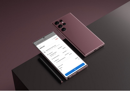
As a beginner, start by listing what users need in the dental app's payment process—like viewing treatment details, choosing payment methods (card, insurance, etc.), and seeing total costs with tax. Sketch a simple flow: Appointment Summary → Payment Options → Billing Info → Confirmation. Keep screens clean with clear labels like "Pay Now" or "Add Insurance." Use icons for credit cards or insurance to help users recognize options easily. Test your design by asking a friend if they can complete the payment flow without confusion, then tweak based on their feedback.

Reviews
1 review

Nice idea, Shivani, but if you're sharing prototype you have to make sure it works perfect, otherwise we won't be able to evaluate your project correctly. The link that you shared starts from in the middle of the flow, that happens but the prototype isn't interactive that much, it doesn't scroll vertically, so when used dropdown. Other than that a few more healthy suggestions would be:
- Error handling: Think about what happens if a payment fails or if information is missing. Even a simple error message or gentle prompt can make the experience much smoother.
- Accessibility: Double-check font sizes, color contrast, and tap targets to make sure the flow works well for all users.
You might also like

Smartwatch Design for Messenger App


GetTracky


Bridge: UI/UX Rebrand of a Blockchain SCM Product


Pulse Music App - Light/Dark Mode

Uxcel Halloween Icon Pack


Color System

Interaction Design Courses

UX Design Foundations


Introduction to Figma

Design Terminology
