Nocturne: Implement a Dark Mode


Overview
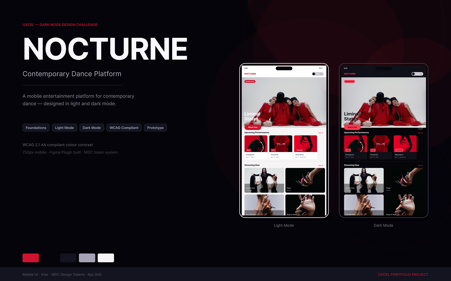
Nocturne is a contemporary dance streaming platform. The challenge: design a complete dark mode system that demonstrates Figma's variable and mode capabilities, not just a dark-coloured screen, but a token-driven, variable-powered mode switching system built entirely in Figma.
Prototypes:
https://www.figma.com/proto/111kHrlZmK9GVOvgN2bMQZ/Dark-Mode-Design?page-id=51%3A3&node-id=103-973&viewport=575%2C268%2C0.12&t=VxgvL8Ai2yVSWNjd-1&scaling=min-zoom&content-scaling=fixed&starting-point-node-id=103%3A973&show-proto-sidebar=1
https://www.figma.com/proto/111kHrlZmK9GVOvgN2bMQZ/Dark-Mode-Design?page-id=51%3A3&node-id=103-1070&viewport=575%2C268%2C0.12&t=VxgvL8Ai2yVSWNjd-1&scaling=min-zoom&content-scaling=fixed&starting-point-node-id=103%3A1070&show-proto-sidebar=1
The Approach
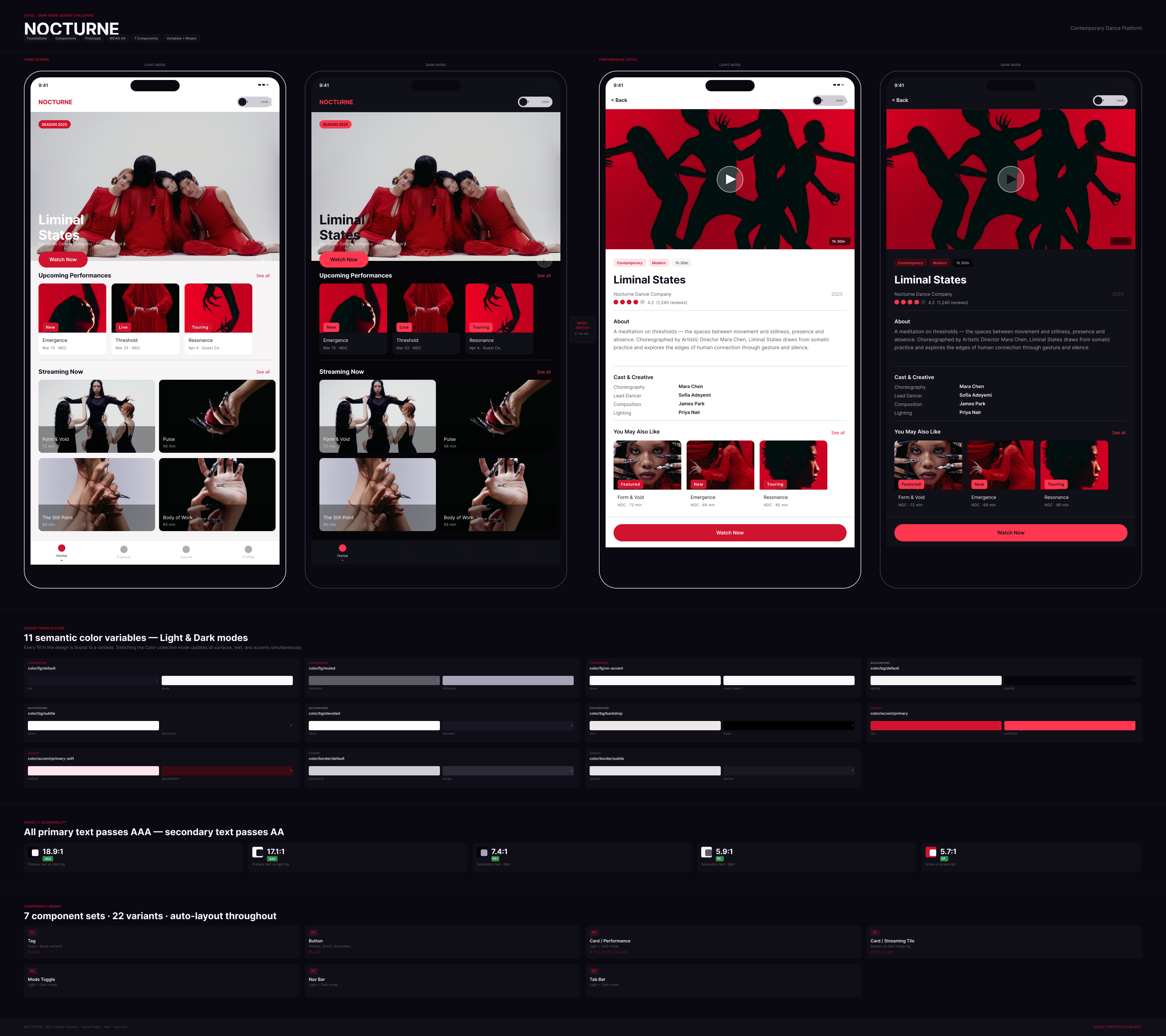
This system uses Figma's variable collection with Light and Dark modes as the single source of truth rather than swapping screens or components.
Token Architecture
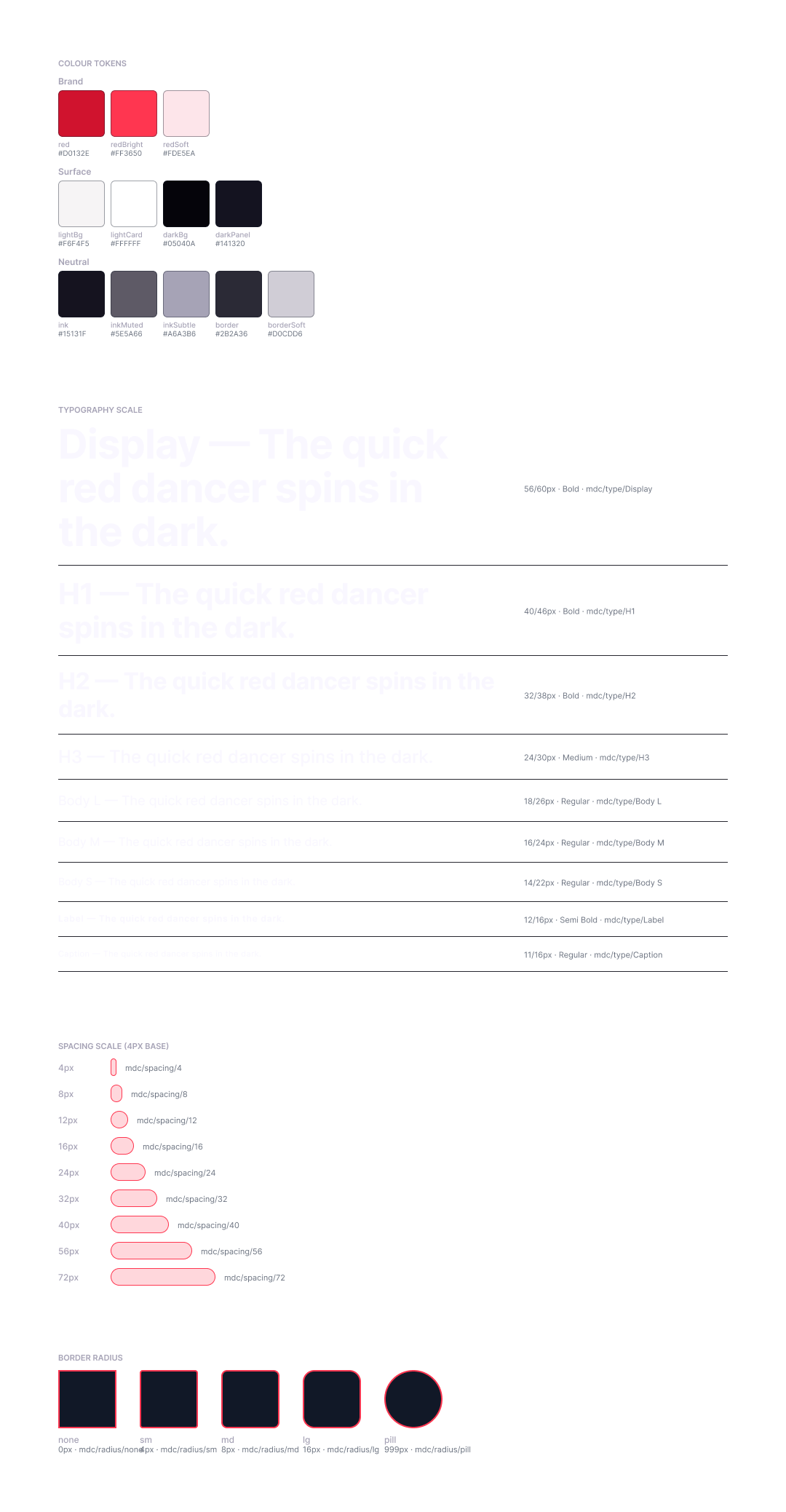
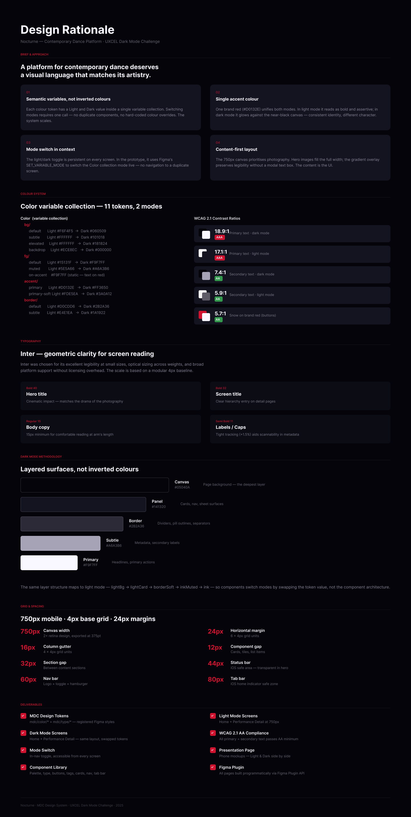
11 semantic colour variables across 4 categories, each carrying both a Light and Dark value.
| Token Light Dark | ||
| color/bg/default | #F6F4F5 | #060509 |
| color/bg/subtle | #FFFFFF | #101018 |
| color/fg/default | #15131F | #F9F7FF |
| color/fg/muted | #5E5A66 | #A6A3B6 |
| color/fg/on-accent | #F9F7FF | #F9F7FF |
| color/accent/primary | #D0132E | #FF3650 |
| color/accent/primary-soft | #FDE5EA | #3A0A12 |
| color/border/default | #D0CDD6 | #2B2A36 |
| color/border/subtle | #E4E1EA | #1A1922 |
Every component fill is bound to a variable. Switching the collection mode updates the entire UI in one action.
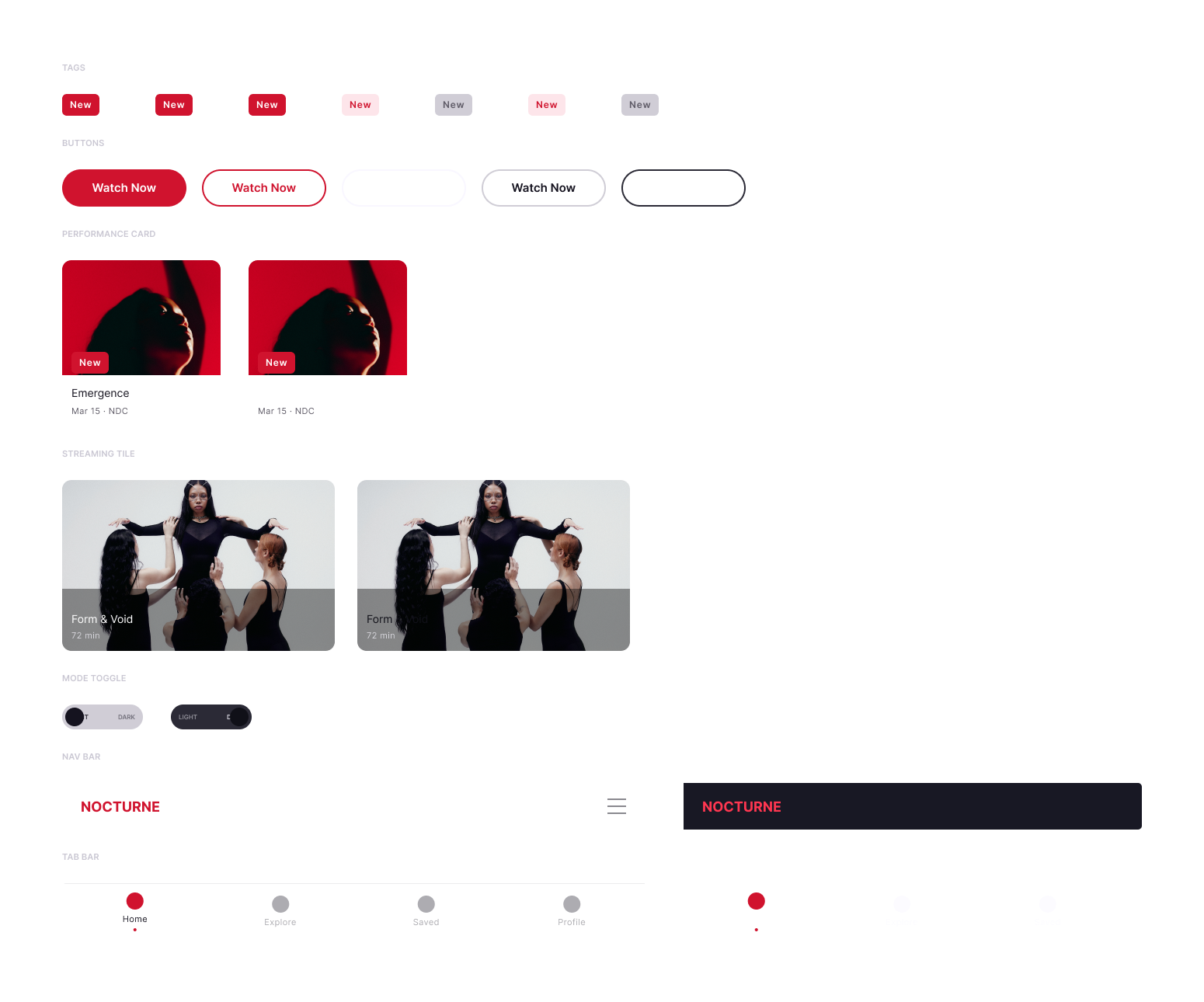
Component Library
7 component sets built with full auto-layout, component properties, and descriptions:
- Tag — status pill, 2 variants
- Button — primary CTA, Light/Dark
- Card / Performance — 204px content card with image, title, subtitle, tag
- Card / Streaming Tile — horizontal tile format with duration
- Mode Toggle — 104×32 pill, LIGHT/DARK labels, animated knob
- Nav Bar — 750×60, logo + hamburger, Light/Dark
- Tab Bar — 4-tab bottom navigation
Each component exposes TEXT properties for content overrides without detaching instances.
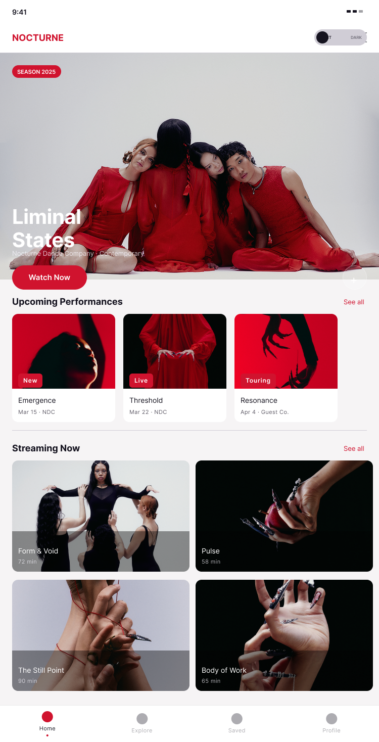
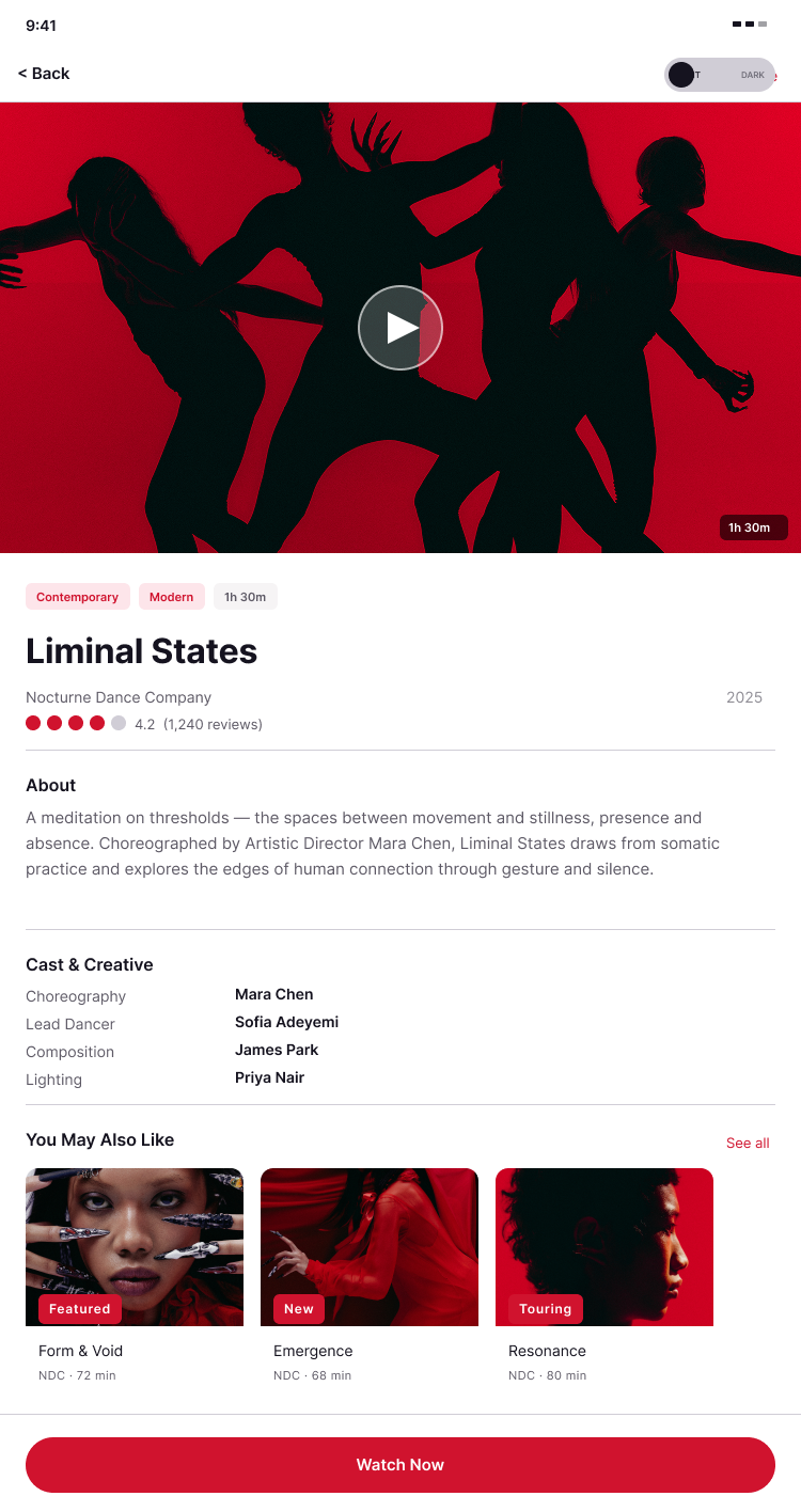
Prototype
Two standalone prototype flows — Home and Performance Detail — each demonstrating live mode switching.
- CHANGE_TO swaps the Mode Toggle variant (knob animates via Smart Animate)
- SET_VARIABLE_MODE switches the Color collection from Light → Dark across the entire frame
The toggle is placed as a direct child of each screen frame so the variable mode change scopes correctly to the parent frame.
Both screens start in Light mode; the prototype manages state at runtime.
WCAG Compliance
| Pair Ratio Level | ||
| Primary text on dark bg | 18.9:1 | AAA |
| Primary text on light bg | 17.1:1 | AAA |
| Secondary text on dark bg | 7.4:1 | AA |
| Secondary text on light bg | 5.9:1 | AA |
| Snow on brand red | 5.7:1 | AA |
Key Decisions
Semantic Naming Over Descriptive Naming
Tokens are named for their role (color/fg/default), not their value (inkColour). This means the same token name works in both modes — no renaming, no exceptions.
on-accent as a Static Token
Snow (#F9F7FF) appears on both dark backgrounds and red buttons. Rather than resolving it contextually, it's registered as color/fg/on-accent with the same value in both modes — honest about what it is.
Surface Depth Through Elevation, Not Lightness
The dark palette uses a four-stop elevation system (default → subtle → elevated → backdrop) that creates hierarchy without relying on opacity hacks or grey approximations.
One Toggle, Every Screen
The mode switch lives in the persistent nav area on every screen.
Deliverables
Foundations page: 14 paint styles, 9 text styles
Components page — 7 component sets
Screens page: 2 prototype-ready frames
Presentation page: token system, WCAG documentation, component inventory
Cover: 1440×900 with Light/Dark phone mockups
Rationale page: design decisions documented

Reviews
3 reviews

Hey Christopher,
As with your other projects, the documentation is very well structured.
However, when looking at the actual design and how that documentation is implemented, a few inconsistencies start to appear.
For example, even though you defined accessibility attributes related to color, many of the texts become difficult to read on mobile devices because of their size. It gives the impression that the interface may have been designed more with desktop in mind, even though the product itself seems intended for mobile use.
I’d also encourage you to take another look at some of the text boxes. In a few places they feel quite large compared to the amount of content inside them. From a development perspective, that could become a bit confusing because the structure doesn’t always reflect the actual content needs.
It also feels like you might have some kind of workflow involving AI that helps you structure or generate parts of these projects. I’d honestly be very curious to hear more about how that process works on your side. That said, I do think it’s still important for you as the designer to do a final pass and make sure everything feels consistent and intentional before presenting the work.

Hi Christopher,
Good start here! The screens look great, and with a few tweaks this project could be hugely improved.
My main concern is the red. On dark mode especially, the saturation is quite intense and it creates a few issues. The "live" tags are reading as buttons rather than labels, and the red in the upcoming performance images is competing for attention, making it hard to know where to look.
Bringing the saturation down would go a long way, as would using a different colour for images and tags.
Looking forward to seeing the next iteration! :)
Awesome work Christopher!
Love especially your design system. <3
You might also like

Improving Dating App Onboarding: A/B Test Design

FORM Checkout Flow - Mobile


A/B Test for Hinge's Onboarding Flow


Accessibility Asse


The Fitness Growth Engine


The Relational Workspace

Visual Design Courses

UX Design Foundations


Introduction to Figma

Design Terminology
