Netflix Wireframe ( let's watch together )

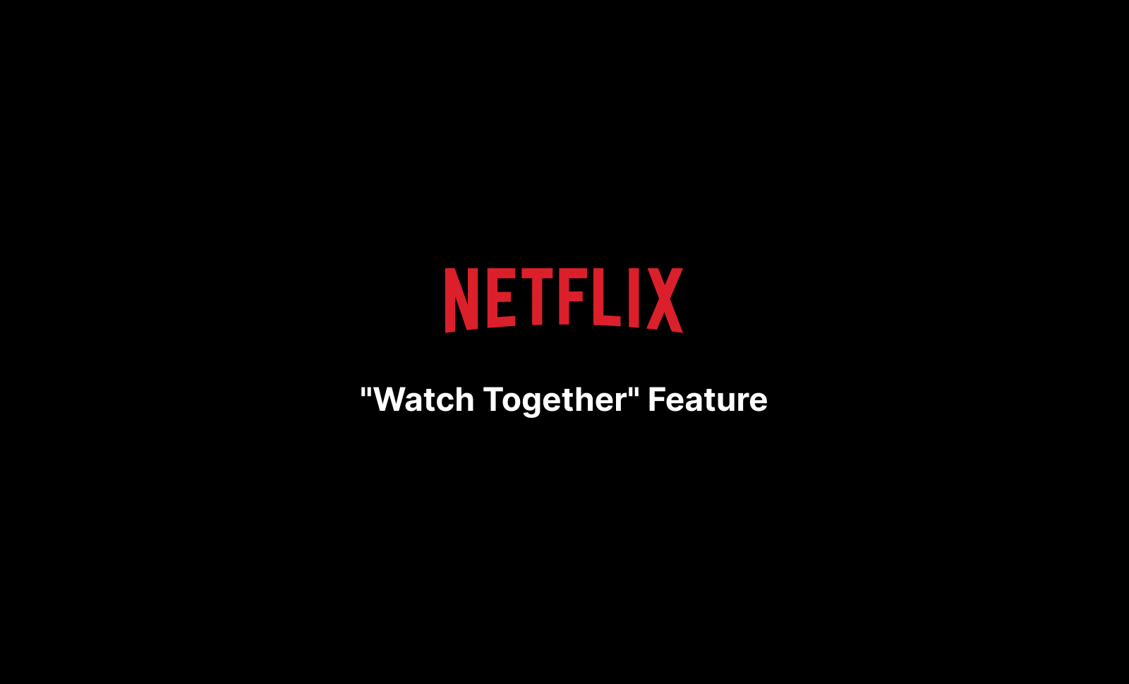
📱 NETFLIX "WATCH TOGETHER" - PROJECT SUMMARY
PROJECT OVERVIEW
Designed a mobile-first social viewing feature for Netflix that enables users to watch content simultaneously with friends/family remotely. The solution addresses the gap in Netflix's current offering—lack of native coordination tools for synchronized viewing—while competing platforms focus on different value propositions.
Duration: 2-hour design sprint
Platform: Netflix Mobile App (iOS/Android)
Deliverables: Competitive analysis, user persona, user flow, mid-fidelity wireframes (8 screens)
THE PROBLEM
Mobile streaming is isolating. Users want to share viewing experiences with remote friends but must juggle multiple apps (WhatsApp, FaceTime, Discord) for coordination, resulting in poor synchronization and disconnected experiences.
THE SOLUTION
"Watch Together" feature with:
- Email-based friend invitations
- Real-time synchronized playback
- Non-intrusive chat overlay
- Session status visibility ("Watching with...")
- Seamless integration into existing Netflix UI patterns
DESIGN PROCESS
- Research - Analyzed Netflix, Disney+/Hulu, Prime Video to identify competitive gaps
- Empathize - Created detailed persona (Social Sarah) with realistic behaviors and pain points
- Define - Mapped 4 key pain points: coordination chaos, sync struggles, disconnected experience, mobile challenges
- Ideate - Designed user flow from content discovery → invitation → synchronized viewing
- Prototype - Created 8 mid-fidelity wireframes showing complete user journey
🎓 KEY LEARNINGS AS A UI/UX DESIGNER
Research & Strategy
- ✅ Always start with competitive analysis before ideating solutions
- ✅ Identify market gaps through systematic evaluation, not assumptions
- ✅ User pain points should drive feature prioritization, not business desires
User-Centered Design
- ✅ Personas must include realistic behaviors, not just demographics
- ✅ Pain points should be specific and observable (e.g., "10 minutes coordinating start times")
- ✅ Design for actual user context (mobile, on-the-go, multitasking)
Information Architecture & Flow
- ✅ Map complete user journeys before jumping to visuals
- ✅ Consider multiple entry points for feature discoverability
- ✅ Respect existing mental models and navigation patterns
Design Decisions & Constraints
- ✅ Work within technical limitations (used email vs. building complex social graph)
- ✅ Pragmatic solutions > perfect solutions (faster time-to-market)
- ✅ Balance new features with existing design system consistency
Interaction Design
- ✅ Contextual UI reduces cognitive load (chat appears only when needed)
- ✅ Clear state management helps users understand system status
- ✅ Non-intrusive overlays maintain primary task focus (watching content)
Visual Design
- ✅ Maintain brand consistency (Netflix's dark UI, red CTAs, typography)
- ✅ Visual hierarchy guides user attention to primary actions
- ✅ Mid-fidelity wireframes communicate interaction patterns better than lo-fi
Scope Management
- ✅ Ship complete, focused solutions rather than over-planning
- ✅ Time constraints require strategic prioritization
- ✅ "Good enough" documentation that serves the goal > pixel-perfect over-design
🎯 CONCLUSION
This project demonstrates foundational UX competencies: research-driven design, user empathy, systematic problem-solving, and practical execution within constraints. The "Watch Together" feature addresses a genuine market gap while respecting Netflix's existing design patterns and technical limitations.
Key Success Factors:
- Followed proper UX methodology (research → empathize → define → prototype)
- Made pragmatic product decisions (email invitations vs. complex social features)
- Balanced innovation with familiarity (new feature in established UI patterns)
- Designed for mobile-specific constraints (small screens, touch interactions)
The project shows readiness to tackle real-world UX challenges with structured thinking and user-first approach.
💬 FEEDBACK & AREAS FOR IMPROVEMENT
I'd appreciate feedback on:
- Feature Viability - Is the email invitation approach realistic, or should I have designed an in-app friend system?
- User Flow Completeness - Are there critical screens or states I missed? (e.g., error states, network issues, user leaves session)
- Interaction Details - Is the chat overlay interaction clear? Should I have designed more micro-interactions?
- Persona Depth - Should I have included Felix (secondary persona) or was focusing deeply on one persona sufficient?
- Competitive Analysis - Did I identify the right competitors and gaps? Are there other insights I should have uncovered?
- Visual Fidelity - Should wireframes have stayed lo-fi for faster iteration, or was mid-fi appropriate for stakeholder communication?
- Accessibility - Did I miss any accessibility considerations? (e.g., chat for hearing-impaired users, screen reader support)
- Edge Cases - What happens if: invitation rejected? Network drops mid-session? Users in different regions with content restrictions?
What would you improve or approach differently?
Tools used
From brief

Topics
Share
Reviews
2 reviews

This is a good start Mohamed.
The spelling mistakes within the actual project compared to the professionally written summary tells me there was some heavy AI use here which makes me think, did you actually learned the lessons you said you did or was this just part of the AI output?
The idea is interesting but your design has spelling and alignment mistakes, as well as inconsistent fonts, the "Play" button being an example.
Another point is on your conversation example. Your thesis is that people want to talk about movies while watching them but the conversation in the chat is about sharing Figma files?
The chat fills the entire screen, if the chat overlay appears every time there is a message, wouldn't that hinder the watching experience?
Again, good start but there's still a lot to think about and improve here.

I really like how you have been so details. More into you rather than Design, good work. But I can suggest you few more as a mentor.
I see so many spelling mistakes, and this is one of the easy sign of the portfolio getting rejected
- There are no colours. It's too black and white.
- The fonts in many screen like the comment section. The alignment is not working to improve that, but it's a great idea to have something like comments.
- Another thing is necessary, is the excitement – like YouTube has the hype button and the confetti icon in life really makes people to click on it and engage which I don't see. It's just writing comments which would not work.
- In terms of persona for just adding a chat button, you have done too much of writing, not every feature in design has to be explained by persona.
- You don't have to know about the strength because you're solving a problem. Focus on that and feature that could help to solve that problem – like people would like to see reactions of people while they are watching it so that could be another feature. Solving the same problem that you are solving.
You might also like
Accessible Signup Form for SaaS Platform

Pawtify - Responsive Landing Page Brief
Plan A/B Test for the Onboarding Flow
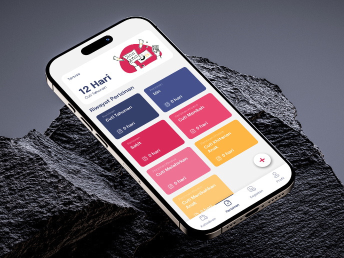
SIPALA - Attendance, Leave, and Activity Management System

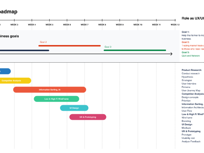
Build a Product Roadmap
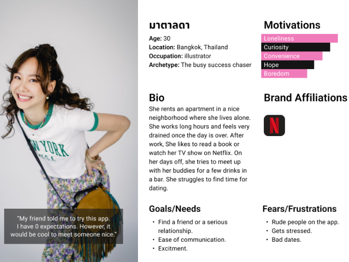
Develop a User Persona
Interaction Design Courses

UX Design Foundations


Introduction to Figma

Design Terminology
