My Very First Figma Design: AirBNB Clone
I've used Adobe Creative Suite before like InDesign, Photoshop, Illustrator, and Premiere to create illustrations, edit photos, layout publications, and create video animations but that was a while ago. Before the end of year, I jumped into Figma for the first time, and it's incredibly intuitive to transition from Adobe to Figma. The learning curve was surprisingly smooth. My previous design knowledge kicked in like riding a bicycle and I figured out the gaps myself. The tools change, but the principles don't.
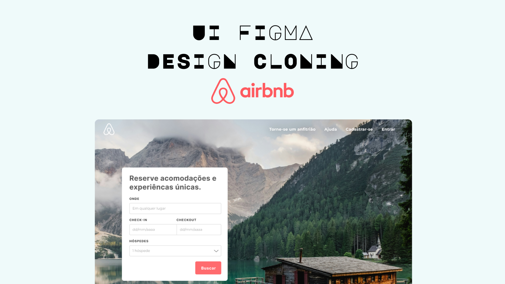
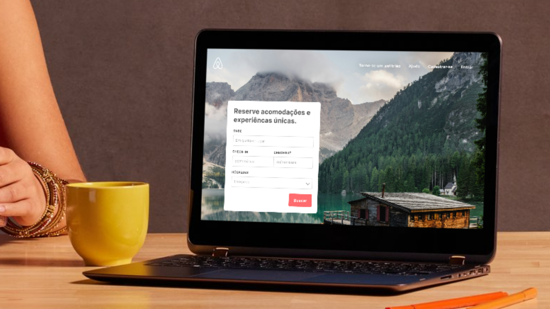
I cloned Airbnb's desktop home interface as my first project. It's not perfect, but it's mine, and I'm genuinely happy with it.
What I Learned
Good design solves actual problems. Airbnb's homepage makes it easy to search and compare properties. The search bar is prominent because that's what users need first. The card layout lets you compare at a glance. Once I understood why things were designed that way, everything made sense.
Here's my Figma clone of AirBNB: Click to open the Preview
Reviews
2 reviews
Hi Karen!
First of all, for a “very first Figma design,” this is a strong start. What I look for at this stage isn’t perfection it’s understanding of structure. And here, I can see that you’re already thinking in terms of layout, hierarchy, and visual grouping rather than just placing elements randomly. That’s a good instinct to have early on.
Cloning something like Airbnb is actually a smart learning move. It forces you to study spacing, card systems, typography scale, and consistency. If the alignment and repetition are mostly coherent, that tells me you’re paying attention to system patterns which is foundational in UI design.
If I were mentoring you, I’d suggest focusing next on spacing consistency, typography rhythm, and component reuse. Try to recreate sections using auto layout and build small reusable components. That will shift you from “designing screens” to “thinking in systems.” Overall, this is a promising starting point with the right direction.
Hey Karen, congrats on your first ever Figma project and making the jump from adobe!
I love to see the project but the link doesn’t seem to open for me, so I can’t fully review the design yet. Once that’s sorted, I’ll happily take a proper look.
From what’s visible in the thumbnail and mockup, I’d reconsider the typography choice. The font feels a bit decorative for this type of interface or even for the cover, and may impact readability. If this is meant to be a homepage-style layout, leaning toward a more neutral, UI-friendly typeface and also keeping the header consistent with the rest of the system could strengthen the overall result.
Solid starting point overall. Fix the link and I can get into more detailed feedback.
You might also like

Smartwatch Design for Messenger App

Bridge: UI/UX Rebrand of a Blockchain SCM Product

Pulse Music App - Light/Dark Mode

Monetization Strategy

Designing A Better Co-Working Experience Through CJM

Design a Settings Page for Mobile
Popular Courses

UX Design Foundations

Introduction to Figma


