Mockup for Interview

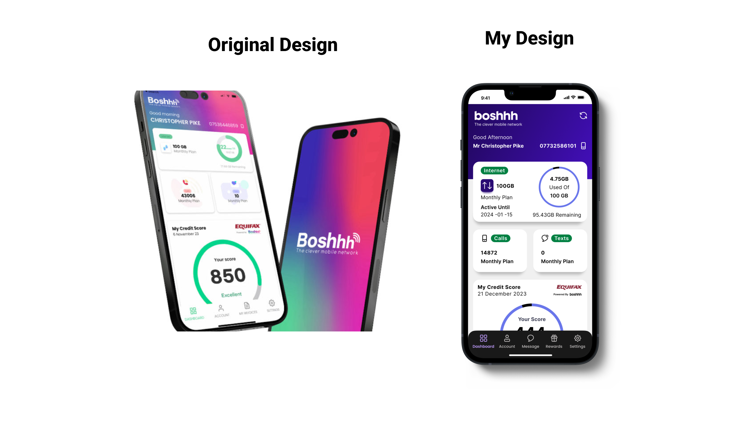
For an interview I took initiative and redesigned their mobile home screen in Figma. I did this quickly in the morning of the interview as I noticed their desktop website colours were different to their mobile version. And so I made a mockup of what their mobile home screen could look like if it was brought in line with their desktop version.
My design as you can see is primarily focused on the colours due to time constraints, but had I known more about the app and how sections worked I would of redesigned them to make them more user-centred.
For instance the calls and texts part of their design I felt were not clear. With out being able to access the app I did not what the text meant or if they sections were clickable. Had i had more time I would have focused more on white space and refining sections making them easier to navigate and understand.
Since the Interview the company has actually updated their interface which seems to be a lot clearer and more user focused.
Tools used
Share
Reviews
2 reviews

I really like the initiative you took in aligning the mobile home screen with the desktop version attention to detail like this shows a solid understanding of brand consistency.
I’m curious, though, did you explore any changes beyond the color palette? I’d love to hear your thoughts on how you might refine the UI elements or even create better user experience. For instance, the largest card on the screen caught my eye. It seems to contain quite a bit of information, which is great, but I wonder if there’s a way to present it that immediately communicates the key details more effectively.
Thinking about how users will interact with and absorb the information could be a great next step in elevating the UX.
Excited to see how you’ll continue to refine your designs!

Nice.
I like your redesign. Lots more white space and solid colors. I saw you changed the UI at the bottom, were the additions based on info from the interviewer or was it up to you how you would make it? I like the front view, but had a bit of trouble reading the original design's image.
For 90 minutes, you changed a lot of things. It would be great if it was given in your description.
You might also like

Accessibility Asse


A/B Test for Hinge's Onboarding Flow


The Relational Workspace


The Fitness Growth Engine


Smartwatch Design for Messenger App


GetTracky

Popular Courses

UX Design Foundations


Introduction to Figma

Design Terminology
