Mobile Gaming App Color System


Reviews
2 reviews

Good start! There are some areas to improve: the project doesn’t mention the name of the mobile gaming app at all. That’s a pretty big omission. Without the app’s name, it’s hard to understand the context, target audience, or even the brand personality the color system is supposed to support. There are no visuals or summaries of the color palettes, which is a missed opportunity for a color system project. For a color system, you’d expect to see swatches, buttons, inputs or any usage examples, other than the only one you shared below

Hi Ceyhun!
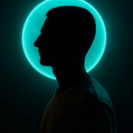
Wonderful job on color selection for an app that is exclusive for Dark mode! They contrast well against the dark background of the presentation and follow WCAG compliance.
Something to improve on in this system is how these colors are presented within the application. The contrast of text against the gradient background of the application is something that intrigued me. Although I noticed that you used a drop-shadow to increase readability, the white text has a low contrast ratio. Consider trying the dark background used in your presentation to maintain those WCAG standards and keep your app readable!
Great start on your color system!
You might also like

Smartwatch Design for Messenger App


Bridge: UI/UX Rebrand of a Blockchain SCM Product


Pulse Music App - Light/Dark Mode


Monetization Strategy


Designing A Better Co-Working Experience Through CJM


Design a Settings Page for Mobile
Visual Design Courses

UX Design Foundations


Introduction to Figma

Design Terminology
