Accessible Sign-Up Form – Inspired by Klaviyo

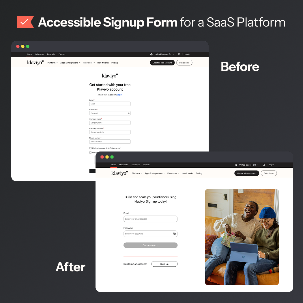
I took a hard look at Klaviyo’s sign-up & login experience. It's a mostly sleek and polished experience, but a few small details were tripping up accessibility and usability.
What I did:
- Removed unnecessary fields, creating a more focused form.
- Removed newsletter sign-up, we can save that for later.
- Gave password rules their own live-check list, clear, concise, and upfront.
*Disclaimer: they've updated the experience since I created my project

Reviews
3 reviews

Shannon, I love that you tackled Klaviyo’s login and register screens with accessibility in mind. But from what you've shared, a few key areas need polish to make your redesign both usable and professional:
Visual Quality & Cohesion
- The half-image, half-vector backgrounds feel uneven and don’t render cleanly in previews; this comes off as unfinished.
- The “I’m not a robot” step looks like a stretched image screenshot rather than an integrated UI element.
- Since you position your project on improving accessibility and usability, visuals need to be crisp, consistent, and clearly executed across the flow.
Backgrounds & Visual Overload
- The original Klaviyo login has a clean white background with a small “What’s new” note and a video (not autoplaying, so still accessible). Your redesign swaps this for a bold orange background and a full image, which actually adds visual clutter instead of decluttering.
- Bright, high-saturation backgrounds tend to overwhelm rather than support accessibility. In this case, the original feels calmer and more professional.
Login vs. Sign-up Differences
- In the live product, login and sign-up are already quite consistent: both are white background, minimalist forms. The only difference is that sign-up has more fields (company name, website, etc.) and no distracting images or videos since it’s a higher-effort flow.
Focus & Error States
- You mentioned fixing focus and error handling, but I tested the original fields, and they already pass accessibility and contrast checks.
- In your redesign, though, the outline thicknesses are inconsistent (normal, focus, and error states don’t match), which reduces clarity.
CTA Hierarchy
- On your login screen, the most important button (“Login”) is disabled by default, while three other buttons are styled as primaries. That’s confusing and not accessible.
- The balance between “Login” and “Create account” in their respective pages also doesn’t reflect their true importance across both flows.
Execution Quality
- Since this project was framed as fixing “small accessibility and usability issues,” the execution quality matters a lot. Right now, it feels inconsistent and less polished than Klaviyo’s real UI.
Typographic Hierarchy & Clarity
- Only two font sizes exist, one for titles and one for everything else, flattening visual hierarchy and reducing clarity.
- Placeholder text is styled identically to input text, labels, and button text. This makes elements harder to differentiate, especially for assistive users.
What Works Well
- You correctly identified accessibility gaps like missing labels, poor contrast, and usability friction in the original flows.
- Your intent to make forms more accessible, with live error handling and clearer interaction cues, is spot-on.
What to Improve
- Execution: Clean up those visuals and alignment issues, make it feel finished.
- Visual Hierarchy: Strengthen font scale and visual weight across CTAs, labels, placeholder text, and feedback states.
- Accessibility: Ensure buttons have clear, accessible states even when disabled. Standardise focus and error outline thickness.

Great effort, Shannon — I like how you focused on accessibility gaps and made the form feel clearer with stronger labels and error handling. To strengthen it further, watch out for visual polish and consistency (like hierarchy, focus states, and button priorities) so the improvements match the professional tone you’re aiming for. Overall, it’s a thoughtful redesign that shows you care about usability and trust — nice work!

Hey Shannon! I liked your approach, Klaviyo’s current split sign-in and sign-up flow is “old but still works,” yet bringing them into a unified visual style was a great decision. It improves brand consistency and lowers context-switching friction. To make it even more engaging, you could change the image or background color when switching between login and sign-up. One thing to note is that Klaviyo’s sign-up flow includes extra required fields (e.g., company name, website), so if this is meant to represent the full sign-up experience, those should be included as well.
I liked how you addressed the contrast issues. Copy-wise, “Sign up for your Klaviyo account” works for a functional form, but for a saas product like klaviyo, a slight upgrade could make the entry point feel more intentional and less like a default CMS string. You could aim for saas tone + conversion, something like “Join Klaviyo to grow your audience” for a value hook.
The current klaviyo sign-up also has a nice password verification style with a progress bar and subtle 12-character prompt, but I prefer your approach, which clearly flags missing elements like a special symbol or number.
Overall — good job!
You might also like

Smartwatch Design for Messenger App


Bridge: UI/UX Rebrand of a Blockchain SCM Product


Pulse Music App - Light/Dark Mode


Monetization Strategy


Designing A Better Co-Working Experience Through CJM


Design a Settings Page for Mobile
Visual Design Courses

UX Design Foundations


Introduction to Figma

Design Terminology
